react-native-awesome-pin


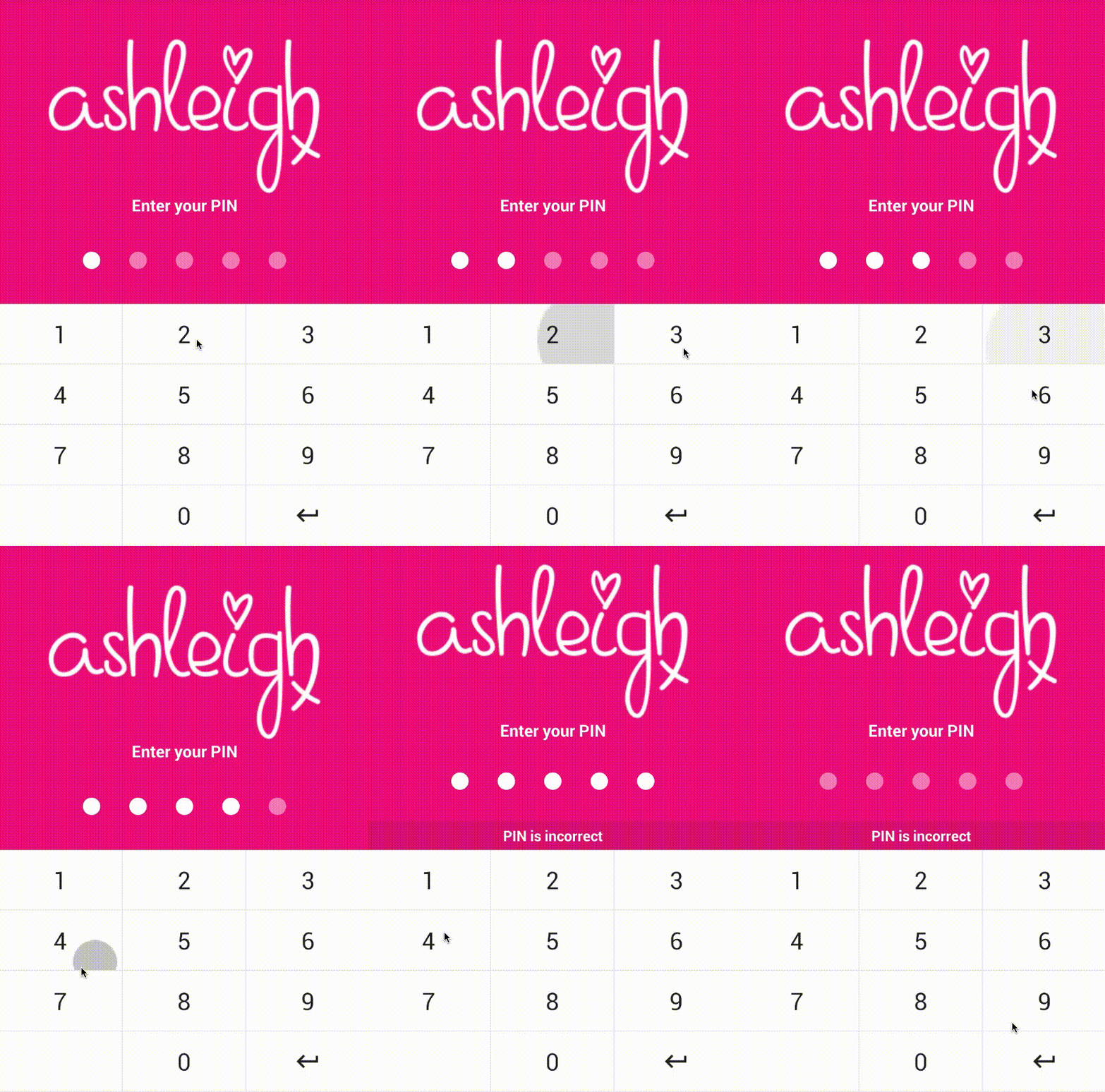
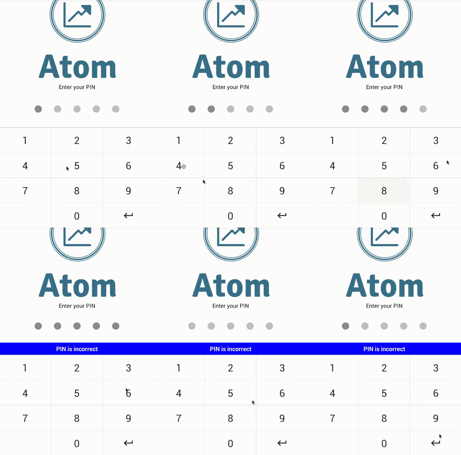
A highly interactive and customizable PIN code screen for React Native.
-
Plug and play PIN screen with dozens of props (can be themed to suit your brand).
-
Keyboard and PIN components can be used independently for more fine-grained customization.
-
Animations and micro-feedback included to create a great user experience.


Install
To get started install via npm:
npm install react-native-awesome-pin --save
Usage
PinScreen
The <PinScreen /> will take up the full view. It is a plug and play component... pass your
logo, tagline, background colour, callback function and start verifying PINs.
Import:
import { PinScreen } from 'react-native-awesome-pin';
Then add it to your code:
<PinScreen
onRef={ ref => (this.pinScreen = ref) }
tagline='Please enter your PIN'
logo={ require('../../img/mylogohere.png') }
containerStyle={{ backgroundColor: '#AAA' }}
keyDown={ this.recievePin.bind(this) }
/>
recievePin(pin){
}
You need to add a ref to your PinScreen, this allows you to throw an error from the
parent component when a PIN is incorrect. Errors can be thrown using the throwError(message)
method. Keyboard errors can be cleared using clearError()
recievePin(pin){
this.pinScreen.clearError();
if(pin != '56771'){
this.pinScreen.throwError('Your PIN is incorrect');
}
}
PinKeyboard

The on-screen keyboard can be used separately if you do not want to use the plug
and play <PinScreen /> component.
Import:
import { PinKeyboard } from 'react-native-awesome-pin';
Then add it to your code:
<PinKeyboard
onRef={ref => (this.keyboard = ref)}
keyDown={this.keyDown.bind(this)}
/>
keyDown(key){
}
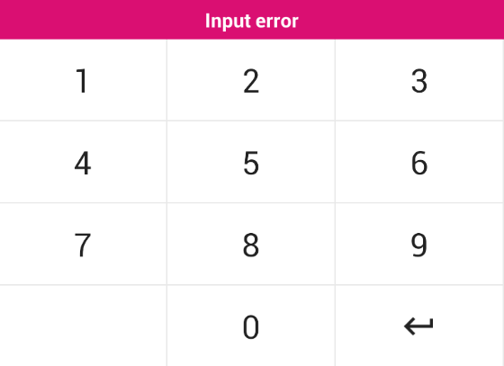
The <PinKeyboard /> also has a throwError(message) method. This will create a popup above the
keyboard displaying the given error message. The style of the popup can be customized through props.
PinInput

The PIN input circles can be used separately if you do not want to use the plug
and play <PinScreen /> component. They come with a shake animation and configurable
device vibration.
Import:
import { PinInput } from 'react-native-awesome-pin';
Then add it to your code:
<PinInput
    onRef={ref => (this.pins = ref)}
    numberOfPins={5}
    numberOfPinsActive={2}
/>
The <PinInput /> has a shake() method which can be called through the reference this.pins.shake().
This will perform a shake animation and vibration if enabled. A callback can be passed through props which
will be fired when the animation is complete. See props below.
Props
PinScreen
The <PinScreen /> is a great plug and play solution for a PIN screen.
| Prop | Type | Optional | Default | Description |
|---|
| onRef | string | No | | onRef allows you to call the throwError(message) method. |
| keyDown | string | No | | Callback function triggered when a key is pressed. Returns the current PIN value. |
| tagline | string | Yes | 'Enter your PIN' | Tagline which sits above the PINS. |
| logo | object | Yes | | Logo to place at top of screen. |
| numberOfPins | number | Yes | 5 | Number of pins to render. |
| keyVibration | bool | Yes | true | Should vibration be enabled for key press. |
| shakeVibration | bool | Yes | true | Should vibration be enabled for shake. |
| headerBackgroundColor | string | Yes | #e2e2e2 | Header colour for the SafeAreaView. |
| footerBackgroundColor | string | Yes | #fff | Footer colour for the SafeAreaView. |
| ItemFooter | element | Yes | | A footer component to render below the PinScreen. |
| containerStyle | object | Yes | See PinScreen.js | Style applied to the container. Background colour can be set here. |
| logoStyle | object | Yes | | Style applied to your logo. |
| taglineStyle | object | Yes | See PinScreen.js | Style applied to the tagline. |
| pinContainerStyle | object | Yes | See PinInput.js | Style applied to PINS container. |
| pinStyle | object | Yes | See PinInput.js | Style applied to each circle PIN. |
| pinActiveStyle | object | Yes | See PinInput.js | Style applied to each circle PIN when it is active. |
| keyboardStyle | object | Yes | See PinKeyboard.js | Style applied to the keyboard. |
| keyboardDisabledStyle | object | Yes | See PinKeyboard.js | Style applied when the keyboard is disabled. |
| keyStyle | object | Yes | See PinKeyboard.js | Style applied to each key on the keyboard. |
| keyTextStyle | object | Yes | See PinKeyboard.js | Style applied to the text inside each key. |
| keyImageStyle | object | Yes | See PinKeyboard.js | Style applied to image in a key. If an image is passed. |
| errorStyle | object | Yes | See PinKeyboard.js | Style applied to popup error. Can set the background colour here. |
| errorTextStyle | object | Yes | See PinKeyboard.js | Style applied to the text inside the popup error. |
PinKeyboard
The <PinKeyboard /> uses two arrays to allow you to set keys and define custom functions for each key. This is not the most fine-tune solution and will be upgraded
in the future.
| Prop | Type | Optional | Default | Description |
|---|
| onRef | string | No | | onRef allows you to call the throwError(message) method. |
| keyDown | string | No | | Callback function triggered when a key is pressed. Returns the key value. |
| keyboard | array | Yes | See PinKeyboard.js | 4 x 3 matrix containing the value for each key. Image or text. |
| keyboardFunc | array | Yes | See PinKeyboard.js | 4 x 3 matrix containing custom functions for each key. Pass null for no function. |
| keyboardStyle | object | Yes | See PinKeyboard.js | Style applied to the keyboard. |
| keyboardDisabledStyle | object | Yes | See PinKeyboard.js | Style applied when the keyboard is disabled. |
| keyStyle | object | Yes | See PinKeyboard.js | Style applied to each key on the keyboard. |
| keyTextStyle | object | Yes | See PinKeyboard.js | Style applied to the text inside each key. |
| keyImageStyle | object | Yes | See PinKeyboard.js | Style applied to image in a key. If an image is passed. |
| errorStyle | object | Yes | See PinKeyboard.js | Style applied to popup error. Can set the background colour here. |
| errorTextStyle | object | Yes | See PinKeyboard.js | Style applied to the text inside the popup error. |
PinScreen
| Prop | Type | Optional | Default | Description |
|---|
| onRef | string | No | | onRef allows you to call the throwError(message) method. |
| numberOfPins | number | Yes | 5 | Number of pins to render. |
| numberOfPinsActive | number | Yes | 0 | Number of active pins. You can pass the pin.length here. |
| vibration | bool | Yes | true | Should vibration be enabled. |
| animationShakeCallback | func | Yes | | 4 x 3 matrix containing custom functions for each key. Pass null for no function. |
| containerStyle | object | Yes | See PinInput.js | Style applied to PINS container. |
| pinStyle | object | Yes | See PinInput.js | Style applied to each circle PIN. |
| pinActiveStyle | object | Yes | See PinInput.js | Style applied to each circle PIN when it is active. |
Contributing
If you want to issue a PR, go ahead ;)
Authors
License
This project is licensed under the MIT License


