
Security News
Cloudflare Adds Security.txt Setup Wizard
Cloudflare has launched a setup wizard allowing users to easily create and manage a security.txt file for vulnerability disclosure on their websites.
By Sarah Gooding - Sep 30, 2024
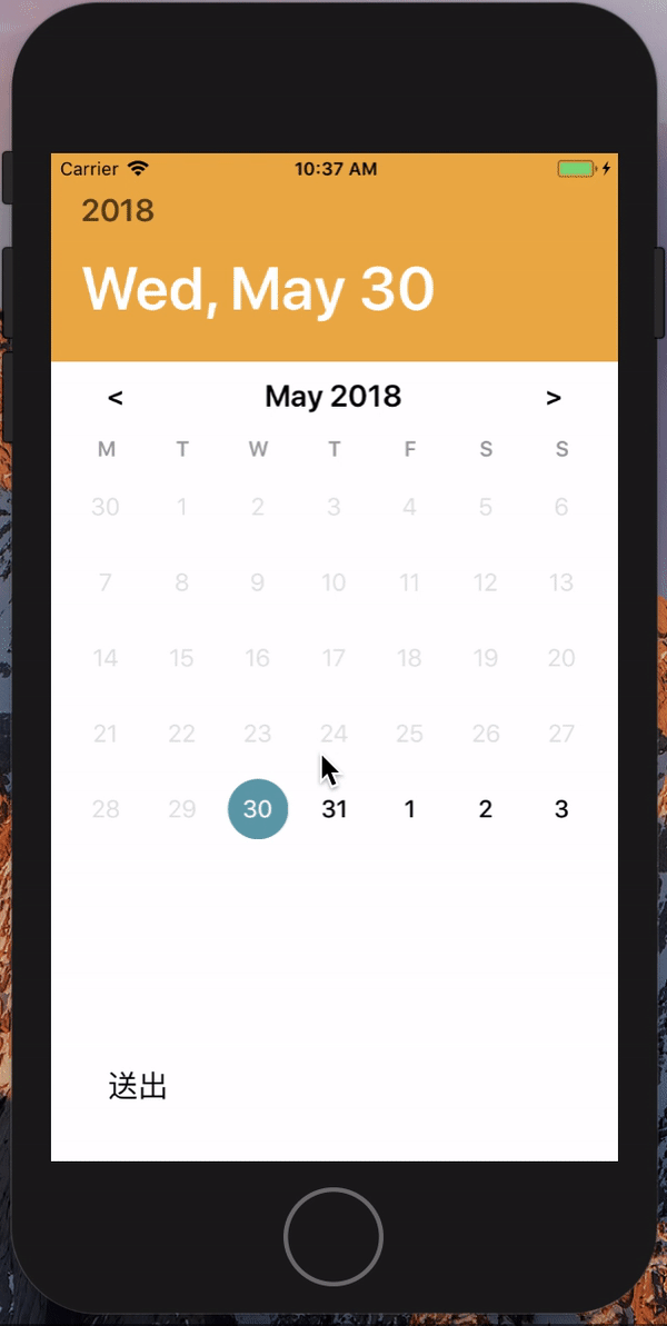
react-native-date-ranges
Advanced tools
$ npm install react-native-date-ranges --save
import DatePicker from 'react-native-date-ranges';

//range picker
<DatePicker
	style={ { width: 350, height: 45 } }
	customStyles = { {
		placeholderText:{ fontSize:20 } // placeHolder style
		headerStyle : {  },			// title container style
		headerMarkTitle : { }, // title mark style
		headerDateTitle: { }, // title Date style
		contentInput: {}, //content text container style
		contentText: {}, //after selected text Style
	} } // optional
	centerAlign // optional text will align center or not
	allowFontScaling = {false} // optional
	placeholder={'Apr 27, 2018 → Jul 10, 2018'}
	mode={'range'}
/>

//single picker
<DatePicker
	style={ { width: 350, height: 45 } }
	customStyles = { {
		placeholderText:{ fontSize:20 }, // placeHolder style
		headerStyle : {  },			// title container style
		headerMarkTitle : { }, // title mark style
		headerDateTitle: { }, // title Date style
		contentInput: {}, //content text container style
		contentText: {}, //after selected text Style
	} } // optional
	centerAlign // optional text will align center or not
	allowFontScaling = {false} // optional
	placeholder={'Apr 27, 2018'}
	selectedBgColor="black"
	selectedTextColor="blue"
/>
| Prop | Type | Description |
|---|---|---|
placeholder | String | optional. |
customStyles | Object | optional. customize style e.g.({ placeholderText:{}, headerStyle:{} ... }) |
style | Object | Optional. date picker's style |
onConfirm | Function | Optional. call function after click button, that would return a date object {startDate:'', endDate:''} e.g( value=>console.log(value)) |
selectedBgColor | String | Optional. custom your selected date background color e.g {"black"} |
selectedTextColor | String | Optional. custom your selected date text color e.g {"black"} |
ButtonStyle | Object | Optional. custom your save button container style |
ButtonTextStyle | Object | Optional. custom your save button Text style |
returnFormat | String | Optional. custom your datetime format e.g.('YYYY/MM/DD') at onConfirm |
headFormat | String | Optional. custom your datetime format showing at headBlock e.g.('YYYY/MM/DD') |
outFormat | String | Optional. custom your datetime format showing at outline touchable filed e.g.('YYYY/MM/DD') |
mode | String | one of ['range', 'single'] , default as single |
| .... |
FAQs
[](https://www.npmjs.com/package/react-native-date-ranges) [](https://
The npm package react-native-date-ranges receives a total of 435 weekly downloads. As such, react-native-date-ranges popularity was classified as not popular.
We found that react-native-date-ranges demonstrated a not healthy version release cadence and project activity because the last version was released a year ago. It has 1 open source maintainer collaborating on the project.
Did you know?

Socket for GitHub automatically highlights issues in each pull request and monitors the health of all your open source dependencies. Discover the contents of your packages and block harmful activity before you install or update your dependencies.
Security News
Cloudflare has launched a setup wizard allowing users to easily create and manage a security.txt file for vulnerability disclosure on their websites.

Security News
The Socket Research team breaks down a malicious npm package targeting the legitimate DOMPurify library. It uses obfuscated code to hide that it is exfiltrating browser and crypto wallet data.

Security News
ENISA’s 2024 report highlights the EU’s top cybersecurity threats, including rising DDoS attacks, ransomware, supply chain vulnerabilities, and weaponized AI.