react-native-floating-action
Floating action button for React Native
Expo example
Open the following click on your phone: Expo link
or user your phone and scan the following QR:

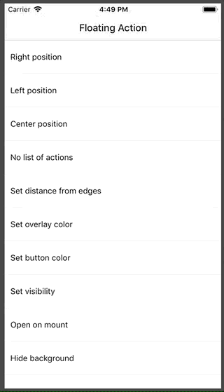
Example of how Expo looks
Installation
npm i react-native-floating-action --save
or
yarn add react-native-floating-action
Example
Take a look into example/ReactNativeFloatingAction-Expo
To execute the example using Expo run the following command:
yarn run run:example
or open Expo link from your mobile
How to use it
First step: import the component:
import { FloatingAction } from 'react-native-floating-action';
Second step: define the buttons
  const actions = [{
    text: 'Accessibility',
    icon: require('./images/ic_accessibility_white.png'),
    name: 'bt_accessibility',
    position: 2
  }, {
    text: 'Language',
    icon: require('./images/ic_language_white.png'),
    name: 'bt_language',
    position: 1
  }, {
    text: 'Location',
    icon: require('./images/ic_room_white.png'),
    name: 'bt_room',
    position: 3
  }, {
    text: 'Video',
    icon: require('./images/ic_videocam_white.png'),
    name: 'bt_videocam',
    position: 4
  }];
Third step: use it
    <View style={styles.container}>
      <Text style={styles.example}>
        Floating Action example
      </Text>
      <FloatingAction
        actions={actions}
        onPressItem={
          (name) => {
            console.log(`selected button: ${name}`);
          }
        }
      />
    </View>
Open and hide it programatically
There are some cases where you want to show or hide the component without pressing the main button:
<FloatingAction
  ref={(ref) => { this.floatingAction = ref; }}
  actions={[...]}
  ...
/>
and then:
this.floatingAction.animateButton();
Configuration
FloatingAction
| Property | Type | Default | Description |
|---|
| actions | array | [] | Actions to be show once user press the main button |
| color | string | #1253bc | Color of the main button |
| distanceToEdge | number | 30 | Distance from button to edge |
| visible | boolean | true | Hide or Show the component using an animation |
| overlayColor | string | rgba(68, 68, 68, 0.6) | Color of the background overlay |
| position | string | right | Position to render the main button and actions, options: (left, right, center) |
| overrideWithAction | string | false | Override the main action with the first action inside list actions, will not show other action |
| floatingIcon | node | ReactElement | |
| showBackground | boolean | true | Show or Hide background after open it |
| openOnMount | boolean | false | Open component after mounting it, useful on some weird cases like tutorials |
| actionsPaddingTopBottom | number | 8 | Change distance between actions |
| onPressItem | function | | Function to be call as soon as the user select an option from actions. Will return the name of the action. |
| onPressMain | function | | Function to be call as soon as use click main button and will return true or false depeneding of the state. |
Actions
| Property | Type | Default | Description |
|---|
| color | string | #1253bc | Color of the action button |
| icon | any | | Icon to be rendered inside the action, will accept an URL or React.Image. If we want to send an URL we need to send it in this way: icon: { uri: 'https://imageurl.com' } if we want to send a React.Image we will use it in this way: icon: require('path/image') |
| name | string | | Name of the icon, this name is used as parameter for onPressItem action |
| text | string | | Text to show near to the button. (Only apply for position = ['left', 'right']) |
| textBackground | string | #ffffff | Background color for Text container |
| textColor | string | #444444 | Text color for every action |
| textElevation | number | 5 | Elevation property (only android) |
TODO


