
Security News
Maven Central Adds Sigstore Signature Validation
Maven Central now validates Sigstore signatures, making it easier for developers to verify the provenance of Java packages.
By Sarah Gooding - Feb 06, 2025
react-native-floating-label-inputs
Advanced tools
This is a fully customizable React Native package, and its props extend from React-native textinput props. If your label floats in the text input while focusing or blurring, this is the perfect package for you, with multiple examples to meet your needs. 💅🎉
npm i react-native-floating-label-inputs
or using yarn
yarn add react-native-floating-label-inputs

| Prop | Type | Default | Description |
|---|---|---|---|
label | string | "" | label of the input field |
Icon | JSX.Element | Undefined | Left icon should be supported by the app. |
floatUpRange | number | 25 | Set the float up Range. if you provide negative number floats down |
rightIcon | JSX.Element | Undefined | Add right side component, it can be an icon. and should be supported by the up. |
inputStyle | ViewStyle | {} | Set the input style which means the style of the input texts. |
labelStyle | TextStyle | {} | Set the label style for the floating label component. |
labelColor | String | '#111' | Set the lable color. |
containerStyle | ViewStyle | {} | Set styles to the input container component. |
error | string or boolean | '' | Set your error message.if error message is passed the border and the label turns red. |
import {View, Text} from 'react-native';
import React, {useState} from 'react';
import FloatingLabelTextInput from 'react-native-floating-label-inputs';
// @ts-ignore
import Icon from 'react-native-vector-icons/EvilIcons';

export default function CommonExample() {
return (
<FloatingLabelTextInput
label="Name"
onChangeText={text => console.log(text)}
/>
);
}
floatUpRange is a prop that gives floating range starting from zero. You should assign the appropriate number depending on your container height. the default value given is 25 but depending on your input container height it may vary.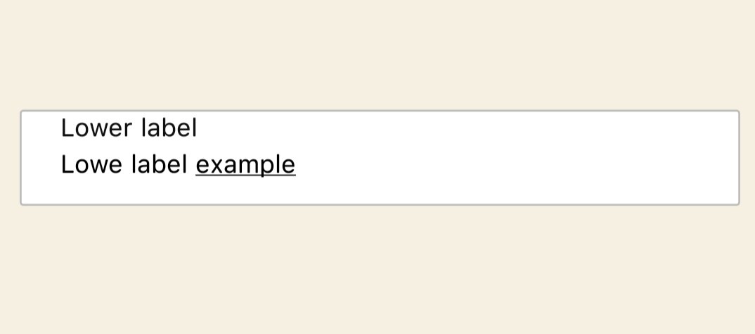
import {View, Text} from 'react-native';
import React from 'react';
import FloatingLabelTextInput from 'react-native-floating-label-inputs';

export default function LoweFloatUpRange() {
  return (
    <FloatingLabelTextInput
      label="Lower label"
      containerStyle={{height: 50}}
      floatUpRange={16}
      inputStyle={{marginTop: 5}}
      error="This field is required"
    />
  );
}
containerStyle is responsible for the container that holds the text field. inputStyle is a style given to the texts that are typed by the user. labelStyle responsible for styling the lable and lableColor is color of the label.
import {View, Text} from 'react-native';
import React from 'react';
import FloatingLabelTextInput from 'react-native-floating-label-inputs';

export default function ColoredExample() {
return (
<FloatingLabelTextInput
label="password"
containerStyle={{backgroundColor: '#111'}}
labelStyle={{backgroundColor: '#111'}}
labelColor="#fff"
inputStyle={{color: '#fff'}}
/>
);
}
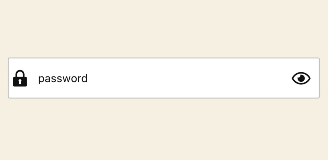
Set an icon both to the right side (The first icon, which is displayed on the right side of the input field) and left side (The second icon, which is displayed on the left side of the input field)
import React, {useState} from 'react';
import FloatingLabelTextInput from 'react-native-floating-label-inputs';
//@ts-ignore
import FontisoIcon from 'react-native-vector-icons/Fontisto';
import FontAwesome5Icon from 'react-native-vector-icons/FontAwesome5';
function WithIcon() {
  const [showPassword, setShowPassword] = useState<boolean>(true);
  return (
    <FloatingLabelTextInput
      label="password"
      icon={
        <FontisoIcon
          name="locked"
          color="#111"
          size={20}
          onPress={() => console.log('Icon pressed')}
        />
      }
      rightIcon={
        !showPassword ? (
          <FontAwesome5Icon
            name="eye"
            color="#111"
            size={20}
            onPress={() => setShowPassword((s: boolean) => !s)}
          />
        ) : (
          <FontAwesome5Icon
            name="eye-slash"
            color="#111"
            size={20}
            onPress={() => setShowPassword((s: boolean) => !s)}
          />
        )
      }
      secureTextEntry={showPassword}
    />
  );
}

export default WithIcon;
A floating label for your TextArea field that can accept multiple lines of text. The label will float up a certain range (specified by the "floatUpRange" prop) as the user types. The "containerStyle" prop that sets the height of the container element, and an "inputStyle" prop that sets the height of the input field itself.

import React from 'react';
import FloatingLabelTextInput from 'react-native-floating-label-inputs';

export default function TextAreaExample() {
 return (
   <FloatingLabelTextInput
     label="Description"
     floatUpRange={50}
     containerStyle={{height: 100}}
     inputStyle={{height: 100}}
     multiline={true}
   />
 );
}
import React, {useState} from 'react';
import FloatingLabelTextInput from 'react-native-floating-label-inputs';
import FontAwesome5Icon from 'react-native-vector-icons/FontAwesome5';
import FontisoIcon from 'react-native-vector-icons/Fontisto';
export default function BorderBottomWithIcon() {
const [showPassword, setShowPassword] = useState<boolean>(true);
return (
<FloatingLabelTextInput
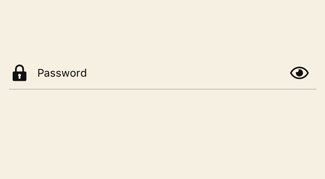
label="Password"
containerStyle={{
borderWidth: 0,
backgroundColor: '#f5f0e1',
borderBottomWidth: 1,
height: 40,
}}
labelStyle={{backgroundColor: '#f5f0e1'}}
floatUpRange={16}
icon={
<FontisoIcon
name="locked"
color="#111"
size={20}
onPress={() => console.log('Icon pressed')}
/>
}
rightIcon={
!showPassword ? (
<FontAwesome5Icon
name="eye"
color="#111"
size={20}
onPress={() => setShowPassword((s: boolean) => !s)}
/>
) : (
<FontAwesome5Icon
name="eye-slash"
color="#111"
size={20}
onPress={() => setShowPassword((s: boolean) => !s)}
/>
)
}
secureTextEntry={showPassword}
/>
);
}
👤 Dagmawi Zewdu
👤 Sentayhu Berhanu
If you have a suggestion that would make this better, please fork the repo and create a pull request. You can also simply open an issue with the tag "enhancement". Don't forget to give the project a star! Thanks again!
git checkout -b feature/AmazingFeature)git commit -m 'Add some AmazingFeature')git push origin feature/AmazingFeature)FAQs
## About The Package
The npm package react-native-floating-label-inputs receives a total of 0 weekly downloads. As such, react-native-floating-label-inputs popularity was classified as not popular.
We found that react-native-floating-label-inputs demonstrated a not healthy version release cadence and project activity because the last version was released a year ago. It has 1 open source maintainer collaborating on the project.
Did you know?

Socket for GitHub automatically highlights issues in each pull request and monitors the health of all your open source dependencies. Discover the contents of your packages and block harmful activity before you install or update your dependencies.
Security News
Maven Central now validates Sigstore signatures, making it easier for developers to verify the provenance of Java packages.

Security News
CISOs are racing to adopt AI for cybersecurity, but hurdles in budgets and governance may leave some falling behind in the fight against cyber threats.

Research
Security News
Socket researchers uncovered a backdoored typosquat of BoltDB in the Go ecosystem, exploiting Go Module Proxy caching to persist undetected for years.