An easy and simple to use React Native component to render a high performant and easily customizable image gallery with common gestures like pan, pinch and double tap. Supporting both iOS and Android. Free and made possible along with costly maintenance and updates by Lue Hang (the author).

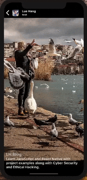
Learn more about React Native with project examples along with Cyber Security and Ethical Hacking at LH BLOG.
Index
Improved and changed on top of react-native-gallery.
Install
Type in the following to the command line to install the dependency.
$ npm install --save react-native-gallery-swiper
or
$ yarn add react-native-gallery-swiper
Usage Example
Add an import to the top of the file. At minimal, declare the GallerySwiper component in the render() method providing an array of data for the images prop.
Local images must have a defined dimensions field with width and height.
import GallerySwiper from "react-native-gallery-swiper";
render() {
return (
<GallerySwiper
style={{ flex: 1, backgroundColor: "black" }}
images={[
// Version *1.1.0 update (or greater versions):
// Can be used with different image object fieldnames.
// Ex. source, source.uri, uri, URI, url, URL
{ uri: "https://luehangs.site/pic-chat-app-images/beautiful-blond-blonde-hair-478544.jpg" },
{ source: require("yourApp/image.png"),
// IMPORTANT: It is REQUIRED for LOCAL IMAGES
// to include a dimensions field with the
// actual width and height of the image or
// it will throw an error.
dimensions: { width: 1080, height: 1920 } },
{ source: { uri: "https://luehangs.site/pic-chat-app-images/beautiful-beautiful-women-beauty-40901.jpg" } },
{ uri: "https://luehangs.site/pic-chat-app-images/animals-avian-beach-760984.jpg",
// Optional: Adding a dimensions field with
// the actual width and height for REMOTE IMAGES
// will help improve performance.
dimensions: { width: 1080, height: 1920 } },
{ URI: "https://luehangs.site/pic-chat-app-images/beautiful-blond-fishnet-stockings-48134.jpg" },
{ url: "https://luehangs.site/pic-chat-app-images/beautiful-beautiful-woman-beauty-9763.jpg" },
{ URL: "https://luehangs.site/pic-chat-app-images/attractive-balance-beautiful-186263.jpg" },
]}
/>
);
}
API
<GallerySwiper /> component accepts the following props...
Props
| Props | Description | Type | Default |
|---|
images | An array of objects. source, source.uri, uri, URI, url or URL is a required field (if multiple similar fields in an image object, priority will go from start source to last URL). EX. [{ source: require("yourApp/image.png"), dimensions: { width: 1080, height: 1920 } }, { uri: "https://luehangs.site/pic-chat-app-images/animals-avian-beach-760984.jpg", dimensions: { width: 1080, height: 1920 } }, { uri: "https://luehangs.site/pic-chat-app-images/beautiful-blond-blonde-hair-478544.jpg"}] | Array | Required |
initialPage | Index of image to be displayed first. | number | 0 |
imageComponent | Custom function to render your images. (imageProps: { imageLoaded: Boolean, source: object, image: object, style: Array<object>, resizeMode: string, capInsets: object, onLoadStart: Function, onLoad: Function, ...extras }, imageDimensions: {width: number, height: number}, index: number) => React.Element index params included in Version ^1.3.1 update | Function | <Image/> component |
errorComponent | Custom function to render the page of an image that couldn't be displayed. | Function | A <View/> with a stylized error |
initialNumToRender | How many items to render in the initial batch. Version ^1.3.0 update. | number | |
flatListProps | Props to be passed to the underlying FlatList. | Object | {windowSize: 3} |
pageMargin | Blank margin space to show between images. | number | 0 |
sensitiveScroll | Whether to enable an intelligent detection to detect rough and fast swiping gestures in order to "cushion" or slow down a swipe at the end. Version ^1.4.0 update. | Boolean | true |
onPageSelected | Fired with the index of page that has been selected. | Function | |
onPageScrollStateChanged | Called when page scrolling state has changed, see scroll state and events. | Function | |
onPageScroll | Scroll event, see scroll state and events. | Function | |
scrollViewStyle | Custom style for the FlatList component. | Object | {} |
onSingleTapConfirmed | Executed after a single tap. | Function | |
onLongPress | Executed after a long press. | Function | |
refPage | The ref for the inner View page. Version ^1.2.0 update. Learn more about this at the helpful hints section | Function | |
Scroll state and events
-
onPageScroll(event: { position: number, offset: number, fraction: number }) => void
The event object carries following data:
position: number: index of first page from the left that is currently visible.offset: number: value from range [0,1) describing stage between page transitions.fraction: number: means that (1 - x) fraction of the page at "position" index is visible, and x fraction of the next page is visible.
-
onPageScrollStateChanged(state: string) => void
Called when the page scrolling state has changed. The page scrolling state can be in 3 states:
'idle': string: there is no interaction with the page scroller happening at the time.'dragging': string: there is currently an interaction with the page scroller.'settling': string: there was an interaction with the page scroller, and the page scroller is now finishing its closing or opening animation.
Helpful Hints
Version ^1.2.0 update (or greater versions): refPage prop
| Props | Description | Type | Default |
|---|
refPage | The ref for the inner View Page. | Function | |
Below is an example implementation of the refPage which works like a React ref.
import GallerySwiper from "react-native-gallery-swiper";
render() {
return (
<GallerySwiper
style={{ flex: 1, backgroundColor: "black" }}
refPage={(component) => (this.gallerySwiper = component)}
images={[
{ uri: "https://luehangs.site/pic-chat-app-images/beautiful-blond-blonde-hair-478544.jpg" },
{ source: require("yourApp/image.png"),
dimensions: { width: 1080, height: 1920 } },
{ source: { uri: "https://luehangs.site/pic-chat-app-images/beautiful-beautiful-women-beauty-40901.jpg" } },
{ uri: "https://luehangs.site/pic-chat-app-images/animals-avian-beach-760984.jpg",
dimensions: { width: 1080, height: 1920 } },
{ URI: "https://luehangs.site/pic-chat-app-images/beautiful-blond-fishnet-stockings-48134.jpg" },
{ url: "https://luehangs.site/pic-chat-app-images/beautiful-beautiful-woman-beauty-9763.jpg" },
{ URL: "https://luehangs.site/pic-chat-app-images/attractive-balance-beautiful-186263.jpg" },
]}
/>
);
}
Some Useful Functions
After implementing the refPage={(component) => (this.gallerySwiper = component)} property to the <GallerySwiper /> component.
-
this.gallerySwiper.flingToPage(index: number, velocityX: number)
This Function executes a "fling" to a page:
index: number: The required index of desired page.velocityX: number: The required velocity X and should be above > 0.00.
-
this.gallerySwiper.scrollToPage(index: number, immediate: Boolean)
This Function executes a "scroll" to a page:
index: number: The required index of desired page.immediate: Boolean: Whether to go to page immediately without animation or not. Default is false.
Example Project
Perform steps 1-2 to run locally:
- Clone the Repo
- Install and Run
1. Clone the Repo
Clone react-native-gallery-swiper locally. In a terminal, run:
$ git clone https://github.com/Luehang/react-native-gallery-swiper.git react-native-gallery-swiper
2. Install and Run
$ cd react-native-gallery-swiper/example/
iOS - Mac - Install & Run
1. check out the code
2. npm install
3. npm run ios
Android - Mac - Install & Run
1. check out the code
2. npm install
3. emulator running in separate terminal
4. npm run android
Author

Free and made possible along with costly maintenance and updates by Lue Hang (the author).
Contribute
Pull requests are welcomed.
Beginners
Not sure where to start, or a beginner? Take a look at the issues page.
Contributors
Contributors will be posted here.
License
MIT © Lue Hang, as found in the LICENSE file.


