Research
Security News
Malicious npm Packages Inject SSH Backdoors via Typosquatted Libraries
Socket’s threat research team has detected six malicious npm packages typosquatting popular libraries to insert SSH backdoors.
react-native-gifted-chat
Advanced tools
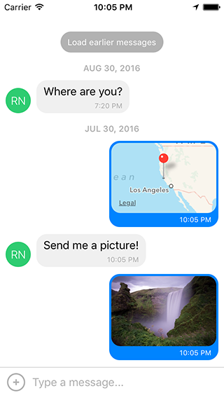
The most complete chat UI for React Native (formerly known as Gifted Messenger).


0.2.x for RN >= 0.44.00.1.x for RN >= 0.40.00.0.10 for RN < 0.40.0import { GiftedChat } from 'react-native-gifted-chat';
class Example extends React.Component {
state = {
messages: [],
};
componentWillMount() {
this.setState({
messages: [
{
_id: 1,
text: 'Hello developer',
createdAt: new Date(),
user: {
_id: 2,
name: 'React Native',
avatar: 'https://facebook.github.io/react/img/logo_og.png',
},
},
],
});
}
onSend(messages = []) {
this.setState((previousState) => ({
messages: GiftedChat.append(previousState.messages, messages),
}));
}
render() {
return (
<GiftedChat
messages={this.state.messages}
onSend={(messages) => this.onSend(messages)}
user={{
_id: 1,
}}
/>
);
}
}
See example/App.js for a working demo!
e.g.
{
  _id: 1,
  text: 'My message',
  createdAt: new Date(Date.UTC(2016, 5, 11, 17, 20, 0)),
  user: {
    _id: 2,
    name: 'React Native',
    avatar: 'https://facebook.github.io/react/img/logo_og.png',
  },
  image: 'https://facebook.github.io/react/img/logo_og.png',
  // Any additional custom parameters are passed through
}
messages (Array) - Messages to displaymessageIdGenerator (Function) - Generate an id for new messages. Defaults to UUID v4, generated by uuiduser (Object) - User sending the messages: { _id, name, avatar }onSend (Function) - Callback when sending a messagelocale (String) - Locale to localize the datesisAnimated (Bool) - Animates the view when the keyboard appearsloadEarlier (Bool) - Enables the "Load earlier messages" buttononLoadEarlier (Function) - Callback when loading earlier messagesisLoadingEarlier (Bool) - Display an ActivityIndicator when loading earlier messagesrenderLoading (Function) - Render a loading view when initializingrenderLoadEarlier (Function) - Custom "Load earlier messages" buttonrenderAvatar (Function) - Custom message avatar; set to null to not render any avatar for the messageonPressAvatar (Function(user)) - Callback when a message avatar is tappedrenderAvatarOnTop (Bool) - Render the message avatar at the top of consecutive messages, rather than the bottom (default)renderBubble (Function) - Custom message bubbleonLongPress (Function(context, message)) - Callback when a message bubble is long-pressed; default is to show an ActionSheet with "Copy Text" (see example using showActionSheetWithOptions())renderMessage (Function) - Custom message containerrenderMessageText (Function) - Custom message textrenderMessageImage (Function) - Custom message imageimageProps (Object) - Extra props to be passed to the <Image> component created by the default renderMessageImagelightboxProps (Object) - Extra props to be passed to the MessageImage's LightboxrenderCustomView (Function) - Custom view inside the bubblerenderDay (Function) - Custom day above a messagerenderTime (Function) - Custom time inside a messagerenderFooter (Function) - Custom fixed bottom view, e.g. "User is typing..."; see example/App.js for an examplerenderInputToolbar (Function) - Custom message composer containerrenderComposer (Function) - Custom text input message composerrenderActions (Function) - Custom action button on the left of the message composerrenderSend (Function) - Custom send buttonrenderAccessory (Function) - Custom second line of actions below the message composeronPressActionButton (Function) - Callback when the Action button is pressed (if set, the default actionSheet will not be used)bottomOffset (Integer) - Distance of the chat from the bottom of the screen (e.g. useful if you display a tab bar)minInputToolbarHeight (Integer) - Minimum height of the input toolbar; default is 44listViewProps (Object) - Extra props to be passed to the messages <ListView>; some props can't be overridden, see the code in MessageContainer.render() for detailskeyboardShouldPersistTaps (Enum) - Determines whether the keyboard should stay visible after a tap; see <ScrollView> docsonInputTextChanged (Function) - Callback when the input text changesmaxInputLength (Integer) - Max message composer TextInput lengthMake sure you have android:windowSoftInputMode="adjustResize" in your AndroidManifest.xml:
<activity
  android:name=".MainActivity"
  android:label="@string/app_name"
  android:windowSoftInputMode="adjustResize"
  android:configChanges="keyboard|keyboardHidden|orientation|screenSize">
If you plan to use GiftedChat inside a Modal, see #200.
Feel free to ask me questions on Twitter @FaridSafi!
FAQs
The most complete chat UI for React Native
The npm package react-native-gifted-chat receives a total of 39,587 weekly downloads. As such, react-native-gifted-chat popularity was classified as popular.
We found that react-native-gifted-chat demonstrated a healthy version release cadence and project activity because the last version was released less than a year ago. It has 0 open source maintainers collaborating on the project.
Did you know?

Socket for GitHub automatically highlights issues in each pull request and monitors the health of all your open source dependencies. Discover the contents of your packages and block harmful activity before you install or update your dependencies.

Research
Security News
Socket’s threat research team has detected six malicious npm packages typosquatting popular libraries to insert SSH backdoors.

Security News
MITRE's 2024 CWE Top 25 highlights critical software vulnerabilities like XSS, SQL Injection, and CSRF, reflecting shifts due to a refined ranking methodology.

Security News
In this segment of the Risky Business podcast, Feross Aboukhadijeh and Patrick Gray discuss the challenges of tracking malware discovered in open source softare.