Security News
Fluent Assertions Faces Backlash After Abandoning Open Source Licensing
Fluent Assertions is facing backlash after dropping the Apache license for a commercial model, leaving users blindsided and questioning contributor rights.
react-native-indicator
Advanced tools
A useful indicator component for React Native


Make sure that you are in your React Native project directory and run:
$ npm install react-native-indicator --save
$ npm install @react-native-community/art --save
For react-native >= 0.60 ReactNativeART should be auto-linked and no additional action is required.
For react-native < 0.60 you need to link ReactNative ART:
$ react-native link @react-native-community/art
More info, following the Art module instruction to configure.
Import react-native-indicator as a JavaScript module:
import { CirclesLoader, PulseLoader, TextLoader, DotsLoader, ... } from 'react-native-indicator';
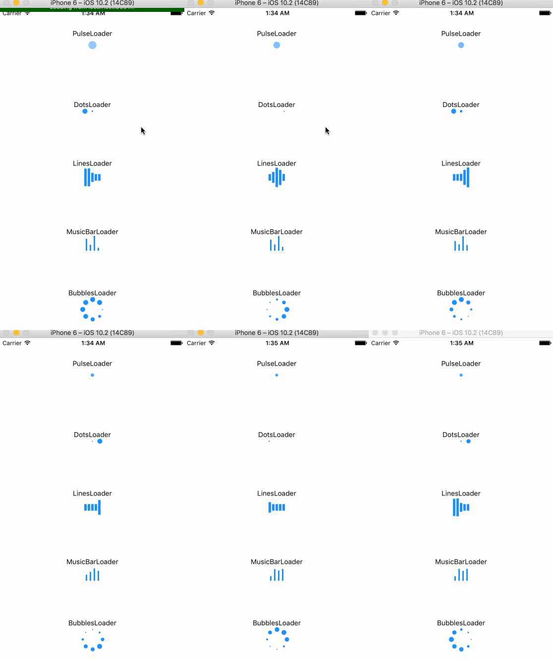
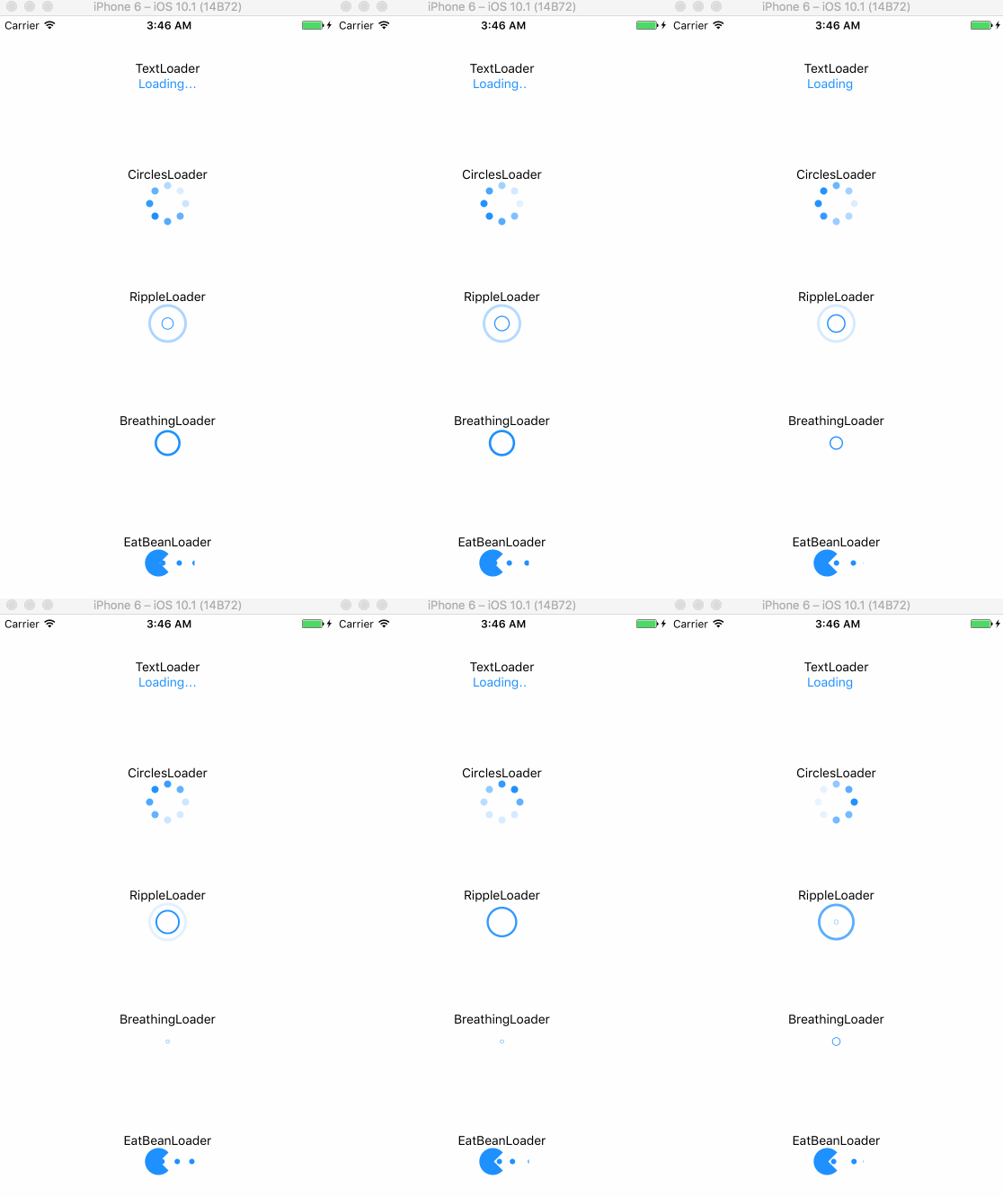
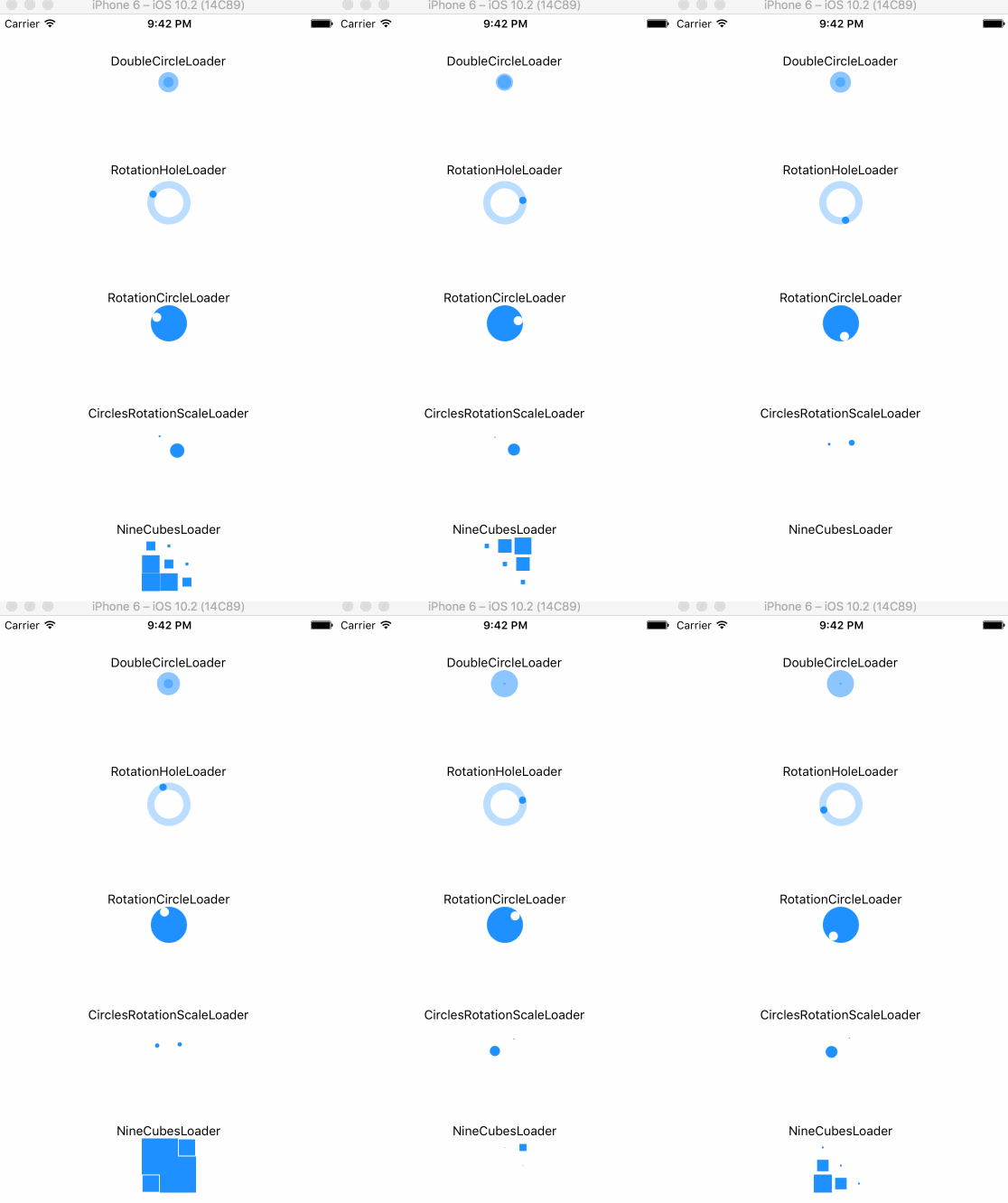
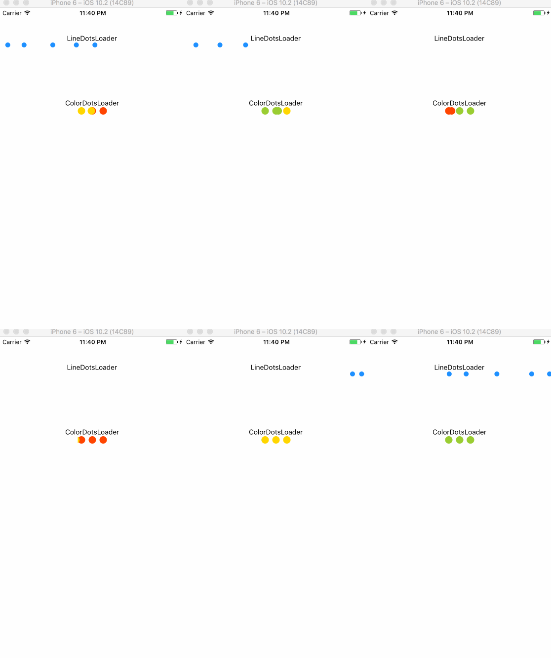
Here is currently available types:
render(){
  return(
    <View>
      <CirclesLoader />
      <TextLoader text="Loading" />
    </View>
  );
}
| prop | type | default | description |
|---|---|---|---|
| size | number | 30 | circle's size |
| color | string | '#1e90ff' | indicator's color |
| frequency | number | 1000 | scale's frequency |
| prop | type | default | description |
|---|---|---|---|
| size | number | 10 | dot's size |
| color | string | '#1e90ff' | indicator's color |
| betweenSpace | number | 5 | distance between two dots |
| prop | type | default | description |
|---|---|---|---|
| text | string | 'Loading' | contents |
| textStyle | style | inherited | text's style |
| prop | type | default | description |
|---|---|---|---|
| size | number | 40 | circle's size |
| color | string | '#1e90ff' | indicator's color |
| dotRadius | number | 10 | each dot's size |
| prop | type | default | description |
|---|---|---|---|
| size | number | 40 | circle's size |
| color | string | '#1e90ff' | indicator's color |
| dotRadius | number | 8 | each dot's size |
| prop | type | default | description |
|---|---|---|---|
| size | number | 10 | circle's size |
| color | string | '#1e90ff' | indicator's color |
| strokeWidth | number | 3 | outline width |
| frequency | number | 800 | scale's frequency |
| prop | type | default | description |
|---|---|---|---|
| size | number | 10 | circle's size |
| frequency | number | 1600 | scale's frequency |
| color | string | '#1e90ff' | indicator's color |
| strokeWidth | number | 3 | outline width |
| prop | type | default | description |
|---|---|---|---|
| color | string | '#1e90ff' | indicator's color |
| barWidth | number | 5 | each bar's width |
| barHeight | number | 40 | each bar's height |
| barNumber | number | 5 | the number of bar |
| betweenSpace | number | 2 | distance between two bars |
| prop | type | default | description |
|---|---|---|---|
| color | string | '#1e90ff' | indicator's color |
| barWidth | number | 3 | each bar's width |
| barHeight | number | 30 | each bar's height |
| betweenSpace | number | 5 | distance between two bars |
| prop | type | default | description |
|---|---|---|---|
| color | string | '#1e90ff' | indicator's color |
| size | number | 30 | indicator's size |
| prop | type | default | description |
|---|---|---|---|
| size | number | 30 | circle's size |
| color | string | '#1e90ff' | indicator's color |
| prop | type | default | description |
|---|---|---|---|
| size | number | 30 | indicator's size |
| color | string | '#1e90ff' | indicator's color |
| rotationSpeed | number | 800 | rotation speed |
| prop | type | default | description |
|---|---|---|---|
| size | number | 40 | indicator's size |
| color | string | '#1e90ff' | indicator's color |
| rotationSpeed | number | 800 | rotation speed |
| strokeWidth | number | 8 | circle outline's width |
| prop | type | default | description |
|---|---|---|---|
| size | number | 50 | indicator's size |
| color | string | '#1e90ff' | indicator's color |
| prop | type | default | description |
|---|---|---|---|
| size | number | 20 | each cube's size |
| color | string | '#1e90ff' | indicator's color |
warning: this indicator will occupy a whole horizontal space automatically, which means you don't need to set any center props. Just keeping the direction of its parent View is vertical.
| prop | type | default | description |
|---|---|---|---|
| size | number | 10 | dot's size |
| color | string | '#1e90ff' | indicator's color |
| dotsNumber | number | 5 | the number of dots |
| betweenSpace | number | 5 | distance between two dots |
| prop | type | default | description |
|---|---|---|---|
| size | number | 15 | each cube's size |
| betweenSpace | number | 7 | distance between two dots |
| color1 | string | '#ff4500'(red) | 1st color |
| color2 | string | '#ffd700'(yellow) | 2nd color |
| color3 | string | '#9acd32'(green) | 3rd color |
| prop | type | default | description |
|---|---|---|---|
| size | number | 10 | dot's size |
| color | string | '#1e90ff' | indicator's color |
| betweenSpace | number | 5 | distance between two dots |
| speed | number | 200 | change speed |
MIT
FAQs
React Native Indicator Component
The npm package react-native-indicator receives a total of 448 weekly downloads. As such, react-native-indicator popularity was classified as not popular.
We found that react-native-indicator demonstrated a not healthy version release cadence and project activity because the last version was released a year ago. It has 1 open source maintainer collaborating on the project.
Did you know?

Socket for GitHub automatically highlights issues in each pull request and monitors the health of all your open source dependencies. Discover the contents of your packages and block harmful activity before you install or update your dependencies.

Security News
Fluent Assertions is facing backlash after dropping the Apache license for a commercial model, leaving users blindsided and questioning contributor rights.

Research
Security News
Socket researchers uncover the risks of a malicious Python package targeting Discord developers.

Security News
The UK is proposing a bold ban on ransomware payments by public entities to disrupt cybercrime, protect critical services, and lead global cybersecurity efforts.