Security News
pnpm 10.0.0 Blocks Lifecycle Scripts by Default
pnpm 10 blocks lifecycle scripts by default to improve security, addressing supply chain attack risks but sparking debate over compatibility and workflow changes.
react-native-material-ui
Advanced tools
Highly customizable material design components for React Native!
npm i react-native-material-ui --save
Copy the MaterialIcons font file from react-native-vector-icons to your local working directory:
./node_modules/react-native-vector-icons/Fonts/MaterialIcons.ttf -> ./android/app/src/main/assets/fonts.
To achieve the level of customizability, React Native Material UI is using a single JS object called uiTheme that is passed in via context. By default, this uiTheme object is based on the lightTheme that you can find here. So, you can change almost everything very easily.
The uiTheme object contains the following keys:
spacing: {} // can be used to change the spacing of components.
fontFamily: {} // can be used to change the default font family.
palette: {  // can be used to change the color of components.
    primaryColor: blue500,
    accentColor: red500,
    ...
}
typography: {} // can be used to change the typography of components
// you can change style of every each component
avatar: {}
button: {}
toolbar: {}
...
import React, { Component } from 'react';
import { Navigator, NativeModules } from 'react-native';

import { COLOR, ThemeProvider } from '../react-native-material-ui';

// you can set your style right here, it'll be propagated to application
const uiTheme = {
    palette: {
        primaryColor: COLOR.green500,
    },
    toolbar: {
        container: {
            height: 50,
        },
    },
};

class Main extends Component {
    render() {
        return (
            <ThemeProvider uiTheme={uiTheme}>
                <App />
            </ThemeProvider>
        );
    }
}
It means, if you want to change primary color of your application for example. You can just pass to ThemeProvider object with your own settings. Your settings will be merged with default theme.
Another great feature is, you can use the uiTheme everywhere. Even in your own components. So if you built your own implementation of Button for example, look how you can get the primary color.
import ...

const contextTypes = {
    uiTheme: PropTypes.object.isRequired,
};

class MyButton extends Component {
    render() {
	    // it's really easy to get primary color everywhere in your app
        const { primaryColor } = this.context.uiTheme.palette;

        return ...
    }
}

export ...
Of course, sometimes we need to change style of only one component. It means, all buttons have red background, but facebook login button that should have blue background. Every each component have style property. So you can very easily overide whatever you want.
<Button style={{ container: { backgroundColor: 'blue' }}} />
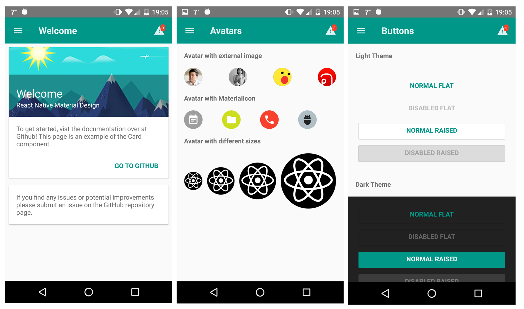
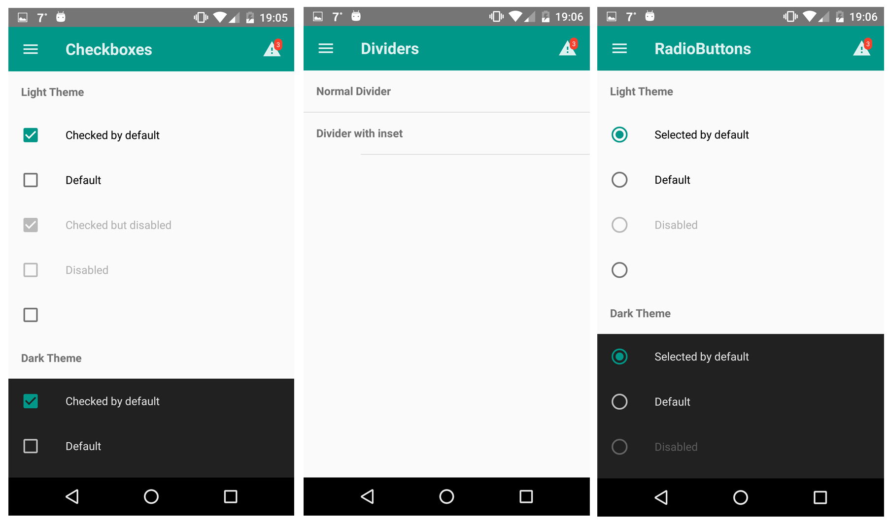
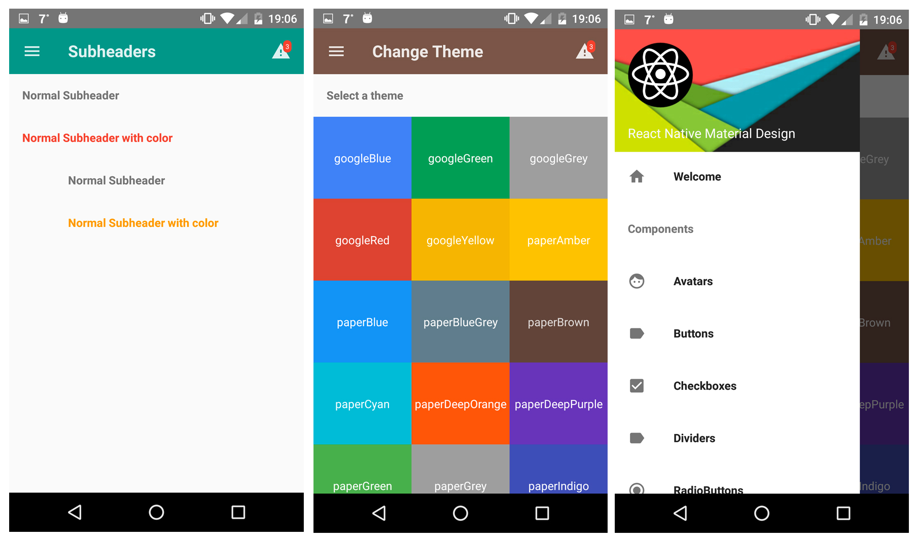
You can try our Demo App!


Here is a list of all component included in this library. (I'm working on documentation for every each component. Be patient please :))
FAQs
React Native Material Design Components
The npm package react-native-material-ui receives a total of 396 weekly downloads. As such, react-native-material-ui popularity was classified as not popular.
We found that react-native-material-ui demonstrated a not healthy version release cadence and project activity because the last version was released a year ago. It has 1 open source maintainer collaborating on the project.
Did you know?

Socket for GitHub automatically highlights issues in each pull request and monitors the health of all your open source dependencies. Discover the contents of your packages and block harmful activity before you install or update your dependencies.

Security News
pnpm 10 blocks lifecycle scripts by default to improve security, addressing supply chain attack risks but sparking debate over compatibility and workflow changes.

Product
Socket now supports uv.lock files to ensure consistent, secure dependency resolution for Python projects and enhance supply chain security.

Research
Security News
Socket researchers have discovered multiple malicious npm packages targeting Solana private keys, abusing Gmail to exfiltrate the data and drain Solana wallets.