Research
Security News
Malicious npm Packages Inject SSH Backdoors via Typosquatted Libraries
Socket’s threat research team has detected six malicious npm packages typosquatting popular libraries to insert SSH backdoors.
react-native-modal-dropdown
Advanced tools
A react-native dropdown component for both iOS and Android.
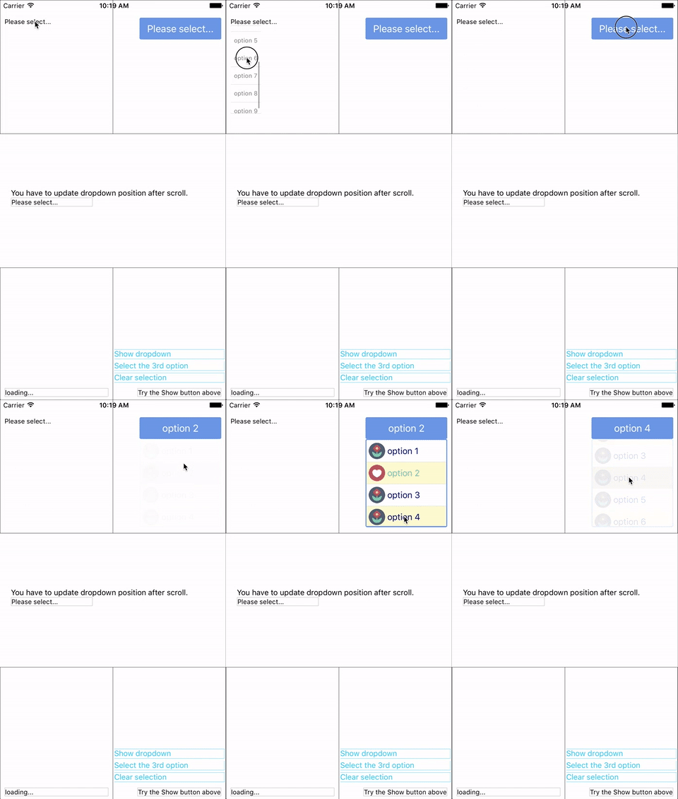
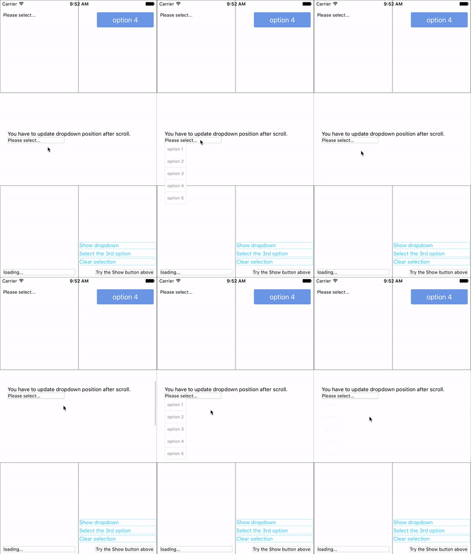
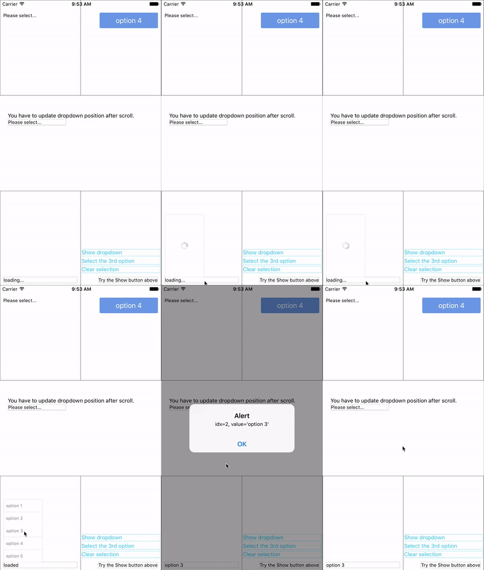
A react-native dropdown/picker/selector component for both Android & iOS.


You can find them in the example.
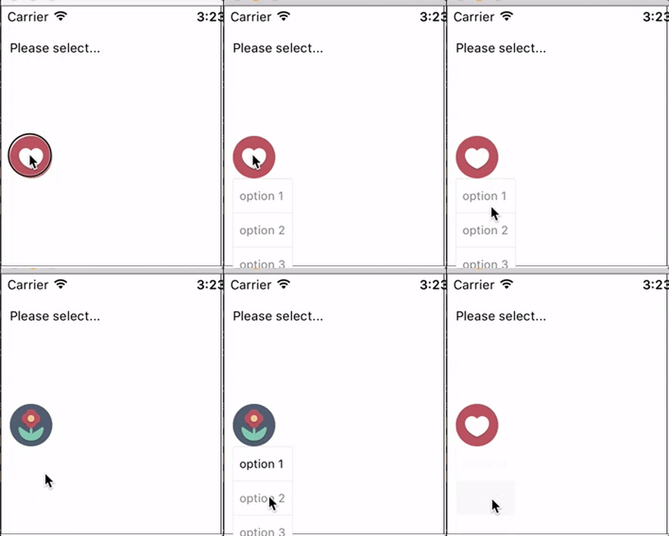
renderSeparator prop API.renderRow.height style for dropdownStyle.updatePosition function.updatePosition function as depreciated. (May be removed in next version.)Now you can use these component as a wrapper / container. Anything wrapped in it can be the trigger of the dropdown.

npm i react-native-modal-dropdown -S
Import this module:
import ModalDropdown from 'react-native-modal-dropdown';
Use as a component:
<ModalDropdown options={['option 1', 'option 2']}/>
Use as a wrapper / container:
<ModalDropdown options={['option 1', 'option 2']}>
  ...
</ModalDropdown>
Give the style props as your choice:
style: Change the style of the button (basic mode) / container (wrapper mode).textStyle: Change the style of text of the button. Invalid in wrapper mode.dropdownStyle: Change the style of dropdown container.You can also render your option row and row separator by implement renderRow and renderSeparator function.
| Prop | Type | Optional | Default | Description |
|---|---|---|---|---|
disabled | bool | Yes | false | disable/enable the component. |
defaultIndex | number | Yes | -1 | Init selected index. -1: None is selected. This only change the highlight of the dropdown row, you have to give a defaultValue to change the init text. |
defaultValue | string | Yes | Please select... | Init text of the button. Invalid in wrapper mode. |
options | arrayOf(string) | Yes | Options. The dropdown will show a loading indicator if options is null/undefined. | |
style | object | Yes | Style of the button. | |
textStyle | object | Yes | Style of the button text. Invalid in wrapper mode. | |
dropdownStyle | object | Yes | Style of the dropdown list. | |
renderRow | func | Yes | Customize render option rows. Will render a default row if null/undefined. | |
renderSeparator | func | Yes | Customize render dropdown list separators. Will render a default thin gray line if null/undefined. | |
onDropdownWillShow | func | Yes | Trigger when dropdown will show by touching the button. Return false can cancel the event. | |
onDropdownWillHide | func | Yes | Trigger when dropdown will hide by touching the button. Return false can cancel the event. | |
onSelect | func | Yes | Trigger when option row touched with selected index and value. Return false can cancel the event. |
| Method | Description |
|---|---|
show() | Show the dropdown. Won't trigger onDropdownWillShow. |
hide() | Hide the dropdown. Won't trigger onDropdownWillHide. |
select(idx) | Select the specified option of the idx. Select -1 will reset it to display defaultValue. Won't trigger onSelect. |
Any suggestion is welcome.
FAQs
A react-native dropdown component for both iOS and Android.
The npm package react-native-modal-dropdown receives a total of 7,455 weekly downloads. As such, react-native-modal-dropdown popularity was classified as popular.
We found that react-native-modal-dropdown demonstrated a not healthy version release cadence and project activity because the last version was released a year ago. It has 1 open source maintainer collaborating on the project.
Did you know?

Socket for GitHub automatically highlights issues in each pull request and monitors the health of all your open source dependencies. Discover the contents of your packages and block harmful activity before you install or update your dependencies.

Research
Security News
Socket’s threat research team has detected six malicious npm packages typosquatting popular libraries to insert SSH backdoors.

Security News
MITRE's 2024 CWE Top 25 highlights critical software vulnerabilities like XSS, SQL Injection, and CSRF, reflecting shifts due to a refined ranking methodology.

Security News
In this segment of the Risky Business podcast, Feross Aboukhadijeh and Patrick Gray discuss the challenges of tracking malware discovered in open source softare.