
Security News
Cloudflare Adds Security.txt Setup Wizard
Cloudflare has launched a setup wizard allowing users to easily create and manage a security.txt file for vulnerability disclosure on their websites.
By Sarah Gooding - Sep 30, 2024
react-native-modal
Advanced tools
react-native-modal is a customizable modal component for React Native applications. It provides a variety of features to create modals with different animations, styles, and behaviors.
Basic Modal
This code demonstrates a basic modal that can be toggled on and off with a button. The modal contains a simple text and a button to hide the modal.
import React, { useState } from 'react';
import { View, Text, Button } from 'react-native';
import Modal from 'react-native-modal';
const BasicModalExample = () => {
const [isModalVisible, setModalVisible] = useState(false);
const toggleModal = () => {
setModalVisible(!isModalVisible);
};
return (
<View style={{ flex: 1, justifyContent: 'center', alignItems: 'center' }}>
<Button title="Show Modal" onPress={toggleModal} />
<Modal isVisible={isModalVisible}>
<View style={{ flex: 1, justifyContent: 'center', alignItems: 'center' }}>
<Text>Hello!</Text>
<Button title="Hide Modal" onPress={toggleModal} />
</View>
</Modal>
</View>
);
};
export default BasicModalExample;Custom Animation
This code demonstrates a modal with custom animations. The modal slides in from the left and slides out to the right.
import React, { useState } from 'react';
import { View, Text, Button } from 'react-native';
import Modal from 'react-native-modal';

const CustomAnimationModalExample = () => {
  const [isModalVisible, setModalVisible] = useState(false);

  const toggleModal = () => {
    setModalVisible(!isModalVisible);
  };

  return (
    <View style={{ flex: 1, justifyContent: 'center', alignItems: 'center' }}>
      <Button title="Show Modal" onPress={toggleModal} />
      <Modal isVisible={isModalVisible} animationIn="slideInLeft" animationOut="slideOutRight">
        <View style={{ flex: 1, justifyContent: 'center', alignItems: 'center' }}>
          <Text>Custom Animation!</Text>
          <Button title="Hide Modal" onPress={toggleModal} />
        </View>
      </Modal>
    </View>
  );
};

export default CustomAnimationModalExample;
Backdrop Customization
This code demonstrates a modal with a customized backdrop. The backdrop color is set to red with an opacity of 0.8.
import React, { useState } from 'react';
import { View, Text, Button } from 'react-native';
import Modal from 'react-native-modal';

const BackdropCustomizationModalExample = () => {
  const [isModalVisible, setModalVisible] = useState(false);

  const toggleModal = () => {
    setModalVisible(!isModalVisible);
  };

  return (
    <View style={{ flex: 1, justifyContent: 'center', alignItems: 'center' }}>
      <Button title="Show Modal" onPress={toggleModal} />
      <Modal isVisible={isModalVisible} backdropColor="red" backdropOpacity={0.8}>
        <View style={{ flex: 1, justifyContent: 'center', alignItems: 'center' }}>
          <Text>Custom Backdrop!</Text>
          <Button title="Hide Modal" onPress={toggleModal} />
        </View>
      </Modal>
    </View>
  );
};

export default BackdropCustomizationModalExample;react-native-modalbox is another modal component for React Native. It provides similar functionalities such as custom animations and backdrop customization. However, react-native-modalbox is known for its simplicity and ease of use, making it a good choice for developers who need basic modal functionalities without extensive customization options.
react-native-popup-dialog is a highly customizable dialog component for React Native. It offers a wide range of features including custom animations, backdrop customization, and various dialog types (e.g., alert, confirm). Compared to react-native-modal, react-native-popup-dialog provides more built-in dialog types and is more focused on creating different types of dialogs rather than just modals.
react-native-root-modal is a modal component that allows you to render modals at the root level of your application. This package is useful for creating global modals that can be triggered from anywhere in the app. While it offers similar functionalities to react-native-modal, react-native-root-modal is more focused on providing a global modal solution.
An enhanced, animated and customizable react-native modal.
This component enhances the original react-native modal by adding animations and many possible customization options while still providing nice defaults:
onModalShow and onModalHideP.S.: The modal will resize itself correctly on device rotation.


This library is available on npm, install it with: npm install --save react-native-modal.
import React, { Component } from 'react'
import { Text, TouchableOpacity, View } from 'react-native'
import Modal from 'react-native-modal'
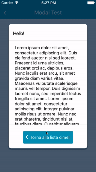
export default class ModalTester extends Component {
state = {
isModalVisible: false
}
_showModal = () => this.setState({ isModalVisible: true })
_hideModal = () => this.setState({ isModalVisible: false })
render () {
return (
<View style={{ flex: 1 }}>
<TouchableOpacity onPress={this._showModal}>
<Text>Show Modal</Text>
</TouchableOpacity>
<Modal isVisible={this.state.isModalVisible}>
<View style={{ flex: 1 }}>
<Text>Hello!</Text>
</View>
</Modal>
</View>
)
}
}
For a more complex example take a look at the /example directory.
| Name | Type | Default | Description |
|---|---|---|---|
| animationIn | string | 'slideInUp' | Modal show animation |
| animationInTiming | number | 300 | Timing for the modal show animation (in ms) |
| animationOut | string | 'slideOutDown' | Modal hide animation |
| animationOutTiming | number | 300 | Timing for the modal hide animation (in ms) |
| backdropColor | string | 'black' | The backdrop background color |
| backdropOpacity | number | 0.70 | The backdrop opacity when the modal is visible |
| backdropTransitionInTiming | number | 300 | The backdrop show timing (in ms) |
| backdropTransitionOutTiming | number | 300 | The backdrop hide timing (in ms) |
| hideOnBack | bool | true | Hide the modal on back button press? |
| onBackButtonPress | func | () => null | Called when the Android back button is pressed |
| isVisible | bool | REQUIRED | Show the modal? |
| children | node | REQUIRED | The modal content |
| onModalShow | func | () => null | Called when the modal is completely visible |
| onModalHide | func | () => null | Called when the modal is completely hidden |
| style | any | null | Style applied to the modal |
Take a look at react-native-animatable for available animations.
Pull requests, feedbacks and suggestions are welcome!
P.S.: Thanks @oblador for react-native-animatable and @brentvatne for the npm namespace!
FAQs
An enhanced React Native modal
The npm package react-native-modal receives a total of 310,434 weekly downloads. As such, react-native-modal popularity was classified as popular.
We found that react-native-modal demonstrated a not healthy version release cadence and project activity because the last version was released a year ago. It has 5 open source maintainers collaborating on the project.
Did you know?

Socket for GitHub automatically highlights issues in each pull request and monitors the health of all your open source dependencies. Discover the contents of your packages and block harmful activity before you install or update your dependencies.
Security News
Cloudflare has launched a setup wizard allowing users to easily create and manage a security.txt file for vulnerability disclosure on their websites.

Security News
The Socket Research team breaks down a malicious npm package targeting the legitimate DOMPurify library. It uses obfuscated code to hide that it is exfiltrating browser and crypto wallet data.

Security News
ENISA’s 2024 report highlights the EU’s top cybersecurity threats, including rising DDoS attacks, ransomware, supply chain vulnerabilities, and weaponized AI.