react-native-multi-selectbox
Renders the Picker/SelectBox/Dropdown with common styling for iOS/Android.
Getting started
How to install:
npm install react-native-multi-selectbox
or
yarn add react-native-multi-selectbox
How to use ?
import React from 'react'
import { Text, View } from 'react-native'
import SelectBox from './lib'
import { xor } from 'lodash'
export default class App extends React.Component {
state = {
selectedLocations: {},
selectedValues: [],
locations: [
{ item: 'Afghanistan', id: 'AF' },
{ item: 'land Islands', id: 'AX' },
{ item: 'Albania', id: 'AL' },
{ item: 'Algeria', id: 'DZ' },
{ item: 'American Samoa', id: 'AS' },
{ item: 'AndorrA', id: 'AD' },
{ item: 'Angola', id: 'AO' },
{ item: 'Anguilla', id: 'AI' },
{ item: 'Antarctica', id: 'AQ' },
{ item: 'Antigua and Barbuda', id: 'AG' },
{ item: 'Argentina', id: 'AR' },
{ item: 'Armenia', id: 'AM' },
{ item: 'Aruba', id: 'AW' },
{ item: 'Australia', id: 'AU' },
{ item: 'Austria', id: 'AT' },
{ item: 'Azerbaijan', id: 'AZ' },
{ item: 'Bahamas', id: 'BS' },
{ item: 'Bahrain', id: 'BH' },
{ item: 'Bangladesh', id: 'BD' },
{ item: 'Barbados', id: 'BB' }
]
}
render() {
const { locations, selectedLocations, selectedValues } = this.state
return (
<View style={{ margin: 30 }}>
<View style={{ width: '100%', alignItems: 'center' }}>
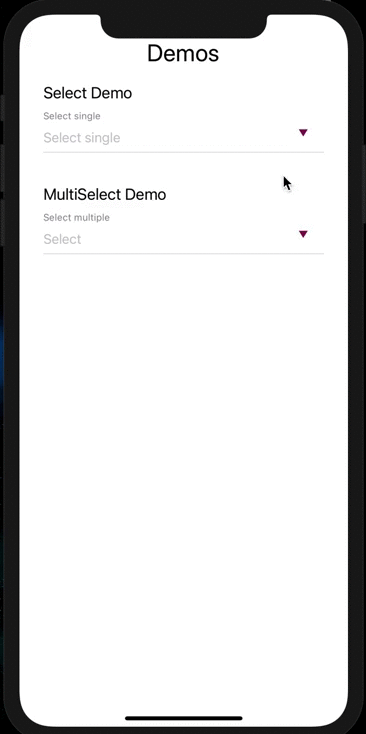
<Text style={{ fontSize: 30, paddingBottom: 20 }}>Demos</Text>
</View>
<Text style={{ fontSize: 20, paddingBottom: 10 }}>Select Demo</Text>
<SelectBox
label="Select"
options={locations}
value={selectedLocations}
onChange={val => this.setState({ selectedLocations: val })}
hideInputFilter={false}
/>
<View style={{ height: 40 }}></View>
<Text style={{ fontSize: 20, paddingBottom: 10 }}>MultiSelect Demo</Text>
<SelectBox
label="Select Groups"
options={locations}
selectedValues={selectedValues}
onMultiSelect={item => {
this.setState({ selectedValues: xor(selectedValues, [item]) })
}}
onTapClose={val => this.setState({ selectedValues: xor(selectedValues, [val]) })}
isMulti
/>
</View>
)
}
}
| Prop | Type | Default Value |
|---|
| label | String | Label |
| inputPlaceholder | string | Label |
| width | string | "100%" |
| viewMargin | string | "0px" |
| isMulti | boolean | false |
| hideInputFilter | boolean | true |
| selectedValues | array | [] |
| value | array | [] |
| selectIcon | component | <Icon name={'downArrow'} /> |
| labelStyle | style object | Default style |
| containerStyle | style object | Default style |
| inputFilterContainerStyle | style object | Default style |
| inputFilterStyle | style object | Default style |
| optionsLabelStyle | style object | Default style |
| optionContainerStyle | style object | Default style |
| multiOptionContainerStyle | style object | Default style |
| multiOptionsLabelStyle | style object | Default style |
| multiListEmptyLabelStyle | style object | Default style |
| listEmptyLabelStyle | style object | Default style |
| selectedItemStyle | style object | Default style |
| options | array | [{ item: 'Afghanistan', id: 'AF' },{ item: 'land Islands', id: 'AX' },{ item: 'Albania', id: 'AL' },{ item: 'Algeria', id: 'DZ' },{ item: 'American Samoa', id: 'AS' },{ item: 'AndorrA', id: 'AD' },{ item: 'Angola', id: 'AO' },{ item: 'Anguilla', id: 'AI' },{ item: 'Antarctica', id: 'AQ' },{ item: 'Antigua and Barbuda', id: 'AG' },{ item: 'Argentina', id: 'AR' },{ item: 'Armenia', id: 'AM' },{ item: 'Aruba', id: 'AW' },{ item: 'Australia', id: 'AU' },{ item: 'Austria', id: 'AT' },{ item: 'Azerbaijan', id: 'AZ' },{ item: 'Bahamas', id: 'BS' },{ item: 'Bahrain', id: 'BH' },{ item: 'Bangladesh', id: 'BD' },{ item: 'Barbados', id: 'BB' }] |
Want to contribute?
Checkout to develop branch and create a new branch & submit a PR
Issues or feature ?
You can submit a request on https://github.com/sauzy34/react-native-multi-selectbox/issues
Support & Share
Star the repository


