Security News
Supply Chain Attack Detected in Solana's web3.js Library
A supply chain attack has been detected in versions 1.95.6 and 1.95.7 of the popular @solana/web3.js library.
react-native-navigation-drawer-extension
Advanced tools
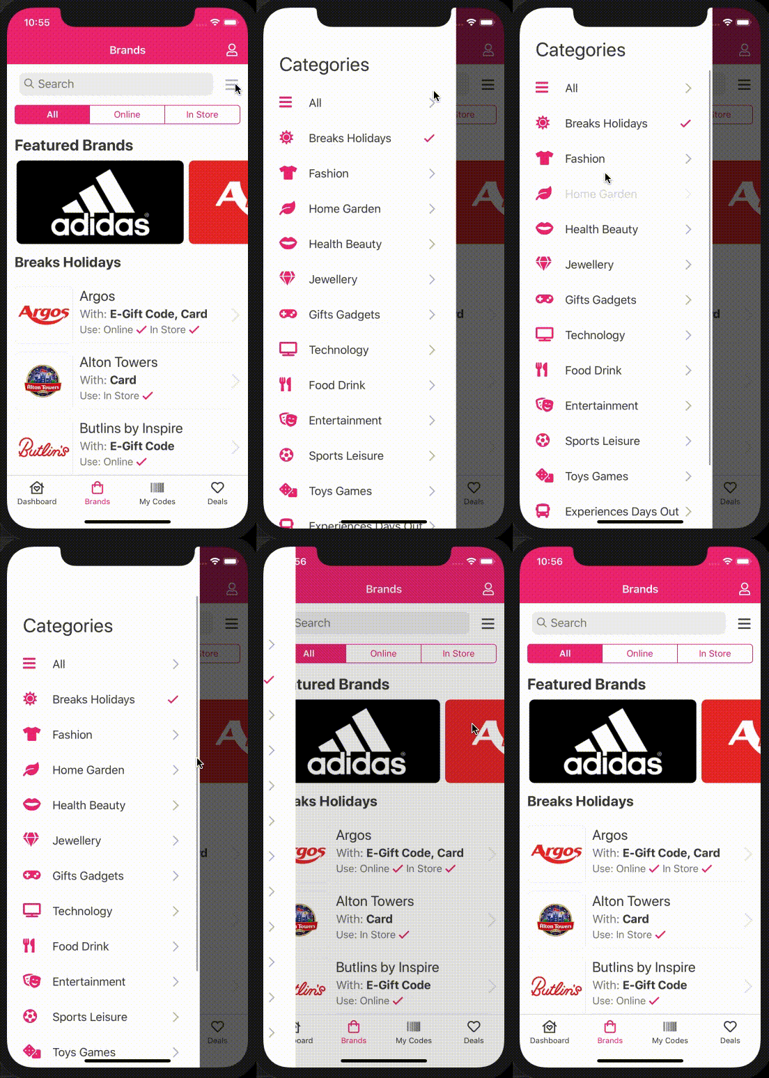
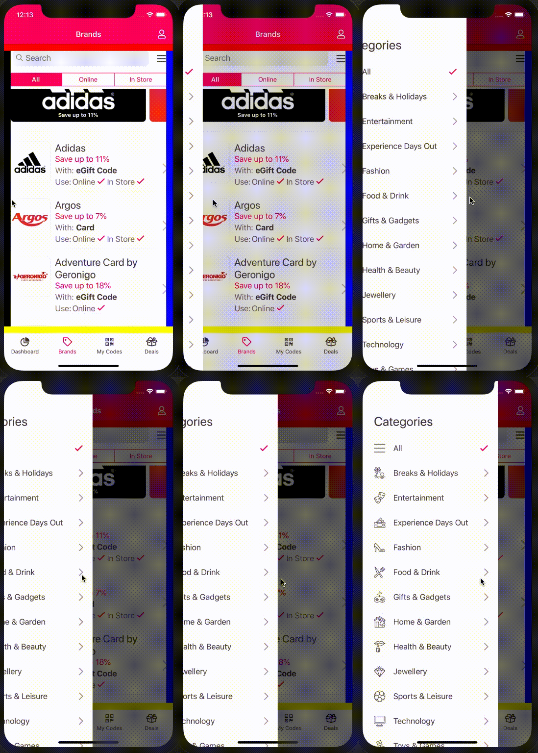
Drawer API built on top of wix react-native-navigation for iOS and Android.

React Native Navigation by Wix does not offer an in-built solution for displaying a drawer on iOS. Their current side-menu has limited functionality on both iOS and Android. This is a drawer solution using showOverlay under the hood to display a drawer on iOS and Android.
If you are using React Native Navigation >= 3.0.0 then use version 3.x.x + of this library.


npm install react-native-navigation-drawer-extension --save
or
yarn add react-native-navigation-drawer-extension
You need to register your drawer component with RNN. To do this use the register method and wrap your component in the RNNDrawer HOC.
import { Navigation } from "react-native-navigation";
import { RNNDrawer } from "react-native-navigation-drawer-extension";

// register our drawer component with RNN
Navigation.registerComponent("CustomDrawer", () => RNNDrawer.create(CustomDrawer));
You can then use the drawer by calling a custom method. The showDrawer method
will take a single parameter options identical to showOverlay.
import { RNNDrawer } from "react-native-navigation-drawer-extension";

RNNDrawer.showDrawer({
  component: {
    name: "CustomDrawer",
    passProps: {
      animationOpenTime: 300,
      animationCloseTime: 300,
      direction: "left",
      dismissWhenTouchOutside: true,
      fadeOpacity: 0.6,
      drawerScreenWidth: "75%" || 445, // Use relative to screen '%' or absolute
      drawerScreenHeight: "100%" || 700,
      style: { // Styles the drawer container, supports any react-native style
        backgroundColor: "red",
      },
      parentComponentId: props.componentId, // Custom prop, will be available in your custom drawer component props
    },
  }
});

RNNDrawer.dismissDrawer();
To navigate from the drawer you must pass the parent componentId and use that to navigate. e.g:
// From drawer component
Navigation.push(parentComponentId, {
  component: {
    name: "CustomScreenFromDrawer",
  },
});
There's a complete and functional example at the example folder, with more thorough explanation on each method.
The props below are used to configure the drawer and are to be used in RNN passProps:. Any aditional
props will be passed to your custom drawer component.
| Prop | Type | Optional | Default | Description |
|---|---|---|---|---|
| animationOpenTime | float | Yes | 300 | Time in milliseconds to execute the drawer opening animation. |
| animationCloseTime | float | Yes | 300 | Time in milliseconds to execute the drawer closing animation. |
| direction | string | Yes | left | Direction to open the collage, one of: ["left", "right", "top", "bottom"]. |
| dismissWhenTouchOutside | bool | Yes | true | Should the drawer be dismissed when a click is registered outside? |
| fadeOpacity | number | Yes | 0.6 | Opacity of the screen outside the drawer. |
| drawerScreenWidth | number/string | Yes | 80% | Width of drawer on portrait orientation. Pass a string containing '%' (e.g. "80%") for setting the width in relation to the screen or a number for absolute width (e.g. 300) |
| drawerScreenWidthOnLandscape | number/string | Yes | 30% | Width of drawer on landscape orientation. Pass a string containing '%' (e.g. "80%") for setting the width in relation to the screen or a number for absolute width (e.g. 300) |
| drawerScreenHeight | number/string | Yes | 100% | Height of drawer. Pass a string containing '%' (e.g. "30%") for setting the height in relation to the screen or a number for absolute height (e.g. 300) |
| disableDragging | boolean | Yes | false | Whether you want to disable dragging of the drawer. Useful if you have ScrollView inside the drawer (addresses #62). |
| disableSwiping | boolean | Yes | false | Whether you want to disable swiping gesture. Use it only in pair with disableDragging. |

The library also exposes a component which will allow you to open the drawer by either swiping the left or right gutter of the phone. This is achieved by using event listeners
to communicate with the RNNDrawer HOC component. To enable this feature wrap your screen with the SideMenuView component. <SideMenuView> is just an enhanced <View> all props are passed down to <View>.
import { SideMenuView } from "react-native-navigation-drawer-extension";

<SideMenuView
  style={{ flex: 1 }}
  drawerName={'CustomDrawer'}
  direction={'right'}
  passProps={{
    animationOpenTime: 300,
    animationCloseTime: 300,
    dismissWhenTouchOutside: true,
    fadeOpacity: 0.6,
    drawerScreenWidth: '75%',
    drawerScreenHeight: '100%',
    parentComponentId: props.componentId,
    style: {
      backgroundColor: 'white',
    },
  }}
  options={{
    layout: {
      componentBackgroundColor: 'transparent',
    }
 >
  {...}
 </SideMenuView>
| Prop | Type | Optional | Default | Description |
|---|---|---|---|---|
| style | StyleProp | Yes | The style of the drawer container. | |
| drawerName | string | No | The name of the drawer component. | |
| direction | string | Yes | left | The direction to open the drawer, one of: ["left", "right"]. |
| passProps | object | Yes | The values passed to the drawer. See props in RNNDrawer above. | |
| options | Options | Yes | The options to configure properties of the React Native Navigation native screen. Refer to React Native Navigation's options object. | |
| swipeSensitivity | number | Yes | 0.2 | The sensitivity of the swipe to invoke each function. |
| sideMargin | number | Yes | 15 | The size of the gutter for both sides. |
| sideMarginLeft | number | Yes | The size of the gutter for the left side. | |
| sideMarginRight | number | Yes | The size of the gutter for the right side. |
Thanks goes to these wonderful people (emoji key):
Daniil Merkulov 💻 📖 | Rodrigo Vieira 💻 🐛 📖 🚧 | Luke Brandon Farrell 💻 🐛 📖 | CyberFuntik 💻 📖 |
This project follows the all-contributors specification. Contributions of any kind welcome!
FAQs
Drawer API built on top of wix react-native-navigation for iOS and Android.
The npm package react-native-navigation-drawer-extension receives a total of 383 weekly downloads. As such, react-native-navigation-drawer-extension popularity was classified as not popular.
We found that react-native-navigation-drawer-extension demonstrated a not healthy version release cadence and project activity because the last version was released a year ago. It has 5 open source maintainers collaborating on the project.
Did you know?

Socket for GitHub automatically highlights issues in each pull request and monitors the health of all your open source dependencies. Discover the contents of your packages and block harmful activity before you install or update your dependencies.

Security News
A supply chain attack has been detected in versions 1.95.6 and 1.95.7 of the popular @solana/web3.js library.

Research
Security News
A malicious npm package targets Solana developers, rerouting funds in 2% of transactions to a hardcoded address.

Security News
Research
Socket researchers have discovered malicious npm packages targeting crypto developers, stealing credentials and wallet data using spyware delivered through typosquats of popular cryptographic libraries.