Research
Security News
Malicious npm Packages Inject SSH Backdoors via Typosquatted Libraries
Socket’s threat research team has detected six malicious npm packages typosquatting popular libraries to insert SSH backdoors.
react-native-paper-onboarding
Advanced tools
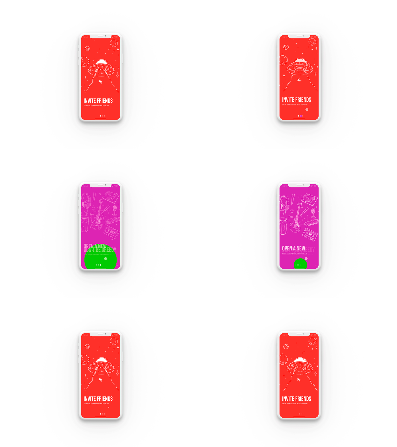
You can be used at the initial screen of the application, for a visual demonstration of the functions of the app. You can also show in quick access what has been changed or added, just swipe the screen left or right

Our company provides custom UI design and development solutions for mobile applications and websites.
Need a team to create a project?
This project is developed and maintained by openGeeksLab LLC.

Just run:
The library depends on that each screen should contain a static backgroundColor field which contains the desired background color for this screen. The screen itself should have a transparent background
import React, { Component } from 'react';
import PaperOnboarding from 'react-native-paper-onboarding';
import Screen1 from './screens/screen1';
import Screen2 from './screens/screen2';
import Screen3 from './screens/screen3';
const screens = [Screen1, Screen2, Screen3];
export default class App extends Component {
render() {
return (
<PaperOnboarding
screens={screens}
/>
);
}
}
import React, { Component } from 'react';
import {
  StyleSheet,
  Image,
  View,
  Text,
} from 'react-native';

import bgImage from './img.png';

export default class Screen1 extends Component {
  static backgroundColor = '#ff3631';

  render() {
    return (
      <View style={styles.container}>
        <View style={styles.imageContainer}>
          <Image
            blurRadius={0}
            source={bgImage}
            style={styles.image}
            resizeMode={'contain'}
          />
        </View>
        <View style={styles.textContainer}>
          <Text style={styles.textTitle}>
            INVITE FRIENDS
          </Text>
          <Text style={styles.lilText}>
            Listen Your Favorite Music Together
          </Text>
        </View>
      </View>
    );
  }
}

const styles = StyleSheet.create({
  container: {
    flex: 1,
    width: '100%',
    height: '100%',
    backgroundColor: 'transparent',
  },
  imageContainer: {
    flex: 1,
    backgroundColor: 'transparent',
  },
  image: {
    width: '100%',
    height: '100%',
  },
  textContainer: {
    height: '27%',
    paddingLeft: 25,
    backgroundColor: 'transparent',
  },
  textTitle: {
    fontSize: 56,
    fontFamily: 'Bebas Neue',
    color: 'rgb(255, 255, 255)',
    backgroundColor: 'transparent',
  },
  lilText: {
    fontSize: 13,
    fontFamily: 'Montserrat',
    color: 'rgb(255, 255, 255)',
    backgroundColor: 'transparent',
  },
});

Expanding is released under the MIT license.
FAQs
You can be used at the initial screen of the application, for a visual demonstration of the functions of the app. You can also show in quick access what has been changed or added, just swipe the screen left or right
The npm package react-native-paper-onboarding receives a total of 1 weekly downloads. As such, react-native-paper-onboarding popularity was classified as not popular.
We found that react-native-paper-onboarding demonstrated a not healthy version release cadence and project activity because the last version was released a year ago. It has 1 open source maintainer collaborating on the project.
Did you know?

Socket for GitHub automatically highlights issues in each pull request and monitors the health of all your open source dependencies. Discover the contents of your packages and block harmful activity before you install or update your dependencies.

Research
Security News
Socket’s threat research team has detected six malicious npm packages typosquatting popular libraries to insert SSH backdoors.

Security News
MITRE's 2024 CWE Top 25 highlights critical software vulnerabilities like XSS, SQL Injection, and CSRF, reflecting shifts due to a refined ranking methodology.

Security News
In this segment of the Risky Business podcast, Feross Aboukhadijeh and Patrick Gray discuss the challenges of tracking malware discovered in open source softare.