react-native-password-strength-meter 

A highly customisable password strength meter implementation with minimal dependencies.
Show Cases
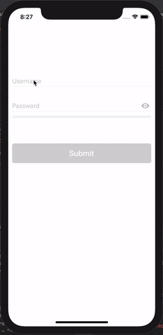
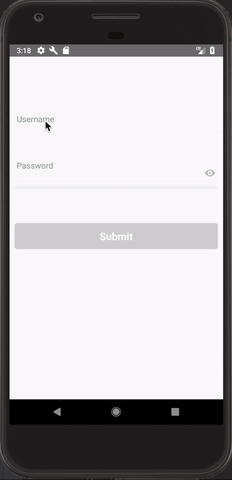
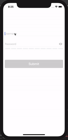
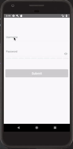
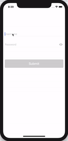
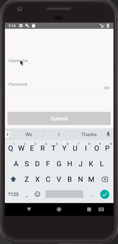
Type Bar
| IOS | Android |
|---|
 |  |
Type Box
| IOS | Android |
|---|
 |  |
Type Circle
| IOS |
|---|
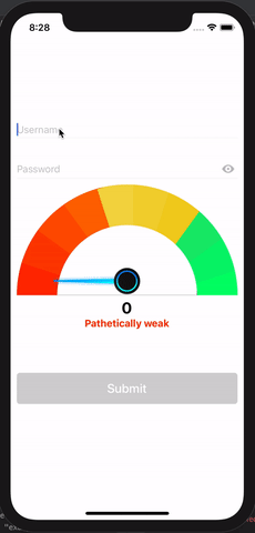 |
Type Text
| IOS | Android |
|---|
 |  |
Getting Started
Installation
$ npm i react-native-password-strength-meter --save
Basic Usage
Password Input Usage
import React, { Component } from 'react';
import {
  View,
  StyleSheet,
  TextInput
} from 'react-native';

import RNPasswordStrengthMeter from 'react-native-password-strength-meter';

export default class PasswordInput extends Component {
  onChange = (password, score, { label, labelColor, activeBarColor }) => {
    console.log(password, score, { label, labelColor, activeBarColor });
  }
  render() {
    return (
      <View style={styles.container}>
        <RNPasswordStrengthMeter
          onChangeText={this.onChange}
          meterType="bar"
        />
      </View>
    );
  }
}
Component Usage
import React, { Component } from 'react';
import {
  View,
  StyleSheet,
  TextInput
} from 'react-native';

import { BarPasswordStrengthDisplay } from 'react-native-password-strength-meter';

export default class BarComponent extends Component {
  state = {
    password: '',
  }

  onChange = password => this.setState({ password })

  render() {
    const { password } = this.state;
    return (
      <View style={styles.container}>
        <TextInput style={styles.textInput} onChangeText={this.onChange} />
        <BarPasswordStrengthDisplay
          password={password}
        />
      </View>
    );
  }
}
Properties
Password Input Props
| Prop | Default | Type | Description |
|---|
| onChangeText | required | func | Callback to Return Input text changes (password, score, { label, labelColor, activeBarColor }) => {} |
| defaultPassword | "" | string | Default Password Value |
| containerWrapperStyle | {} | object | Container wrapper style |
| imageWrapperStyle | {} | object | Eye Image wrapper style |
| imageStyle | {} | object | Eye Image style |
| inputWrapperStyle | {} | object | Text Input wrapper style |
| inputStyle | {} | object | Text Input style |
| placeholderStyle | {} | object | Text Input placeholder style |
| meterType | bar | enum | Meter Type. Can be bar, box, circle, text |
| inputProps | Defaults | object | React Native's TextInput Props |
| passwordProps | Defaults | object | Password Component Props |
Bar Component Props
| Prop | Default | Type | Description |
|---|
| password | required | string | Password Value |
| touched | "" | bool | Field Touched |
| scoreLimit | 100 | number | Password Score's maximum value |
| variations | Defaults | object | Different validations in regex to calculate password score |
| minLength | 5 | number | Minimum length of the password to validate |
| labelVisible | true | bool | Label Visible |
| levels | Defaults | array | Different Levels to calculate password score |
| wrapperStyle | {} | object | Wrapper style |
| barContainerStyle | {} | object | Bar Container style |
| barStyle | {} | object | Bar style |
| labelStyle | {} | object | Label style |
| barColor | #f1f3f4 | string | Bar background color |
| width | deviceWidth - 20 | number | Width of bar |
Box Component Props
| Prop | Default | Type | Description |
|---|
| password | required | string | Password Value |
| touched | "" | bool | Field Touched |
| scoreLimit | 100 | number | Password Score's maximum value |
| variations | Defaults | object | Different validations in regex to calculate password score |
| minLength | 5 | number | Minimum length of the password to validate |
| labelVisible | true | bool | Label Visible |
| levels | Defaults | array | Different Levels to calculate password score |
| wrapperStyle | {} | object | Wrapper style |
| boxContainerStyle | {} | object | Box Container style |
| boxStyle | {} | object | Box style |
| labelStyle | {} | object | Label style |
| boxColor | #f1f3f4 | string | Box background color |
| width | deviceWidth - 20 | number | Width of box container which will be split based on the levels |
| boxSpacing | 2 | number | Spacing in between the boxes |
Circular Component Props
| Prop | Default | Type | Description |
|---|
| password | required | string | Password Value |
| labelVisible | true | bool | Label Visible |
| minLength | 5 | number | Minimum length of the password to validate |
| scoreLimit | 100 | number | Password Score's maximum value |
| easeDuration | 500 | number | Ease Duration of the meter needle |
| variations | Defaults | object | Different validations in regex to calculate password score |
| levels | Defaults | array | Different Levels to calculate password score |
| wrapperStyle | {} | object | Wrapper style |
| outerCircleStyle | {} | object | Outer circle style |
| imageWrapperStyle | {} | object | Image wrapper style |
| imageStyle | {} | object | Image style |
| innerCircleStyle | {} | object | Inner circle style |
| labelWrapperStyle | {} | object | Label wrapper style |
| labelStyle | {} | object | Label style |
| labelNoteStyle | {} | object | Label note style |
| needleImage | Defaults | string | Absolute path to the needle image |
Text Component Props
| Prop | Default | Type | Description |
|---|
| password | required | string | Password Value |
| touched | "" | bool | Field Touched |
| scoreLimit | 100 | number | Password Score's maximum value |
| variations | Defaults | object | Different validations in regex to calculate password score |
| minLength | 5 | number | Minimum length of the password to validate |
| labelVisible | true | bool | Label Visible |
| levels | Defaults | array | Different Levels to calculate password score |
| wrapperStyle | {} | object | Wrapper style |
| labelStyle | {} | object | Label style |
Defaults
defaultPassword: '',
containerWrapperStyle: {},
imageWrapperStyle: {},
imageStyle: {},
inputWrapperStyle: {},
inputStyle: {},
placeholderStyle: {},
meterType: 'bar',
   inputProps: {
    placeholder: 'Password',
  secureTextEntry: true,
},
passwordProps: {
   touched: false,
   scoreLimit: 100,
   variations: {
     digits: /\d/,
     lower: /[a-z]/,
     upper: /[A-Z]/,
     nonWords: /\W/,
   },
   minLength: 5,
   labelVisible: true,
   levels: [
     {
       label: 'Pathetically weak',
       labelColor: '#ff2900',
       activeBarColor: '#ff2900',
     },
     {
       label: 'Extremely weak',
       labelColor: '#ff3e00',
       activeBarColor: '#ff3e00',
     },
     {
       label: 'Very weak',
       labelColor: '#ff5400',
       activeBarColor: '#ff5400',
     },
     {
       label: 'Weak',
       labelColor: '#ff6900',
       activeBarColor: '#ff6900',
     },
     {
       label: 'So-so',
       labelColor: '#f4d744',
       activeBarColor: '#f4d744',
     },
     {
       label: 'Average',
       labelColor: '#f3d331',
       activeBarColor: '#f3d331',
     },
     {
       label: 'Fair',
       labelColor: '#f2cf1f',
       activeBarColor: '#f2cf1f',
     },
     {
       label: 'Strong',
       labelColor: '#14eb6e',
       activeBarColor: '#14eb6e',
     },
     {
       label: 'Very strong',
       labelColor: '#0af56d',
       activeBarColor: '#0af56d',
     },
     {
       label: 'Unbelievably strong',
       labelColor: '#00ff6b',
       activeBarColor: '#00ff6b',
     },
   ],
   wrapperStyle: {},
   labelStyle: {},
   width: deviceWidth - 20,

   // Bar
   barContainerStyle: {},
   barStyle: {},
   barColor: '#f1f3f4',

   // Box
   boxContainerStyle: {},
   boxStyle: {},
   boxColor: '#f1f3f4',
   boxSpacing: 2,

   // Circle
   outerCircleStyle: {},
   imageWrapperStyle: {},
   imageStyle: {},
   innerCircleStyle: {},
   labelWrapperStyle: {},
   labelNoteStyle: {},
}
Password Score Algorithm
The Password Score calculator is based on this amazing Stackoverflow Post authored by @tm_lv.
Contribution
Questions
Feel free to contact me or create an issue


