Security News
Fluent Assertions Faces Backlash After Abandoning Open Source Licensing
Fluent Assertions is facing backlash after dropping the Apache license for a commercial model, leaving users blindsided and questioning contributor rights.
react-native-raw-bottom-sheet
Advanced tools
Add Your Own Component To Bottom Sheet Whatever You Want (Android & iOS)
Please pay close attention if you are upgrading the RBSheet from version 2 to version 3.
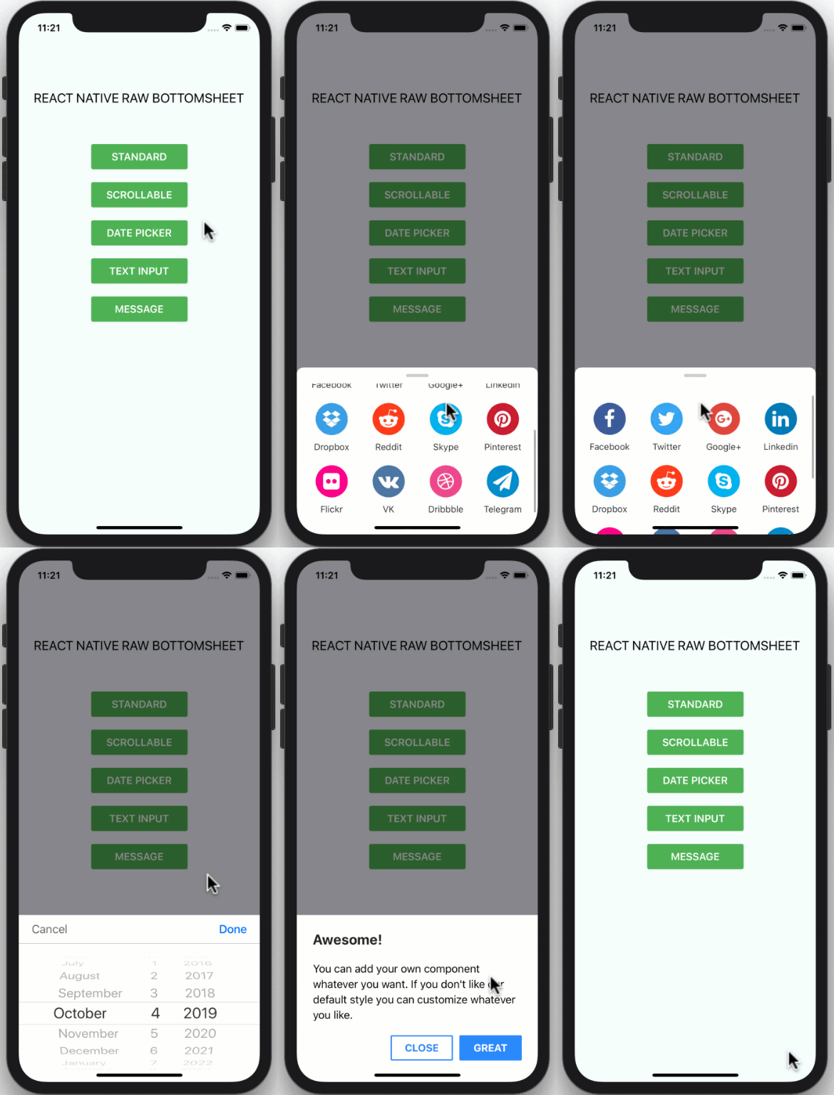
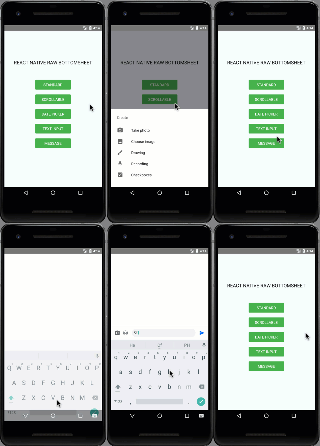
| Showcase iOS | Showcase Android |
|---|---|
 |  |
npm i react-native-raw-bottom-sheet --save
yarn add react-native-raw-bottom-sheet
Please check the example folder to explore more example codes.
import React, {useRef} from 'react';
import {View, Button} from 'react-native';
import RBSheet from 'react-native-raw-bottom-sheet';

export default function Example() {
  const refRBSheet = useRef();

  return (
    <View style={{flex: 1}}>
      <Button
        title="OPEN BOTTOM SHEET"
        onPress={() => refRBSheet.current.open()}
      />
      <RBSheet
        ref={refRBSheet}
        useNativeDriver={true}
        customStyles={{
          wrapper: {
            backgroundColor: 'transparent',
          },
          draggableIcon: {
            backgroundColor: '#000',
          },
        }}
        customModalProps={{
          animationType: 'slide',
          statusBarTranslucent: true,
        }}
        customAvoidingViewProps={{
          enabled: false,
        }}>
        <YourOwnComponent />
      </RBSheet>
    </View>
  );
}
const refRBSheet = useRef([]);

const renderItem = ({item, index}) => {
  return (
    <View>
      <TouchableOpacity
        style={styles.button}
        onPress={() => refRBSheet.current[index].open()}>
        <Text style={styles.buttonText}>ITEM {item + 1}</Text>
      </TouchableOpacity>

      <RBSheet ref={ref => (refRBSheet.current[index] = ref)}>
        <View style={styles.bottomSheetContainer}>
          <Text style={styles.bottomSheetText}>I AM ITEM {item + 1}</Text>
        </View>
      </RBSheet>
    </View>
  );
};
| Props | Type | Description | Default |
|---|---|---|---|
| height | number | The height of bottom sheet. | 260 |
| openDuration | number | Duration of the animation when opening bottom sheet. | 300 (ms) |
| closeDuration | number | Duration of the animation when closing bottom sheet. | 200 (ms) |
| closeOnPressMask | boolean | Press the outside area (mask) to close bottom sheet. | true |
| closeOnPressBack | boolean | Press hardware back android to close bottom sheet (Android only). | false |
| draggable | boolean | Enable the drag-down gesture to close the bottom sheet. | false |
| dragOnContent | boolean | The draggable is only worked on the draggable icon. Set this to trueif you want to drag on the content as well (doesn't work with ScrollView). | false |
| useNativeDriver | boolean | Use the native driver to run smoother animation. | false |
| customStyles | object | Add custom styles to bottom sheet. | {} |
| customModalProps | object | Add custom props to modal. | {} |
| customAvoidingViewProps | object | Add custom props to KeyboardAvoidingView. | {} |
| onOpen | function | Callback function that will be called after the bottom sheet has been opened. | null |
| onClose | function | Callback function that will be called after the bottom sheet has been closed. | null |
customStyles: {
  wrapper: {...}, // The Root of component (Change the mask's background color here).
  container: {...}, // The Container of bottom sheet (The animated view that contains your component).
  draggableIcon: {...} // The style of Draggable Icon (If you set `draggable` to `true`).
}
| Method Name | Description | Usage |
|---|---|---|
| open | The method to open bottom sheet. | refRBSheet.current.open() |
| close | The method to close bottom sheet. | refRBSheet.current.close() |
I'm really glad you're reading this, because we need volunteer developers to help bring this project to life.
yarn to install devDependenciesexample folderyarn & yarn start to run the example projectexample/App.jsREADME.md to update documentation (Optional)__tests__ folder (Optional)index.d.ts to update typing (Optional)This project is licensed under the MIT License - see the LICENSE.md file for details.
Made with ❤️ by NY Samnang.
FAQs
Add Your Own Component To Bottom Sheet Whatever You Want (Android & iOS)
We found that react-native-raw-bottom-sheet demonstrated a healthy version release cadence and project activity because the last version was released less than a year ago. It has 1 open source maintainer collaborating on the project.
Did you know?

Socket for GitHub automatically highlights issues in each pull request and monitors the health of all your open source dependencies. Discover the contents of your packages and block harmful activity before you install or update your dependencies.

Security News
Fluent Assertions is facing backlash after dropping the Apache license for a commercial model, leaving users blindsided and questioning contributor rights.

Research
Security News
Socket researchers uncover the risks of a malicious Python package targeting Discord developers.

Security News
The UK is proposing a bold ban on ransomware payments by public entities to disrupt cybercrime, protect critical services, and lead global cybersecurity efforts.