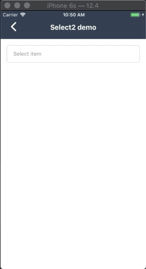
react-native-select-two
Component like Select2 on web for React Native
Add it to your project
- Insall package
- Using NPM
npm install react-native-select-two - or:
- Using Yarn
yarn add react-native-select-two
- Install React Native Modal dependence
- Using NPM
npm install react-native-modal - or
-Using Yarn
yarn add react-native-modal
- Import package
import Select2 from 'react-native-select-two';
Usage
import React, { Component } from "react"
import { View, Text, StyleSheet } from "react-native"
import Select2 from "react-native-select-two"
const mockData = [
{ id: 1, name: "React Native Developer", checked: true },
{ id: 2, name: "Android Developer" },
{ id: 3, name: "iOS Developer" }
]
class CreateNewAppointment extends Component {
render() {
return (
<View style={styles.container}>
<Select2
isSelectSingle
style={{ borderRadius: 5 }}
colorTheme="blue"
popupTitle="Select item"
title="Select item"
data={mockData}
onSelect={data => {
this.setState({ data })
}}
onRemoveItem={data => {
this.setState({ data })
}}
/>
</View>
)
}
}
Multiple select
Properties
| Property name | Type | Default | Description |
|---|
| style | Object | none | Custom style for component |
| modalStyle | Object | none | Custom style for modal |
| title | String | none | String display when you don't select any item |
| data | Array | *required | Datasource of list options: an array of objects (each object have name and id property) |
| onSelect | Function | none | The callback function trigger after you press select button |
| onRemoveItem | Function | none | The callback function trigger after you press tags to remove them |
| popupTitle | String | none | Title of modal select item |
| colorTheme | string/color | #16a45f | Color for componet |
| isSelectSingle | Bool | false | Selelect only one option |
| showSearchBox | Bool | true | Show or hide search field |
| cancelButtonText | string | Hủy | Cancel button text title |
| selectButtonText | String | Chọn | Select button text title |
| searchPlaceHolderText | String | Nhập vào từ khóa | Placeholder text for search field |
| listEmptyTitle | String | Không tìm thấy lựa chọn phù hợp | Title to show when there's no item to be render |
| defaultFontName | String | none | Set custom font for all component |
| selectedTitleStyle | Object | none | Set custom style for display selected title text |
| buttonTextStyle | Object | none | Set custom button text style |
| buttonStyle | Object | none | Set custom button style |
MIT Licensed