
Research
Security News
Malicious npm Package Targets Solana Developers and Hijacks Funds
A malicious npm package targets Solana developers, rerouting funds in 2% of transactions to a hardcoded address.
By Socket Research Team - Dec 02, 2024
react-native-skeleton-content
Advanced tools
A simple and fully customizable React Native component that implements a skeleton-like loader
If you are not using expo, please head up to this page instead.

React native Skeleton Content, a simple yet fully customizable component made to achieve loading animation in a Skeleton-style. Works in both iOS and Android.


npm install react-native-skeleton-content
import SkeletonContent from 'react-native-skeleton-content';
layout to the component specifying the size of the bones (see the Examples section below). Below is an example with a custom layout. A key prop for each child is optional but highly recommended.export default function Placeholder() {
return (
<SkeletonContent
containerStyle={{ flex: 1, width: 300 }}
isLoading={false}
layout={[
{ key: 'someId', width: 220, height: 20, marginBottom: 6 },
{ key: 'someOtherId', width: 180, height: 20, marginBottom: 6 }
]}
>
<Text style={styles.normalText}>Your content</Text>
<Text style={styles.bigText}>Other content</Text>
</SkeletonContent>
);
}
isLoading to your state to show/hide the SkeletonContent when the assets/data are available to the user.export default function Placeholder () {
const [loading, setLoading] = useState(true);
return (
<SkeletonContent
containerStyle={{flex: 1, width: 300}}
isLoading={isLoading}>
{...otherProps}
/>
)
}
| Name | Type | Default | Description |
|---|---|---|---|
| isLoading | bool | required | Shows the Skeleton bones when true |
| layout | array of objects | [] | A custom layout for the Skeleton bones |
| duration | number | 1200 ms | Duration of one cycle of animation |
| containerStyle | object | flex: 1 | The style applied to the View containing the bones |
| easing | Easing | bezier(0.5, 0, 0.25, 1) | Easing of the bones animation |
| animationType | string | "shiver" | The animation to be used for animating the bones (see demos below) |
| animationDirection | string | "horizontalRight" | Used only for shiver animation, describes the direction and end-point (ex: horizontalRight goes on the x-axis from left to right) |
| boneColor | string | "#E1E9EE" | Color of the bones |
| highlightColor | string | "#F2F8FC" | Color of the highlight of the bones |
Note: The Easing type function is the one provided by react-native-reanimated, so if you want to change the default you will have to install it as a dependency.
See the playground section to experiment : 1 - Changing the direction of the animation (animationDirection prop) :

export default function Placeholder () {
  return (
    <SkeletonContent
        containerStyle={{flex: 1, width: 300}}
        animationDirection="horizontalLeft"
        isLoading={true}>
        ...
    />
  )
}
2 - Changing the colors and switching to "pulse" animation (boneColor, highlightColor and animationType prop) :
export default function Placeholder () {
  return (
    <SkeletonContent
        containerStyle={{flex: 1, width: 300}}
        boneColor="#121212"
        highlightColor="#333333"
        animationType="pulse"
        isLoading={true}>
        ...
    />
  )
}
3 - Customizing the layout of the bones (layout prop) :

export default function Placeholder () {
  return (
    <SkeletonContent
        containerStyle={{flex: 1, width: 300}}
        animationDirection="horizontalLeft"
        layout={[
        // long line
        { width: 220, height: 20, marginBottom: 6 },
        // short line
        { width: 180, height: 20, marginBottom: 6 },
        ...
        ]}
        isLoading={true}>
        ...
    />
  )
}
You can test out the features and different props easily on Snack. Don't hesitate to take contact if anything is unclear !
FAQs
A simple and fully customizable React Native component that implements a skeleton-like loader
The npm package react-native-skeleton-content receives a total of 1,094 weekly downloads. As such, react-native-skeleton-content popularity was classified as popular.
We found that react-native-skeleton-content demonstrated a not healthy version release cadence and project activity because the last version was released a year ago. It has 1 open source maintainer collaborating on the project.
Did you know?

Socket for GitHub automatically highlights issues in each pull request and monitors the health of all your open source dependencies. Discover the contents of your packages and block harmful activity before you install or update your dependencies.
Research
Security News
A malicious npm package targets Solana developers, rerouting funds in 2% of transactions to a hardcoded address.

Security News
Research
Socket researchers have discovered malicious npm packages targeting crypto developers, stealing credentials and wallet data using spyware delivered through typosquats of popular cryptographic libraries.
Security News
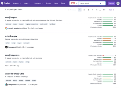
Socket's package search now displays weekly downloads for npm packages, helping developers quickly assess popularity and make more informed decisions.