Huge News!Announcing our $40M Series B led by Abstract Ventures.Learn More
Socket
Sign inDemoInstall
Socket

react-native-slider-picker

Package Overview
Dependencies
Maintainers
1
Versions
55
Alerts
File Explorer

Advanced tools

Socket logo

Install Socket

Detect and block malicious and high-risk dependencies

Install

react-native-slider-picker

Custom range slide picker for React Native. 🚧 UNDER CONSTRUCTION 🚧

  • 1.0.36
  • Source
  • npm
  • Socket score

Version published
Weekly downloads
22
decreased by-63.33%
Maintainers
1
Weekly downloads
 
Created
Source

React Native Slider Picker

A lean, custom React Native input component to select a single value on a scale from 0 to a maximum value of your choice.

🚧 🚧 This package is currently under construction 🚧 🚧

Installation

npm install react-native-slider-picker

Required dependencies

React Native Slider Picker sole dependency is react-native-css-vh-vw, which is used for height and width dimensions.

Usage

Props:

Note: All props are optional and have default values.

NameTypeDescriptionDefaultNotes
buttonBackgroundColorStringSets background color of Slider's button. Can pass valid React Native color keywords, hexidecimal, rgb(), or rgba() values."white"
buttonBorderColorStringSets border color of Slider's button. Can pass valid React Native color keywords, hexidecimal, rgb(), or rgba() values."dimgrey"
buttonBorderWidthNumberSets border width of Slider's button.1
buttonDimensionsPercentageNumberSets height and width of Slider's button as percentage of viewport width.1
callbackFunctionCalled on change.() => {}
defaultValueNumberDefault value for slider on load.5If valued passed is greater than maxValue, the value will be set to that of maxValue.
fillColorStringSets fill color of inner slider."dodgerblue"Can pass valid React Native color keywords, hexidecimal, rgb(), or rgba() values.
heightPercentageNumberPercentage of device's viewport to set as component's height.1Value passed to vh()
labelFontColorStringSets font color of labels if they are displayed."dimgrey"Can pass valid React Native color keywords, hexidecimal, rgb(), or rgba() values.
labelFontWeightStringSets font weight of labels if they are displayed."" -> the default fontWeight value in React Native.
maxLabelStringLabel for the maximum value.Empty <View> component.Empty <View> has a flex : 1 value.
maxValueNumberThe maximum value/high end of range for the Slider.10
midLabelStringLabel for the medium value.Empty <View> component.Empty <View> has a flex : 1 value.
minLabelStringLabel for the minimum value.Empty <View> component.Empty <View> has a flex: 1 value.
scaleNumberFontColorStringSets font color of scale numbers if they are displayed."dimgrey"Can pass valid React Native color keywords, hexidecimal, rgb(), or rgba() values.
scaleNumberFontWeightStringSets font weight of scale numbers if they are displayed."" -> the default fontWeight value in React Native.
showFillBooleanBoolean value to determine whether or not the slider inner shows a fill or if it is transparent.true
showNumberScaleBooleanBoolean value to determine whether or not to display scale of numbers for the Slider's range.false
showSeparatorScaleBooleanBoolean value to determine whether or not to display lines dividing the slider into different sections.false
sliderInnerBackgroundColorStringSets background color of inner slider View."white"Can pass valid React Native color keywords, hexidecimal, rgb(), or rgba() values.
sliderInnerBorderStylesObjectAn object of StyleSheet properties to set border-related styles of sliderInner View component.{ borderWidth: vw(1) / 2, borderColor: '#d9dce4', borderBottomColor: '#f1f4f5', borderRadius: 50 }If passed, the object is filtered to remove any key/value properties that are not for component's border.
widthPercentageNumberPercentage of device's viewport to set as component's width.85Value passed to vw()

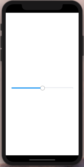
Basic, bare-bones usage:

import { SliderPicker } from 'react-native-slider-picker';

<SliderPicker />

Output:
react-native-slider-picker Basic Usage

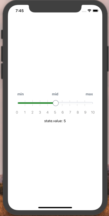
Usage with scale

import { SliderPicker } from 'react-native-slider-picker';

export class Demo extends React.Component {
  constructor(props) {
    super(props);

    this.state = { value: 5 };
  }
  
  render() {
    return (
      <View style={styles.container}>

        <Generics.SliderPicker 
          minLabel={'min'}
          midLabel={'mid'}
          maxLabel={'max'}
          maxValue={10}
          callback={position => {
            this.setState({ value: position });
          }}
          defaultValue={this.state.value}
          labelFontColor={"#6c7682"}
          labelFontWeight={'600'}
          showFill={true}
          fillColor={'green'}
          labelFontWeight={'bold'}
          showNumberScale={true}
          showSeparatorScale={true}
          buttonBackgroundColor={'#fff'}
          buttonBorderColor={"#6c7682"}
          buttonBorderWidth={1}
          scaleNumberFontWeight={'300'}
          buttonDimensionsPercentage={6}
          heightPercentage={1}
          widthPercentage={80}
        />
        
        <Text>state.value: {this.state.value}</Text>
      </View>
    );
  }
}

Output:
react-native-slider-picker With Scale

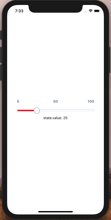
Usage with many props:

import { SliderPicker } from 'react-native-slider-picker';

export class Demo extends React.Component {
  constructor(props) {
    super(props);

    this.state = { value: 25 };
  }
  
  render() {
    return (
      <View style={styles.container}>

        <Generics.SliderPicker 
          minLabel={'0'}
          midLabel={'50'}
          maxLabel={'100'}
          maxValue={100}
          callback={position => {
            this.setState({ value: position });
          }}
          defaultValue={this.state.value}
          labelFontColor={"#6c7682"}
          labelFontWeight={'600'}
          showFill={true}
          fillColor={'red'}
          labelFontWeight={'bold'}
          showNumberScale={true}
          showSeparatorScale={true}
          buttonBackgroundColor={'#fff'}
          buttonBorderColor={"#6c7682"}
          buttonBorderWidth={1}
          scaleNumberFontWeight={'300'}
          buttonDimensionsPercentage={6}
          heightPercentage={1}
          widthPercentage={80}
        />
        
        <Text>state.value: {this.state.value}</Text>
      </View>
    );
  }
}

Output:
react-native-slider-picker With Many Props

Keywords

FAQs

Package last updated on 15 Apr 2020

Did you know?

Socket

Socket for GitHub automatically highlights issues in each pull request and monitors the health of all your open source dependencies. Discover the contents of your packages and block harmful activity before you install or update your dependencies.

Install

Related posts

SocketSocket SOC 2 Logo

Product

  • Package Alerts
  • Integrations
  • Docs
  • Pricing
  • FAQ
  • Roadmap
  • Changelog

Packages

npm

Stay in touch

Get open source security insights delivered straight into your inbox.


  • Terms
  • Privacy
  • Security

Made with ⚡️ by Socket Inc