react-native-stateless-form
-
Never again worry about scrolling and focusing form fields
-
Display icons and inline error messages with ease
-
Use any form state management tool you want
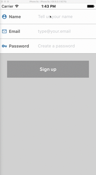
Screen capture
What it does
It implements the most common pattern of mobile form user interaction by convension over configuration. You'll never have to worry again about scrolling and focusing form fields.
- It uses inline form fields with icons and labels
- It displays different icons for valid and invalid field values
- It displays validation message inside the field
- When a field receives focus, it displays a keyboard (*)
- If it is not the last field in the form, the keyboard return key is set to
Next (**) - If it is the last field in the form, the keyboard return key is set to
Done and hides keaboard on return (**) - When a field receives focus, the form scrolls to the top of the field to avoid it being hidden behind the keyboard
- When all fields lose focus, the form scrolls back to the top of the form
(*) Unless an external keyboard is connected to the device
(**) On Android the return key button is always displayed as Done for now, since React Native does not support changing it yet. But the behaviour works correctly ;)
What it does NOT do
- It does not implement form validation. We recommend using validate-model for that. But you can use anything you want.
- It does not implement form state management. We recommend using Redux Form for that. But you can use anything you want.
- It does not implement a submit button and enabled/disabled/loading behaviour for you. We recommend using apsl-react-native-button for that. But you can use anything you want.
Support
- React Native 0.25+
- iOS
- Android (see installation below)
Inspiration
This package is inspired by FaridSafi/react-native-gifted-form, and my intention is to merge with it in the future.
The reason for creating a new package is that I want the form components to be presentational only, and not to store state at all. This way we can easily integrate with Redux Form, any other form management tool, or even implement our own form management.
Installation
npm install react-native-stateless-form --save
Android
You should add android:windowSoftInputMode="adjustNothing" attribute to the <activity> tag with android:name=".MainActivity" in your AndroidManifest.xml. Otherwise, it will have duplicate scroll behaviour.
Examples
The dirtiest example using React state
import React, { Component } from 'react-native'
import Icon from 'react-native-vector-icons/MaterialIcons'
import { StatelessForm, InlineTextInput } from 'react-native-stateless-form'

class Form extends Component {
  constructor(props, context) {
    super(props, context)
    this.state = {
      name: null,
      email: null,
      password: null,
    }
  }

  render() {
    const { name, email, password } = this.state
    const nameValid = (name && name.length > 0 ? true : false)
    const emailValid = /^[A-Z0-9._%+-]+@[A-Z0-9.-]+\.[A-Z]{2,4}$/i.test(email)
    const passwordValid = (password && password.length >= 8 ? true : false)
    return (
      <StatelessForm style={{
        flex: 1,
        marginTop: 20,
        backgroundColor: 'lightgray',
      }}>
        <InlineTextInput
          label='Name'
          placeholder='Tell us your name'
          style={{ borderColor: 'gray' }}
          labelStyle={{ color: 'dimgray' }}
          inputStyle={{ color: 'slategray' }}
          messageStyle={{ color: 'red' }}
          icon={ <Icon name={'account-circle'} size={18} color={'steelblue'} /> }
          validIcon={ <Icon name='check' size={18} color='green' /> }
          invalidIcon={ <Icon name='clear' size={18} color='red' /> }
          value={name}
          valid={nameValid}
          message={name && !nameValid ? 'Please fill your name' : null}
          onChangeText={(text) => { this.setState({name: text}) }}
        />
        <InlineTextInput
          label='Email'
          placeholder='type@your.email'
          autoCorrect={false}
          autoCapitalize='none'
          keyboardType='email-address'
          style={{ borderColor: 'gray' }}
          labelStyle={{ color: 'dimgray' }}
          inputStyle={{ color: 'slategray' }}
          messageStyle={{ color: 'red' }}
          icon={ <Icon name={'mail-outline'} size={18} color={'steelblue'} /> }
          validIcon={ <Icon name='check' size={18} color='green' /> }
          invalidIcon={ <Icon name='clear' size={18} color='red' /> }
          value={email}
          valid={emailValid}
          message={email && !emailValid ? 'Please enter a valid email address' : null}
          onChangeText={(text) => { this.setState({email: text}) }}
        />
        <InlineTextInput
          label='Password'
          placeholder='Create a password'
          autoCorrect={false}
          autoCapitalize='none'
          secureTextEntry={true}
          style={{ borderColor: 'gray' }}
          labelStyle={{ color: 'dimgray' }}
          inputStyle={{ color: 'slategray' }}
          messageStyle={{ color: 'red' }}
          icon={ <Icon name={'vpn-key'} size={18} color={'steelblue'} /> }
          validIcon={ <Icon name='check' size={18} color='green' /> }
          invalidIcon={ <Icon name='clear' size={18} color='red' /> }
          value={password}
          valid={passwordValid}
          message={password && !passwordValid ? 'Password too short' : null}
          onChangeText={(text) => { this.setState({password: text}) }}
        />
      </StatelessForm>
    )
  }
}

import { AppRegistry } from 'react-native'
AppRegistry.registerComponent('Form', () => Form)
Create your own component to keep it DRY
import React, { Component, PropTypes } from 'react-native'
import Icon from 'react-native-vector-icons/MaterialIcons'
import { StatelessForm, InlineTextInput } from 'react-native-stateless-form'
class FormInput extends Component {
focus() {
this.refs.input.focus()
}
blur() {
this.refs.input.blur()
}
render() {
const { iconName } = this.props
return (
<InlineTextInput
ref='input' // This is necessary for focus() and blur() implementation to work
style={{ borderColor: 'gray' }}
labelStyle={{ color: 'dimgray' }}
inputStyle={{ color: 'slategray' }}
messageStyle={{ color: 'red' }}
icon={ <Icon name={iconName} size={18} color={'steelblue'} /> }
validIcon={ <Icon name='check' size={18} color='green' /> }
invalidIcon={ <Icon name='clear' size={18} color='red' /> }
{ ...this.props }
/>
)
}
}
FormInput.propTypes = {
value: PropTypes.string,
valid: PropTypes.bool,
}
class Form extends Component {
constructor(props, context) {
super(props, context)
this.state = {
name: null,
email: null,
password: null,
}
}
render() {
const { name, email, password } = this.state
const nameValid = (name && name.length > 0 ? true : false)
const emailValid = /^[A-Z0-9._%+-]+@[A-Z0-9.-]+\.[A-Z]{2,4}$/i.test(email)
const passwordValid = (password && password.length >= 8 ? true : false)
return (
<StatelessForm style={{flex: 1, marginTop: 20, backgroundColor: 'lightgray'}}>
<FormInput
label='Name'
placeholder='Tell us your name'
iconName='account-circle'
value={name}
valid={nameValid}
message={name && !nameValid ? 'Please fill your name' : null}
onChangeText={(text) => { this.setState({name: text}) }}
/>
<FormInput
label='Email'
placeholder='type@your.email'
autoCorrect={false}
autoCapitalize='none'
keyboardType='email-address'
iconName='mail-outline'
value={email}
valid={emailValid}
message={email && !emailValid ? 'Please enter a valid email address' : null}
onChangeText={(text) => { this.setState({email: text}) }}
/>
<FormInput
label='Password'
placeholder='Create a password'
autoCorrect={false}
autoCapitalize='none'
secureTextEntry={true}
iconName='vpn-key'
value={password}
valid={passwordValid}
message={password && !passwordValid ? 'Password too short' : null}
onChangeText={(text) => { this.setState({password: text}) }}
/>
</StatelessForm>
)
}
}
import { AppRegistry } from 'react-native'
AppRegistry.registerComponent('Form', () => Form)
Usage with validate-model
import React, { Component, PropTypes } from 'react-native'
import Icon from 'react-native-vector-icons/MaterialIcons'
import { StatelessForm, InlineTextInput } from 'react-native-stateless-form'
import { validate } from 'validate-model'

const UserValidators = {
  name: {
    title: 'Name',
    validate: [{
      validator: 'isLength',
      arguments: [1, 255],
    }]
  },
  email: {
    title: 'Email',
    validate: [{
      validator: 'isLength',
      arguments: [1, 255],
    },
    {
      validator: 'isEmail',
      message: '{TITLE} must be valid',
    }]
  },
  password: {
    title: 'Password',
    validate: [{
      validator: 'isLength',
      arguments: [8, 255],
      message: '{TITLE} is too short',
    }]
  },
}

class FormInput extends Component {
  focus() {
    this.refs.input.focus()
  }

  blur() {
    this.refs.input.blur()
  }

  render() {
    const { iconName, name, value } = this.props
    const { valid, messages } = validate(UserValidators[name], value)
    const message = (messages && messages.lenght > 0 ? messages[0] : null)
    return (
      <InlineTextInput
        ref='input'
        style={{ borderColor: 'gray' }}
        labelStyle={{ color: 'dimgray' }}
        inputStyle={{ color: 'slategray' }}
        messageStyle={{ color: 'red' }}
        icon={ <Icon name={iconName} size={18} color={'steelblue'} /> }
        validIcon={ <Icon name='check' size={18} color='green' /> }
        invalidIcon={ <Icon name='clear' size={18} color='red' /> }
        valid={valid}
        message={message}
        { ...this.props }
      />
    )
  }
}

FormInput.propTypes = {
  value: PropTypes.string,
  valid: PropTypes.bool,
}

class Form extends Component {
  constructor(props, context) {
    super(props, context)
    this.state = {
      name: null,
      email: null,
      password: null,
    }
  }

  render() {
    const { name, email, password } = this.state
    return (
      <StatelessForm style={{flex: 1, marginTop: 20, backgroundColor: 'lightgray'}}>
        <FormInput
          name='name'
          label='Name'
          placeholder='Tell us your name'
          iconName='account-circle'
          value={name}
          onChangeText={(text) => { this.setState({name: text}) }}
        />
        <FormInput
          name='email'
          label='Email'
          placeholder='type@your.email'
          autoCorrect={false}
          autoCapitalize='none'
          keyboardType='email-address'
          iconName='mail-outline'
          value={email}
          onChangeText={(text) => { this.setState({email: text}) }}
        />
        <FormInput
          name='password'
          label='Password'
          placeholder='Create a password'
          autoCorrect={false}
          autoCapitalize='none'
          secureTextEntry={true}
          iconName='vpn-key'
          value={password}
          onChangeText={(text) => { this.setState({password: text}) }}
        />
      </StatelessForm>
    )
  }
}

import { AppRegistry } from 'react-native'
AppRegistry.registerComponent('Form', () => Form)
Usage with Redux Form
import React, { Component, PropTypes } from 'react-native'
import Icon from 'react-native-vector-icons/MaterialIcons'
import { StatelessForm, InlineTextInput } from 'react-native-stateless-form'
import { validateAll } from 'validate-model'
import { Provider } from 'react-redux'
import { createStore, combineReducers, applyMiddleware } from 'redux'
import { reduxForm, reducer as formReducer } from 'redux-form'
import createLogger from 'redux-logger'

const UserValidators = {
  name: {
    title: 'Name',
    validate: [{
      validator: 'isLength',
      arguments: [1, 255],
    }]
  },
  email: {
    title: 'Email',
    validate: [{
      validator: 'isLength',
      arguments: [1, 255],
    },
    {
      validator: 'isEmail',
      message: '{TITLE} must be valid',
    }]
  },
  password: {
    title: 'Password',
    validate: [{
      validator: 'isLength',
      arguments: [8, 255],
      message: '{TITLE} is too short',
    }]
  },
}

const validate = values => {
  const validation = validateAll(UserValidators, values)
  if (!validation.valid) return validation.messages
  return {}
}

class FormInput extends Component {
  focus() {
    this.refs.input.focus()
  }

  blur() {
    this.refs.input.blur()
  }

  render() {
    const { iconName, name, value, error } = this.props
    const message = ( error && error.length > 0 ? error[0] : null)
    return (
      <InlineTextInput
        ref='input'
        style={{ borderColor: 'gray' }}
        labelStyle={{ color: 'dimgray' }}
        inputStyle={{ color: 'slategray' }}
        messageStyle={{ color: 'red' }}
        icon={ <Icon name={iconName} size={18} color={'steelblue'} /> }
        validIcon={ <Icon name='check' size={18} color='green' /> }
        invalidIcon={ <Icon name='clear' size={18} color='red' /> }
        message={message}
        { ...this.props }
      />
    )
  }
}

FormInput.propTypes = {
  value: PropTypes.string,
  valid: PropTypes.bool,
}

class Form extends Component {
  render() {
    const { fields: { name, email, password } } = this.props
    return (
      <StatelessForm style={{flex: 1, marginTop: 20, backgroundColor: 'lightgray'}}>
        <FormInput
          name='name'
          label='Name'
          placeholder='Tell us your name'
          iconName='account-circle'
          { ...name }
        />
        <FormInput
          name='email'
          label='Email'
          placeholder='type@your.email'
          autoCorrect={false}
          autoCapitalize='none'
          keyboardType='email-address'
          iconName='mail-outline'
          { ...email }
        />
        <FormInput
          name='password'
          label='Password'
          placeholder='Create a password'
          autoCorrect={false}
          autoCapitalize='none'
          secureTextEntry={true}
          iconName='vpn-key'
          { ...password }
        />
      </StatelessForm>
    )
  }
}

Form = reduxForm({
  form: 'user',
  fields: ['name', 'email', 'password'],
  validate
})(Form);

const reducers = {
  form: formReducer
}
const reducer = combineReducers(reducers)
const createStoreWithMiddleware = applyMiddleware(createLogger())(createStore)
function configureStore(initialState) {
  return createStoreWithMiddleware(reducer, initialState)
}
const store = configureStore()

const Root = () => (
  <Provider store={store}>
    <Form />
  </Provider>
)

import { AppRegistry } from 'react-native'
AppRegistry.registerComponent('Form', () => Root)
StatelessForm
A wrapper that will manage auto-focusing and auto-scrolling for its children components
| Property | Type | Default | Description |
|---|
| style | style | {} | Style for the form wrapper |
+ Any other ScrollView prop you wish to pass.
Components
InlineTextInput
| Property | Type | Default | Description |
|---|
| label | string | 'Use label prop' | Label for the text input |
| value | string | null | Value for the text input |
| valid | boolean | false | Whether the value is valid or not |
| message | string | null | Validation message to be shown |
| style | style | {} | Style changes to the main ScrollView |
| iconStyle | style | {} | Style changes to the icon View |
| labelStyle | style | {} | Style changes to the label Text |
| inputStyle | style | {} | Style changes to the TextInput |
| messageStyle | style | {} | Style changes to the validation message Text |
| icon | element | null | Any react component to be used as icon |
| validIcon | element | null | Any react component to be used as icon when valid. Requires icon prop |
| invalidIcon | element | null | Any react component to be used as icon when invalid. Requires icon prop |
+ Any other TextInput prop you wish to pass.
Other components
My intention is to implement most of FaridSafi/react-native-gifted-form's components. But I'll do each one only when I need it in a real project, so it might take some time.
PR's are very much welcome!
Creating new components
Any react component can be rendered inside Stateless Form as a component. But there is a special case below:
Focusable input components
If you want your component to receive focus when previous component finished editing, you must implement the following pattern:
- Your component should implement the
focus() method. - Your component should implement the
blur() method. - Your component should implement
onSubmitEditing or equivalent and call this.props.onNextInputFocus(this.props.nextInput, this) so StatelessForm can focus the next input or blur the current input. - Your component must have
valid and value on its propTypes. This is how StatelessForm will recognize it as a focusable and/or scrollable input component. It is important that only focusable or scrollable components have these props on propTypes.
Scrollable input components
If you want your component to receive scroll when showing keyboard, you must implement the following pattern:
- Your component should implement
onFocus and call this.props.onFocus(scrollTo) on focus. scrollTo must be your component's y position. - You can get your
y position using onLayout prop. Check InlineTextInput for references on how to implement it. - Your component should implement
onBlur and call this.props.onBlur on blur. - Your component also must have
valid and value on its propTypes.
Contributing
Please create issues and send pull requests!
License
MIT


