Research
Security News
Malicious npm Packages Inject SSH Backdoors via Typosquatted Libraries
Socket’s threat research team has detected six malicious npm packages typosquatting popular libraries to insert SSH backdoors.
react-native-swipe-item
Advanced tools
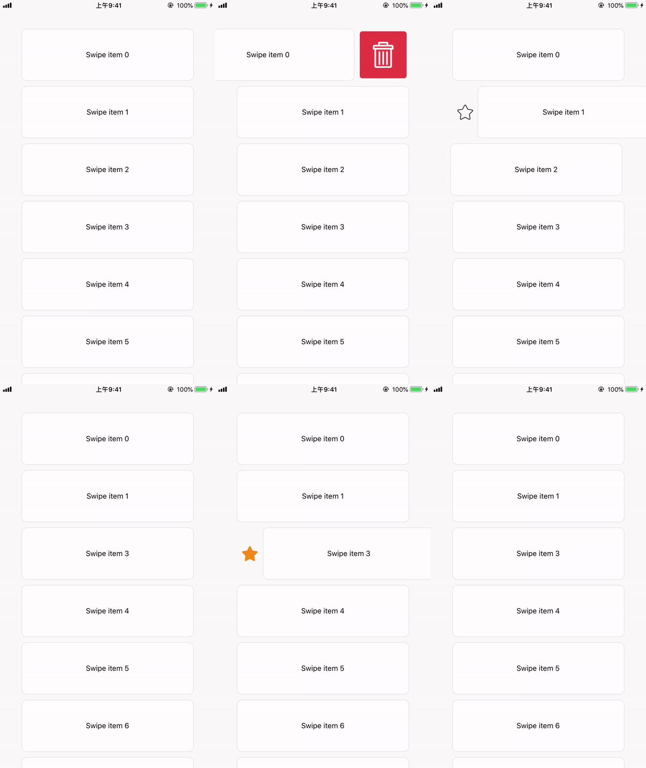
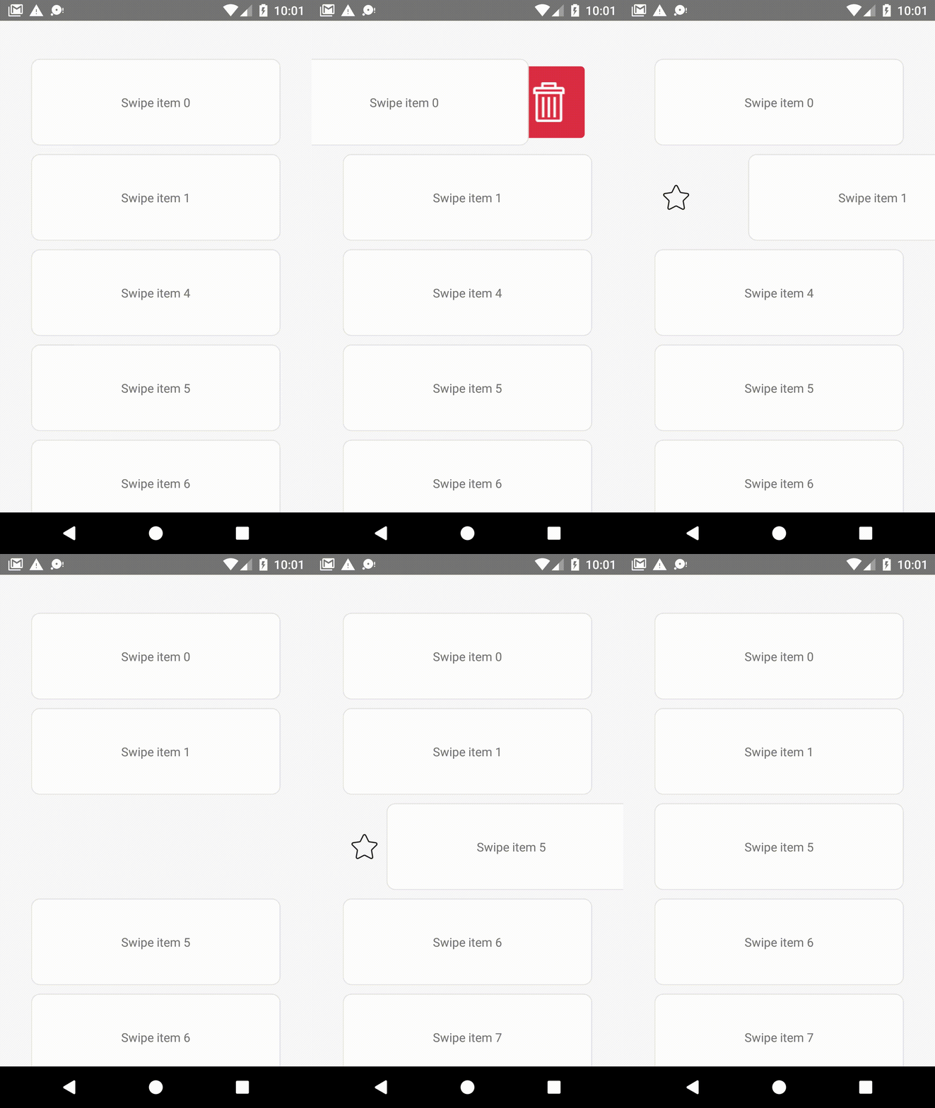
A swipe item for react-native. Support both iOS and Android.


See react-native-swipe-item-demo.
npm i --save react-native-swipe-item
0.5.0.You can use the SwipeButtonsContainer to wrap buttons that you want to show when users swipe the item, and pass it to props.
import { SwipeItem, SwipeButtonsContainer, SwipeProvider } from 'react-native-swipe-item';

export default function SwipeButtonCustom() {

    const leftButton = (
        <SwipeButtonsContainer
            style={{
                alignSelf: 'center',
                aspectRatio: 1,
                flexDirection: 'column',
                padding: 10,
            }}

        >
            <TouchableOpacity
                onPress={() => console.log('left button clicked')}
            >
                <Text>Click me !</Text>
            </TouchableOpacity>
        </SwipeButtonsContainer>
    );

    return (
        <SwipeProvider>
            <SwipeItem
                style={styles.button}
                swipeContainerStyle={styles.swipeContentContainerStyle}
                leftButtons={leftButton}
            >
                <Text>
                    Swipe me!
                </Text>
            </SwipeItem>
            <SwipeItem>
                ...
            </SwipeItem>
        </SwipeProvider>
    );
}

const styles = StyleSheet.create({
    button: {
        width: '80%',
        height: 100,
        alignSelf: 'center',
        marginVertical: 5,
    },
    swipeContentContainerStyle: {
        justifyContent: 'center',
        alignItems: 'center',
        backgroundColor: '#ffffff',
        borderRadius: 10,
        borderColor: '#e3e3e3',
        borderWidth: 1,
    }
});
SwipeProvider since v0.6.0
SwipeItem
SwipeButtonsContainer
SwipeProvider PropsSwipe items mode, default is single.
| TYPE | REQUIRED |
|---|---|
single | multiple | No |
single: only allow one swipe item to be opened. The opened swipe item would be automatically closed when the new swipe item triggers the close event. (see the closeTrigger prop for more detail.)
multiple: allow multiple swipe items to be opened.
The trigger for automatically closed swipe item , only works when the mode prop is single, default is onItemMoved.
| TYPE | REQUIRED |
|---|---|
onItemMoved | onButtonShowed | No |
onItemMoved: when the swipe item is moved, the opened one will be closed.
onButtonShowed: when the swipe item button is showing, the opened one will be closed.
SwipeItem PropsThese styles will be applied to the swipe item layout.
| TYPE | REQUIRED |
|---|---|
| style | No |
These styles will be applied to the swipe item container which user swipe.
Example:
return (
        <SwipeItem swipeContainerStyle={styles.swipeContentContainerStyle} >
        </SwipeItem>
    );
}

const styles = StyleSheet.create({
    swipeContentContainerStyle: {
        justifyContent: 'center',
        alignItems: 'center',
        backgroundColor: '#ffffff',
        borderRadius: 10,
        borderColor: '#e3e3e3',
        borderWidth: 1,
    }
});
| TYPE | REQUIRED |
|---|---|
| style | No |
Buttons that want to show on the left when the item swiped to right.
| TYPE | REQUIRED |
|---|---|
SwipeButtonsContainer | No |
Buttons that want to show on the right when the item swiped to left.
| TYPE | REQUIRED |
|---|---|
SwipeButtonsContainer | No |
The component for the swipe item.
Example:
import ViewOverflow from 'react-native-view-overflow';
...
...
export default function SwipeButtonCustom() {
    return (
        <SwipeItem
            style={styles.button}
            swipeContainerStyle={styles.swipeContentContainerStyle}
            containerView={ViewOverflow}
        >
            <Text>
                Swipe me!
            </Text>
        </SwipeItem>
    );
}
...
| TYPE | REQUIRED | PLATFORM |
|---|---|---|
ViewOverflow | Yes | Android |
This prop will be called when the item started swipe from the origin position, and the SwipeItem reference passed as an argument.
This prop will be called when left buttons showed, and the SwipeItem reference passed as an argument.
This prop will be called when right buttons showed, and the SwipeItem reference passed as an argument.
This prop will be called when the item moved to the origin, and the SwipeItem reference passed as an argument.
since v0.4
Disable the swipe feature when there are no buttons.
| TYPE | REQUIRED |
|---|---|
boolean | No |
SwipeItem Ref MethodsClose the swipe item.
Example:
const itemRef = useRef(null);
...
itemRef.current.close();
...
<SwipeItem ref={itemRef} >
    ...
</SwipeItem>
SwipeButtonsContainer PropsThis component extends react-native View props.
MIT
FAQs
The swipeale item for react-native
The npm package react-native-swipe-item receives a total of 269 weekly downloads. As such, react-native-swipe-item popularity was classified as not popular.
We found that react-native-swipe-item demonstrated a not healthy version release cadence and project activity because the last version was released a year ago. It has 1 open source maintainer collaborating on the project.
Did you know?

Socket for GitHub automatically highlights issues in each pull request and monitors the health of all your open source dependencies. Discover the contents of your packages and block harmful activity before you install or update your dependencies.

Research
Security News
Socket’s threat research team has detected six malicious npm packages typosquatting popular libraries to insert SSH backdoors.

Security News
MITRE's 2024 CWE Top 25 highlights critical software vulnerabilities like XSS, SQL Injection, and CSRF, reflecting shifts due to a refined ranking methodology.

Security News
In this segment of the Risky Business podcast, Feross Aboukhadijeh and Patrick Gray discuss the challenges of tracking malware discovered in open source softare.