
Research
/Security News
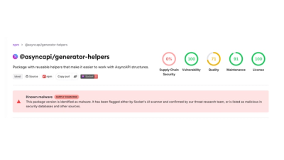
Compromised npm Packages in the AsyncAPI Namespace Deliver Miasma Botnet Loader
4 compromised asyncapi packages deliver miasma botnet loader on macOS, Linux and Windows.
By Socket Research Team - Jul 14, 2026
react-native-tags-input
Advanced tools
Fully customizable React Native input-component to add tags to an array. The tags are displayed as chips that can be deleted.
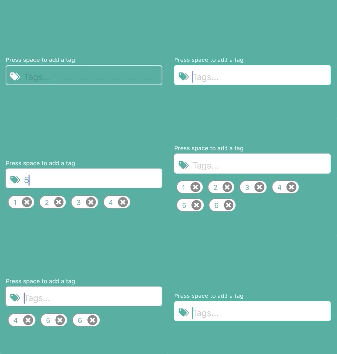
https://www.npmjs.com/package/react-native-tags-input
https://github.com/jimmybengtsson/react-native-tags-input
$ npm install react-native-tags-input --save
| necessary | types | about | |
|---|---|---|---|
| tags | ✓ | object | Object containing a empty string called tag and a empty array called tagsArray |
| updateState | ✓ | func | Function to pass for component to be able to update parents state |
| keysForTag | string | String to decide when a tag will be added. Space for standard | |
| containerStyle | styles | Styles for the most outer view component | |
| label | string | Text to appear on top of input | |
| labelStyle | styles | Styles for label text | |
| inputContainerStyle | styles | Styles for the outer input component | |
| inputStyle | styles | Styles for the inner input component | |
| leftElement | element | Element to be passed to input. Such as an icon. | |
| leftElementContainerStyle | styles | Styles for the left element inside input | |
| rightElement | element | Element to be passed to input. Such as an icon. | |
| rightElementContainerStyle | styles | Styles for the right element inside input | |
| tagsViewStyle | styles | Styles for the view component containing the tag-chips | |
| tagStyle | styles | Styles for the tag-chips | |
| tagTextStyle | styles | Styles for the text inside a tag-chip | |
| disabled | boolean | Active input or not? false for standard | |
| disabledInputStyle | styles | Styles for when the input is disabled | |
| deleteElement | element | If this is included, the delete icon will be replaced by the element provided. (Thanks to periabyte) | |
| deleteIconStyles | styles | Styles for the delete icon | |
| customElement | element | Element to be displayed between input and tags. For example suggestions. (Auto suggestions will be implemented in a future release) |
This component also inherits all native TextInput props that come with a standard React Native TextInput element.
Auto suggest example by using customElement-prop

import React, { Component } from 'react';
import {
  Dimensions,
  StyleSheet,
  View
} from 'react-native';

import TagInput from 'react-native-tags-input';

export default class App extends React.Component {
  constructor(props) {
    super(props);
    this.state = {
      tags: {
        tag: '',
        tagsArray: []
      },
    };
  }

  updateTagState = (state) => {
      this.setState({
        tags: state
      })
    };

  render() {
    return (
      <View style={styles.container}>
        <TagInput
          updateState={this.updateTagState}
          tags={this.state.tags}
          />
      </View>
    );
  }
}

const styles = StyleSheet.create({
  container: {
    flex: 1,
    justifyContent: 'center',
    alignItems: 'center',
  },
});
import React, { Component } from 'react';
import {
  Dimensions,
  StyleSheet,
  View
} from 'react-native';
import {Icon} from 'react-native-elements';

import TagInput from 'react-native-tags-input';

const mainColor = '#3ca897';

export default class App extends React.Component {
  constructor(props) {
    super(props);
    this.state = {
      tags: {
        tag: '',
        tagsArray: []
      },
      tagsColor: mainColor,
      tagsText: '#fff',
    };
  }

  updateTagState = (state) => {
      this.setState({
        tags: state
      })
    };

  render() {
    return (
      <View style={styles.container}>
        <TagInput
          updateState={this.updateTagState}
          tags={this.state.tags}
          placeholder="Tags..."
          label='Press comma & space to add a tag'
          labelStyle={{color: '#fff'}}
          leftElement={<Icon name={'tag-multiple'} type={'material-community'} color={this.state.tagsText}/>}
          leftElementContainerStyle={{marginLeft: 3}}
          containerStyle={{width: (Dimensions.get('window').width - 40)}}
          inputContainerStyle={[styles.textInput, {backgroundColor: this.state.tagsColor}]}
          inputStyle={{color: this.state.tagsText}}
          onFocus={() => this.setState({tagsColor: '#fff', tagsText: mainColor})}
          onBlur={() => this.setState({tagsColor: mainColor, tagsText: '#fff'})}
          autoCorrect={false}
          tagStyle={styles.tag}
          tagTextStyle={styles.tagText}
          keysForTag={', '}/>
      </View>
    );
  }
}

const styles = StyleSheet.create({
  container: {
    flex: 1,
    justifyContent: 'center',
    alignItems: 'center',
    backgroundColor: mainColor,
  },
  textInput: {
      height: 40,
      borderColor: 'white',
      borderWidth: 1,
      marginTop: 8,
      borderRadius: 5,
      padding: 3,
    },
    tag: {
        backgroundColor: '#fff'
      },
    tagText: {
        color: mainColor
      },
});
Pull requests are welcome. For major changes, please open an issue first to discuss what you would like to change.
react-native-tags-input is MIT License @ Jimmy Bengtsson
FAQs
Did you know?

Socket for GitHub automatically highlights issues in each pull request and monitors the health of all your open source dependencies. Discover the contents of your packages and block harmful activity before you install or update your dependencies.
Research
/Security News
4 compromised asyncapi packages deliver miasma botnet loader on macOS, Linux and Windows.
Research
/Security News
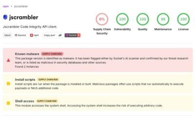
A compromised jscrambler npm release added a malicious preinstall hook that runs hidden native binaries on Linux, macOS, and Windows.

Research
/Security News
A malicious .NET package is typosquatting the Braintree SDK to steal live payment card data, merchant API keys, and host secrets from production apps.