Research
Security News
Kill Switch Hidden in npm Packages Typosquatting Chalk and Chokidar
Socket researchers found several malicious npm packages typosquatting Chalk and Chokidar, targeting Node.js developers with kill switches and data theft.
react-path-tooltip
Advanced tools


A simple react tooltip component for SVG paths, also known as SVGElements.
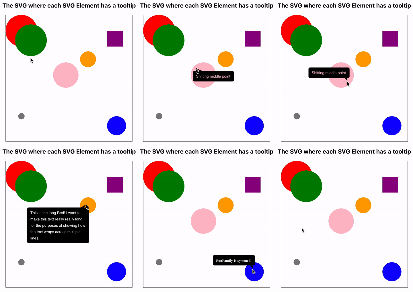
The component detects the visual context, such as SVG size, path relative location and size, and the display size needed for the text, and calculates an optimal orientation and rendering approach. See the sample below for better explanation.

See the code for this simple example here.
In order to install, run the following command:
$ npm install react-path-tooltip --save
A very simple `App.tsx' example:
import React from "react"
import "./App.css"
import { PathTooltip } from "ReactPathTooltip" // import the package

function App() {

  const svgRef = React.createRef<SVGSVGElement>()
  const pathRef = React.createRef<SVGCircleElement>()

  return (
    < div className="App" >
      < div className="Main">
        <svg width="400" height="400" ref={svgRef}>
          <circle cx={50} cy={50} r={50} fill="red" ref={pathRef} />
          <PathTooltip svgRef={svgRef} pathRef={pathRef} tip="Hello World!" />
        </svg>
      </div>
    </div>
  )
}

export default App
The following parameters are passed to the tooltip component:
| Prop | Type | Description |
|---|---|---|
| tip | string | Mandatory. The text to be displayed inside the tooltip. Must include simple text. No new lines, or html decoration |
| svgRef | React.RefObject | Mandatory. A React reference object to the SVG element |
| pathRef | React.RefObject | Mandatory. A React reference object to the path element bounded to the tooltip. Must be a valid reference to a path element. There are a number of such types such as SVGRectElement, SVGCircleElement, etc |
| bgColor | string | Optional. Background color. Default: "black" |
| textColor | string | Optional. Text color. Default: "white" |
| fontFamily | string | Optional. The font family. Default: san-serif |
| fontSize | number | Optional. The font size. Default 12 |
MIT
FAQs
A tooltip for SVG paths in React
The npm package react-path-tooltip receives a total of 5,437 weekly downloads. As such, react-path-tooltip popularity was classified as popular.
We found that react-path-tooltip demonstrated a not healthy version release cadence and project activity because the last version was released a year ago. It has 1 open source maintainer collaborating on the project.
Did you know?

Socket for GitHub automatically highlights issues in each pull request and monitors the health of all your open source dependencies. Discover the contents of your packages and block harmful activity before you install or update your dependencies.

Research
Security News
Socket researchers found several malicious npm packages typosquatting Chalk and Chokidar, targeting Node.js developers with kill switches and data theft.

Security News
pnpm 10 blocks lifecycle scripts by default to improve security, addressing supply chain attack risks but sparking debate over compatibility and workflow changes.

Product
Socket now supports uv.lock files to ensure consistent, secure dependency resolution for Python projects and enhance supply chain security.