React Photo Album
React Photo Album is a responsive photo gallery component for React. React Photo
Album supports rows, columns, and masonry layouts. Inspired by
react-photo-gallery,
re-engineered from the ground up.
Overview


- Built for React: works with React 18, 17 and 16.8.0+
- SSR friendly: produces server-side rendered markup that looks pixel
perfect on the client even before hydration
- Responsive images: responsive images with automatic resolution switching
are supported out of the box
- Feature packed: supports 3 layout options (rows, columns and masonry),
responsive images, custom data attributes and is fully configurable and
customizable
- TypeScript: type definitions come built-in in the package
- Performance: it was built with performance in mind in order to support
large photo albums and silky smooth layout adjustments
Layouts
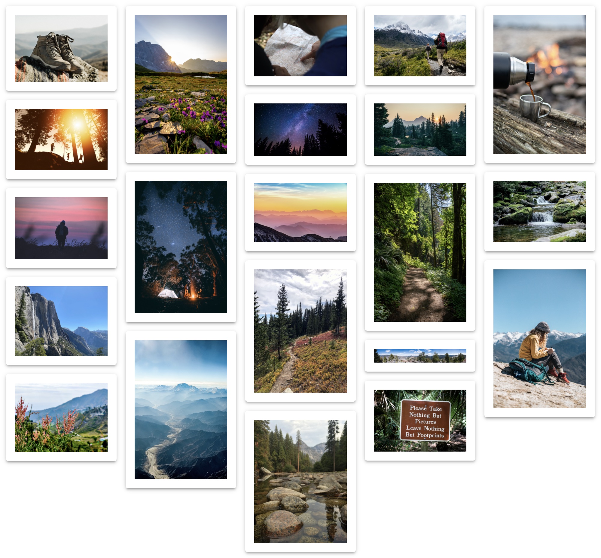
Rows
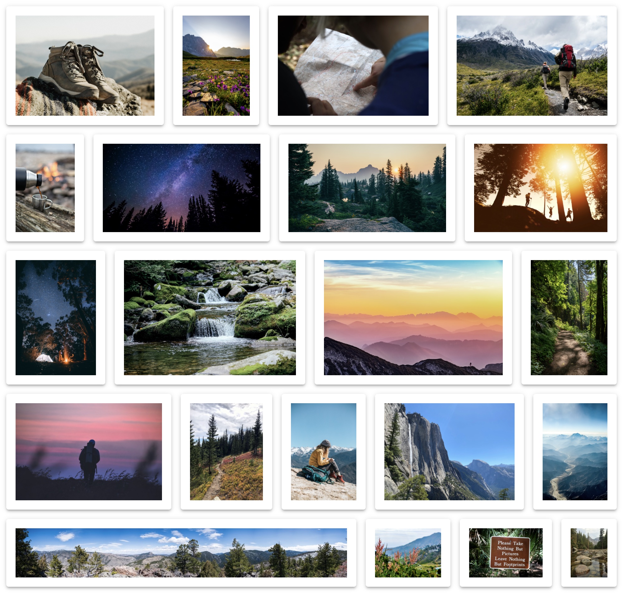
Columns

Masonry
Documentation
https://react-photo-album.com/documentation
Examples
https://react-photo-album.com/examples
Changelog
https://github.com/igordanchenko/react-photo-album/releases
Installation
npm install react-photo-album
Minimal Setup Example
import PhotoAlbum from "react-photo-album";

const photos = [
  { src: "/images/image1.jpg", width: 800, height: 600 },
  { src: "/images/image2.jpg", width: 1600, height: 900 },
];

export default function Gallery() {
  return <PhotoAlbum layout="rows" photos={photos} />;
}
How It Works
Rows Layout
Rows layout fills the rectangular container space by arranging photos into rows
that are similar in size, with the height of each row being as close to the
targetRowHeight as possible. This layout uses an algorithm adapted from the
Knuth and Plass line breaking algorithm. To calculate the single best layout, it
uses Dijkstra's algorithm to find the shortest past in a graph where each photo
to break on represents a node, and each row represents an edge. The cost of each
edge is calculated as the squared deviation from the targetRowHeight. This
algorithm produces rows that are similar in height and photos that are not being
stretched or shrunken abnormally (as is what happens in a naive implementation).
It solves the issue of panoramas shrinking rows or having stragglers or
stretched images in the last row, instead creating a justified grid. The graph
is being built as the shortest path is being calculated to improve algorithm's
performance, so the entire adjacency list is not calculated ahead of time.
Columns Layout
Columns layout fills the rectangular container space by arranging photos into a
predefined number of columns, determined by the columns parameter. This layout
uses an algorithm very similar to the one described above, but instead of
Dijkstra's algorithm, it uses a dynamic programming algorithm to find the
shortest path of length N in a directed weighted graph.
Masonry Layout
Masonry layout arranges photos into columns of equal width by placing each photo
into the shortest column. This layout does not completely fill the rectangular
container space, but the columns end up being as close in height to each other
as possible.
Responsive Images
React Photo Album automatically generates sizes and srcset image attributes.
In the case of SSR, React Photo Album includes sizes and srcset image
attributes in the server-rendered markup, allowing browsers to pick images of
the most appropriate resolution depending on their viewport size. To enable
images with automatic resolution switching, simply provide smaller images in the
photo srcSet attribute.
import PhotoAlbum from "react-photo-album";

const photos = [
  {
    src: "/images/image1_800x600.jpg",
    width: 800,
    height: 600,
    srcSet: [
      { src: "/images/image1_400x300.jpg", width: 400, height: 300 },
      { src: "/images/image1_200x150.jpg", width: 200, height: 150 },
    ],
  },
  {
    src: "/images/image2_1600x900.jpg",
    width: 1600,
    height: 900,
    srcSet: [
      { src: "/images/image2_800x450.jpg", width: 800, height: 450 },
      { src: "/images/image2_400x225.jpg", width: 400, height: 225 },
    ],
  },
];

export default function Gallery() {
  return <PhotoAlbum layout="rows" photos={photos} />;
}
SSR
React Photo Album extensively uses CSS flexbox and CSS calc function to
calculate the dimensions of images on the client. Unlike its predecessor, React
Photo Album avoids setting the exact dimensions of images in pixels. Thanks to
this approach, server-side rendered markup looks pixel-perfect on the client
even before hydration (or even when JavaScript is completely disabled in the
browser). To enable server-side rendering, be sure to specify
defaultContainerWidth prop. Otherwise, React Photo Album produces empty markup
on the server and renders on the client only after hydration.
Credits
Thanks to Sandra G (aka neptunian) for authoring
the original
react-photo-gallery library
that served as inspiration and foundation for
react-photo-album.
License
MIT © 2021 Igor Danchenko


