Research
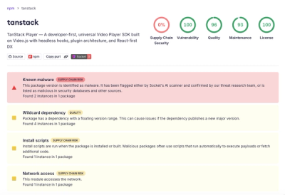
Malicious npm Package Brand-Squats TanStack to Exfiltrate Environment Variables
A brand-squatted TanStack npm package used postinstall scripts to steal .env files and exfiltrate developer secrets to an attacker-controlled endpoint.
react-range
Advanced tools

See all the other examples and their source code! Try it out in the Stackblitz sandbox!
pnpm add react-range
import * as React from "react";
import { Range } from "react-range";

const SuperSimple: React.FC = () => {
  const [values, setValues] = React.useState([50]);
  return (
    <Range
      label="Select your value"
      step={0.1}
      min={0}
      max={100}
      values={values}
      onChange={(values) => setValues(values)}
      renderTrack={({ props, children }) => (
        <div
          {...props}
          style={{
            ...props.style,
            height: "6px",
            width: "100%",
            backgroundColor: "#ccc",
          }}
        >
          {children}
        </div>
      )}
      renderThumb={({ props }) => (
        <div
          {...props}
          key={props.key}
          style={{
            ...props.style,
            height: "42px",
            width: "42px",
            backgroundColor: "#999",
          }}
        />
      )}
    />
  );
};
aria patterns for assistive technologies, check a11y part for accessibility infotab and shift+tab to focus thumbsarrow up or arrow right or k to increase the thumb value by one steparrow down or arrow left or j to decrease the thumb value by one steppage up to increase the thumb value by ten stepspage down to decrease the thumb value by ten stepsYou are responsible for the accessibility name!
Default accessibility name is Accessibility label, set with code: aria-label="Accessibility label", but is not visible (only for screen-readers and other assistive tech),
so make sure to use correct name by passing it to the prop called label.
If you want to have a visible label (best practice), then use labelledBy.
You naming options are:
label prop (translates to aria-label in the code)labelledBy prop (translates to aria-labellebdy in the code)Please check Basic and Basic visible label examples for more info.
Aria used on the component is following Accessible Rich Internet Applications (WAI-ARIA) 1.2 slider role, but please be aware that different assistive technologies provide different support (especially in combination with operating systems and browsers).
Therefore please make sure to test it yourself and with people with disabilities. We can not provide prompt information about support, but are happy to add your findings to this Readme.
We need to do more testing to claim any conformance. We did make sure the component is operable with keyboard, that it is respecting ARIA patterns for slider role and having possibility to name the component (accessible name). You are welcome to report any accessibility related findings, we look forward to add information about user tests and support for assistive technologies.
<Range /> propsrenderTrack: (params: {
props: {
style: React.CSSProperties;
ref: React.RefObject<any>;
onMouseDown: (e: React.MouseEvent) => void;
onTouchStart: (e: React.TouchEvent) => void;
};
children: React.ReactNode;
isDragged: boolean;
disabled: boolean;
}) => React.ReactNode;
renderTrack prop to define your track (root) element. Your function gets four parameters and should return a React component:
props - this needs to be spread over the root track element, it connects mouse and touch events, adds a ref and some necessary stylingchildren - the rendered thumbs, thumb structure should be specified in a different prop - renderThumbisDragged - true if any thumb is being draggeddisabled - true if <Range disabled={true} /> is setThe track can be a single narrow div as in the Super simple example; however, it might be better to use at least two nested divs where the outer div is much thicker and has a transparent background and the inner div is narrow, has visible background and is centered. props should be then spread over the outer bigger div. Why to do this? It's nice to keep the onMouseDown and onTouchStart targets bigger since the thumb can be moved also by clicking on the track (in a single thumb scenario).
renderThumb: (params: {
  props: {
    key: number;
    style: React.CSSProperties;
    tabIndex?: number;
    "aria-valuemax": number;
    "aria-valuemin": number;
    "aria-valuenow": number;
    draggable: boolean;
    role: string;
    onKeyDown: (e: React.KeyboardEvent) => void;
    onKeyUp: (e: React.KeyboardEvent) => void;
  };
  value: number;
  index: number;
  isDragged: boolean;
}) => React.ReactNode;
renderThumb prop to define your thumb. Your function gets four parameters and should return a React component:
props - it has multiple props that you need to spread over your thumb elementvalue - a number, relative value based on min, max, step and the thumb's positionindex - the thumb index (order)isDragged - true if the thumb is dragged, great for styling purposesrenderMark?: (params: {
props: {
key: string;
style: React.CSSProperties;
ref: React.RefObject<any>;
};
index: number;
}) => React.ReactNode;
renderMark is an optional prop so you can render an element at each step. See this example. Your function gets 2 parameters and should return a React component:
props - this needs to be spread over the root track element, it adds a ref, key and some necessary stylingindex - index of the mark, might be useful if you want to use different styles for even/odd marksYou can use any dimensions for your marks and react-range will automatically position them at the correct place.
values: number[];
An array of numbers. It controls the position of thumbs on the track. values.length equals to the number of rendered thumbs.
onChange: (values: number[]) => void;
Called when a thumb is moved, provides new values.
onFinalChange: (values: number[]) => void;
Called when a change is finished (mouse/touch up, or keyup), provides current values. Use this event when you have to make for example ajax request with new values.
min: number;
The range start. Can be decimal or negative. Default is 0.
max: number;
The range end. Can be decimal or negative. Default is 100.
step: number;
The minimal distance between two values. Can be decimal. Default is 1.
allowOverlap: boolean;
When there are multiple thumbs on a single track, should they be allowed to overlap? Default is false.
draggableTrack: boolean;
When there are multiple thumbs on a single track, should it be possible to drag all thumbs at once? Default is false.
direction: Direction;

enum Direction {
  Right = "to right",
  Left = "to left",
  Down = "to bottom",
  Up = "to top",
}
It sets the orientation (vertical vs horizontal) and the direction in which the value increases. You can get this enum by:
import { Direction } from "react-range";
Default value is Direction.Right.
disabled: boolean;
If true, it ignores all touch and mouse events and makes the component not focusable. Default is false.
rtl: boolean;
If true, the slider will be optimized for RTL layouts. Default is false.
There is an additional helper function being exported from react-range. Your track is most likely a div with some background. What if you want to achieve a nice "progress bar" effect where the part before the thumb has different color than the part after? What if you want to have the same thing even with multiple thumbs (aka differently colored segments)? You don't need to glue together multiple divs in order to do that! You can use a single div and set background: linear-gradient(...). getTrackBackground function builds this verbose linear-gradient(...) for you!
getTrackBackground: (params: {
  min: number;
  max: number;
  values: number[];
  colors: string[];
  direction?: Direction;
  rtl?: boolean;
}) => string;
min, max, values and direction should be same as for the <Range /> component. colors is a list of colors. This needs to be true:
values.length + 1 === colors.length;
That's because one thumb (one value) splits the track into two segments, so you need two colors.
There is a native input solution:
<input type="range" />
However, it has some serious shortcomings:
There are also many React based solutions but most of them are too bloated, don't support styling through CSS in JS or have lacking performance.
react-range has two main goals:
react-range is a more low-level approach than other libraries. It doesn't come with any styling (except some positioning) or markup. It's up to the user to specify both! Think about react-range as a foundation for other styled input ranges.This library is tightly coupled to many DOM APIs. It would be very hard to ensure 100% test coverage just with unit tests that would not involve a lot of mocking. Or we could re-architect the library to better abstract all DOM interfaces but that would mean more code and bigger footprint.
Instead of that, react-range adds thorough end to end tests powered by playwright.
All tests are automatically ran in Travis CI with headless chromium. This way, the public API is well tested, including pixel-perfect positioning. Also, the tests are pretty fast, reliable and very descriptive.
Do you want to run them in the dev mode (slows down operations, opens the browser)?
pnpm ladle serve #start the ladle server
pnpm test:e2e:dev #run the e2e tests
CI mode (ladle started on the background, quick, headless)
pnpm test:e2e
This is how you can spin up the dev environment:
git clone https://github.com/tajo/react-range
cd react-range
pnpm install
pnpm ladle serve
Big big shoutout to Tom MacWright for donating the react-range npm handle! ❤️
rc-slider is a React component for creating range sliders. It offers similar functionality to react-range, including support for multiple handles and custom styling. However, rc-slider provides more built-in features like tooltips and marks, which can simplify development for certain use cases.
react-slider is another React component for creating range sliders. It is highly customizable and supports multiple handles, custom styling, and various configurations. Compared to react-range, react-slider has a simpler API but may require more custom code for advanced features.
react-input-range is a React component for creating range sliders with a focus on simplicity and ease of use. It supports single and multi-handle sliders, custom styling, and value labels. While it offers less flexibility than react-range, it is easier to set up and use for basic range slider needs.
FAQs
Range input. Slides in all directions.
The npm package react-range receives a total of 199,211 weekly downloads. As such, react-range popularity was classified as popular.
We found that react-range demonstrated a not healthy version release cadence and project activity because the last version was released a year ago. It has 1 open source maintainer collaborating on the project.
Did you know?

Socket for GitHub automatically highlights issues in each pull request and monitors the health of all your open source dependencies. Discover the contents of your packages and block harmful activity before you install or update your dependencies.

Research
A brand-squatted TanStack npm package used postinstall scripts to steal .env files and exfiltrate developer secrets to an attacker-controlled endpoint.

Research
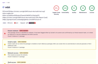
Compromised SAP CAP npm packages download and execute unverified binaries, creating urgent supply chain risk for affected developers and CI/CD environments.

Company News
Socket has acquired Secure Annex to expand extension security across browsers, IDEs, and AI tools.