react-resizable-box
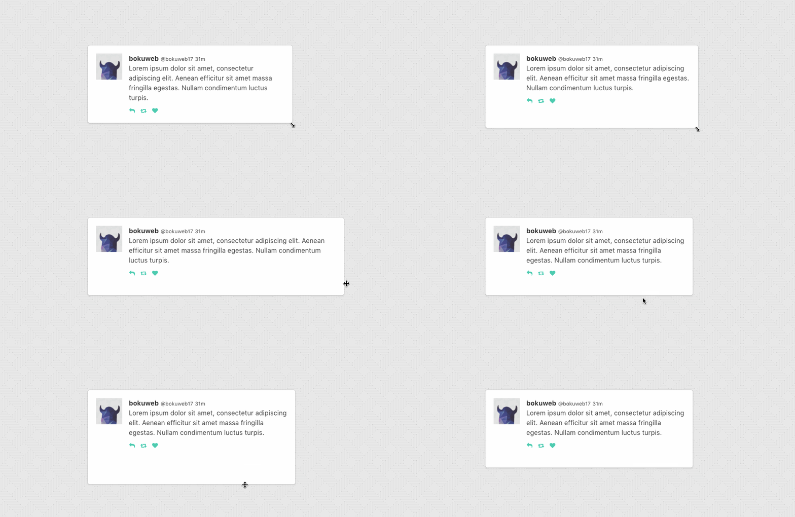
Resizable component for React.


Demo

See demo: http://bokuweb.github.io/react-resizable-box/example/
Installation
npm i react-resizable-box
Overview
Basic
<Resizable
  customClass="item"
  width={320}
  height={200}
>
  Basic Sample
</Resizable>
With min/max width and height
<Resizable
  customClass="item"
  width={320}
  height={200}
  minWidth={160}
  minHeight={160}
  maxWidth={480}
  maxHeight={480}
>
  min size is 160px x 160px, max size is 480px x 480px.
</Resizable>
Props
width: PropTypes.oneOfType([PropTypes.number, PropTypes.string])
The width property is used to set the width of a resizable component.
For example, you can set 300, '300px', 50%.
If ommited, set 'auto'.
height: PropTypes.oneOfType([PropTypes.number, PropTypes.string])
The height property is used to set the width of a resizable component.
For example, you can set 300, '300px', 50%.
If ommited, set 'auto'.
minWidth: PropTypes.number
The minWidth property is used to set the minimum width of a resizable component.
minHeight: PropTypes.number
The minHeight property is used to set the minimum height of a resizable component.
maxWidth: PropTypes.number
The maxWidth property is used to set the maximum width of a resizable component.
maxHeight: PropTypes.number
The maxheight property is used to set the maximum height of a resizable component.
grid: PropTypes.arrayOf(PropTypes.number)
The grid property is used to specify the increments that resizing should snap to. Defaults to [1, 1].
customClass: PropTypes.string
The customClass property is used to set the custom className of a resizable component.
customStyle: Proptypes.object
The customStyle property is used to set the custom classStyle of a resizable component.
handleStyle: PropTypes.shape({ top: PropTypes.object, right: PropTypes.object, bottom: PropTypes.object, left: PropTypes.object, topRight: PropTypes.object, bottomRight: PropTypes.object, bottomLeft: PropTypes.object, topLeft: PropTypes.object })
The handleStyle property is used to override the style of one or more resize handles.
Only the axis you specify will have its handle style replaced.
If you specify a value for right it will completely replace the styles for the right resize handle,
but other handle will still use the default styles.
isResizable: PropTypes.shape({ top: PropTypes.bool, right: PropTypes.bool, bottom: PropTypes.bool, left: PropTypes.bool, topRight: PropTypes.bool, bottomRight: PropTypes.bool, bottomLeft: PropTypes.bool, topLeft: PropTypes.bool })
The isResizable property is used to set the resizable permission of a resizable component.
The permission of top, right, bottom, left, topRight, bottomRight, bottomLeft, topLeft direction resizing.
If omitted, all resizer are enabled.
If you want to permit only right direction resizing, set { top:false, right:true, bottom:false, left:false, topRight:false, bottomRight:false, bottomLeft:false, topLeft:false }.
onClick: PropTypes.func
Calls when resizable component clicked.
onTouchStart: PropTypes.func
Calls when resizable component touched.
onDoubleClick: PropTypes.func
Calls when resizable component double clicked.
onResizeStart: PropTypes.func
Calls when resizable component resize starts.
Calls back with (direction: string, styleSize: object, clientSize: object, event: object)
- direction:
top, right, bottom, left, topRight, bottomRight, bottomLeft, and topLeft. - styleSize:
{ width, height }
- this argument is {width, height} of getComputedStyle.
- clientSize:
{ width, height }
- this argument is
clientWidth and clientHeight.
- event:
mouse down event
onResize: PropTypes.func
Calls when resizable component resize.
Calls back with (direction: string, styleSize: object, clientSize: object, delta: object)
- direction:
top, right, bottom, left, topRight, bottomRight, bottomLeft, and topLeft. - styleSize:
{ width, height }
- this argument is {width, height} of getComputedStyle.
- clientSize:
{ width, height }
- this argument is
clientWidth and clientHeight.
- delta:
{ width, height }
- this delta width and height by resize.
For example, when <Resizable width={100} height={200} style={{ padding: '20px'}} onResize={...} /> mounted and resize 'right' 20px, this callback is called with ('right', { width: 120, height: 200 }, { width: 160, height: 240 }, {width: 20, height: 0})
onResizeStop: PropTypes.func
Calls back with (direction: string, styleSize: object, clientSize: object, delta: object)
- direction:
top, right, bottom, left, topRight, bottomRight, bottomLeft, and topLeft. - styleSize:
{ width, height }
- this argument is {width, height} of getComputedStyle.
- clientSize:
{ width, height }
- this argument is
clientWidth and clientHeight.
- delta:
{ width, height }
- this delta width and height by resize.
For example, when <Resizable width={100} height={200} style={{ padding: '20px'}} onResize={...} /> mounted and resize 'right' 20px, this callback is called with ('right', { width: 120, height: 200 }, { width: 160, height: 240 }, {width: 20, height: 0})
Test
npm test
Changelog
v1.3.0
- Add
grid props to snap grid. (thanks @paulyoung)
v1.3.0
- Add
userSelect: none when resize get srated. - Add shouldComponentUpdate.
- Add hander custom className.
v1.2.0
- Add module export plugin for
require.
v1.1.3
v1.1.2
- Add size argument to resizeStart callback.
- Fix bug
v1.1.1
v1.1.0
- Add delta argument to onResize and onResizeStop callback.
v1.0.0
v0.4.2
- Support react v15
- ESLint run when push
v0.4.1
- Add mousedown event object to
onResizeStart callback argument.
v0.4.0
- Support
'px' and '%' for width and height props.
License
The MIT License (MIT)
Copyright (c) 2016 @Bokuweb
Permission is hereby granted, free of charge, to any person obtaining a copy of this software and associated documentation files (the "Software"), to deal in the Software without restriction, including without limitation the rights to use, copy, modify, merge, publish, distribute, sublicense, and/or sell copies of the Software, and to permit persons to whom the Software is furnished to do so, subject to the following conditions:
The above copyright notice and this permission notice shall be included in all copies or substantial portions of the Software.
THE SOFTWARE IS PROVIDED "AS IS", WITHOUT WARRANTY OF ANY KIND, EXPRESS OR IMPLIED, INCLUDING BUT NOT LIMITED TO THE WARRANTIES OF MERCHANTABILITY, FITNESS FOR A PARTICULAR PURPOSE AND NONINFRINGEMENT. IN NO EVENT SHALL THE AUTHORS OR COPYRIGHT HOLDERS BE LIABLE FOR ANY CLAIM, DAMAGES OR OTHER LIABILITY, WHETHER IN AN ACTION OF CONTRACT, TORT OR OTHERWISE, ARISING FROM, OUT OF OR IN CONNECTION WITH THE SOFTWARE OR THE USE OR OTHER DEALINGS IN THE SOFTWARE.


