Research
Security News
Malicious npm Packages Inject SSH Backdoors via Typosquatted Libraries
Socket’s threat research team has detected six malicious npm packages typosquatting popular libraries to insert SSH backdoors.
react-spinner-loader
Advanced tools
An easy to use, simple multi-purpose react loader. Ability to show full page loading and inner section loading

With Yarn
yarn add react-spinner-loader
With npm
npm i --save react-spinner-loader
You could view the documentation in Github Page as well.
react-spinner-loader is compatible with both Class and Functional React Components.
import Loader from 'react-spinner-loader';
const App = () => {
    const [loader, setLoader] = useState(true);
    return (
        <div>
            <Loader show = {loader}>
        </div>
    )
}
By default, react-spinner-loader comes up with the following properties. You could use the following to customize your loader out of the box.
| Prop | Optional | Default | Possible Values | Description |
|---|---|---|---|---|
| show | No | false | true | false | To Show/Hide Loader |
| type | Yes | inline | inline | box | body | To show either full page or inline loader |
| message | Yes | - | User Custom String | To show Loading Message |
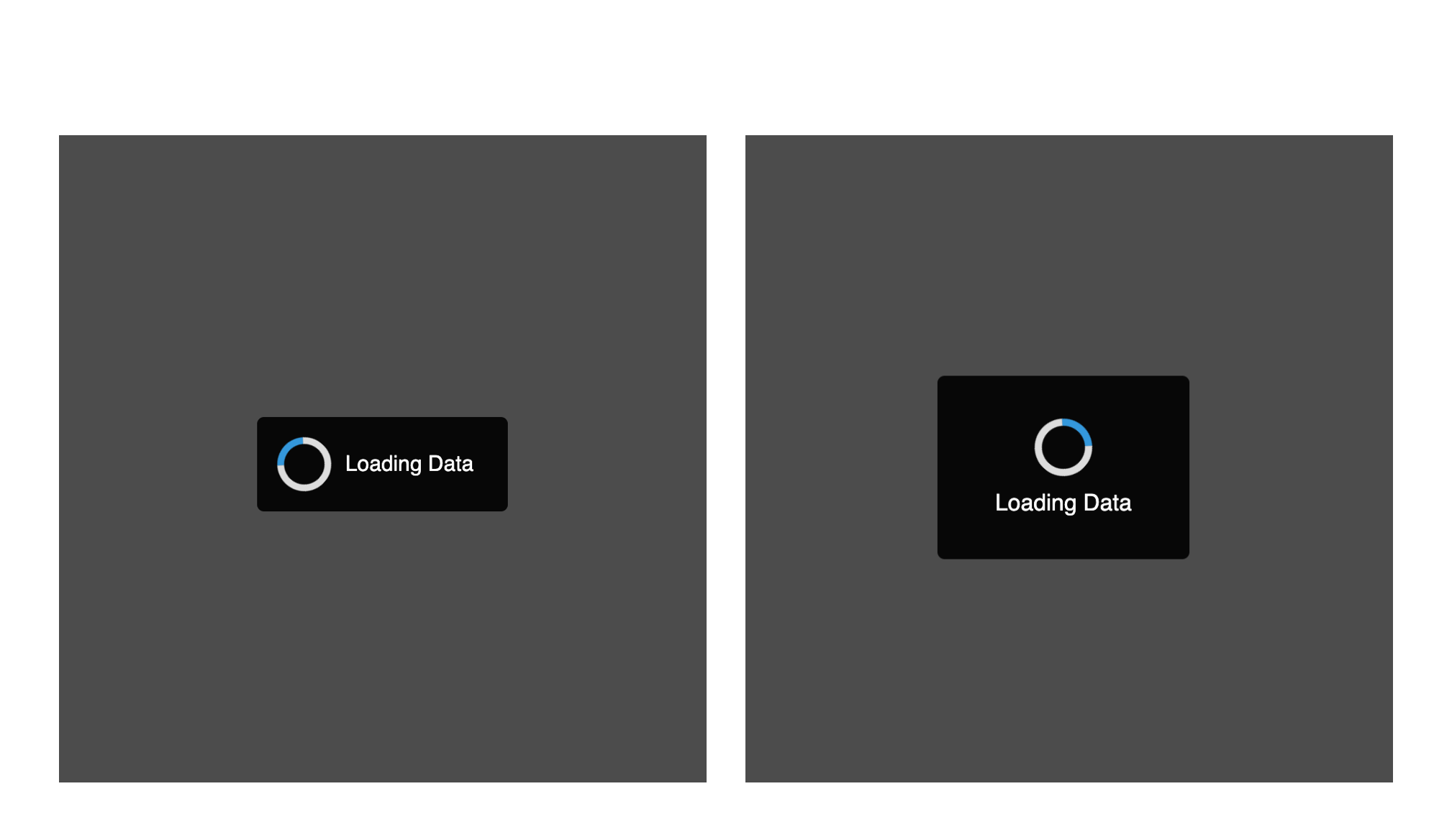
| stack | Yes | horizontal | horizontal | vertical | To decide the position of spinner and message |
| spinnerStyle | Yes | Any Primary and Secondary Color. | To change the color of spinner | |
| spinnerSize | Yes | 40px | Size in px | em | rem | To change the size of spinner |
| messageStyle | Yes |
#101010 (Inline) #FFFFFF (Other) | CSS Properties | To change the style of messages |
To show inline loaders, use type = "inline". This is the default value.
<Loader show = {loader} type = "inline" />
To show a full page loader with blur background, use type = "body"
<Loader show = {loader} type = "body" />
To show a full page loader without blur background, then use type = "box"
<Loader show = {loader} type = "box" />
Many times, we would want to provide a loading message along with the loader to help user understand why is it taking a lot of time to load the data.
To achieve this, you could pass custom loading string with message prop.
Alternatively, you could also configure the message styling with messageStyling prop.
<Loader
    show = {loader}
    message = "Loading Message"
    messageStyling = {{
        color: blue
    }}
/>
This prop would help to place message either horizontally or vertically with respect to the spinner.
<Loader show = {loader} stack = "vertical"/>
Want to align the spinner with your website theme? You could always use spinnerStyle prop to customize the loader colors.
<Loader
    show = {loader}
    spinnerStyle = {{
        primary: '#46B597',
        secondary: '#2D866D'
    }}
/>
Increase or Decrease the spinner size with spinnerSize
<Loader show = {loader} spinnerSize = "50px"/>
FAQs
An easy to use, simple multi-purpose react loader. Ability to show full page loading and inner section loading
The npm package react-spinner-loader receives a total of 83 weekly downloads. As such, react-spinner-loader popularity was classified as not popular.
We found that react-spinner-loader demonstrated a not healthy version release cadence and project activity because the last version was released a year ago. It has 1 open source maintainer collaborating on the project.
Did you know?

Socket for GitHub automatically highlights issues in each pull request and monitors the health of all your open source dependencies. Discover the contents of your packages and block harmful activity before you install or update your dependencies.

Research
Security News
Socket’s threat research team has detected six malicious npm packages typosquatting popular libraries to insert SSH backdoors.

Security News
MITRE's 2024 CWE Top 25 highlights critical software vulnerabilities like XSS, SQL Injection, and CSRF, reflecting shifts due to a refined ranking methodology.

Security News
In this segment of the Risky Business podcast, Feross Aboukhadijeh and Patrick Gray discuss the challenges of tracking malware discovered in open source softare.