Research
Security News
Malicious npm Packages Inject SSH Backdoors via Typosquatted Libraries
Socket’s threat research team has detected six malicious npm packages typosquatting popular libraries to insert SSH backdoors.
react-var-ui
Advanced tools
react-var-ui is a simple React component library for variable setting and preview, inspired by iOS settings, react-dat-gui and dat.gui.
While some code from react-dat-gui was used, this library functions in a completely different way. The codebase uses modern React code practices such as hooks and functional components. Instead of iterating over the children array, react-var-ui uses a Context. Creation of custom components is also easier.
What makes react-var-ui different when compared to similar libraries such as Leva or react-dat-gui, react-var-ui doesn't force itself to float over all your content, instead react-var-ui lives peacefully inside of the React node it is placed in. Unlike Leva and much more like react-dat-gui, react-var-ui relies on a local state variable, providing the developer with more flexibility. While this might seem less convenient, it allows for more customization and usage of multiple instances of react-dat-gui within one project.
Install react-var-ui with either npm or yarn:
yarn add react-var-ui
# or
npm install react-var-ui
Then include the CSS with:
/* In your CSS/SCSS file: */
@import 'react-var-ui/dist/index.css';
or:
// In your JS/TS file (assuming your bundler supports loading CSS files):
import 'react-var-ui/dist/index.css';
const [values, setValues] = React.useState({
  toggle: true,
  color: '#FF0000',
  select: 1,
  slider: 0.4,
  xy: [0, 0.2],
  string: 'Hello world!'
});

return (
  <VarUI updateValues={setValues} values={values}>
    <VarCategory label="Example">
      <VarColor path="color" label="Color" />
      <VarToggle path="toggle" label="Toggle" />
      <VarSelect
        path="select"
        label="Select"
        options={[
          { key: 0, label: 'Zero' },
          { key: 1, label: 'One' }
        ]}
      />
      <VarSlider
        label="VarSlider"
        path="slider"
        min={0.2}
        max={0.8}
        step={0.1}
      />
      <VarString label="VarString" path="string" />
      <VarXY label="VarXY" path="xy" />
      <VarButton buttonLabel="VarButton" onClick={() => alert('clicked!')} />
    </VarCategory>
  </VarUI>
);
react-var-ui uses jest for automated unit tests and storybook for manually testing the UI.
You can run unit tests after installing by running:
yarn test
Storybook can be ran with:
yarn storybook
To run the example app, you first need to start the project with:
yarn start
And then enter the example directory and start the app:
cd ./example
yarn start
(make sure to run yarn install before.)
This is the main component which provides a Context for other components. It is not required to use this component - other components accept onChange and value properties which provide a similar functionality.
| Property | Description | Type |
|---|---|---|
| values | A JavaScript object or array to be mutated by the input components. | object |
| updateValues | The function to be called whenever an update is available. | (values: object) => void |
| Property | Description | Type |
|---|---|---|
| className | Additional class names for the wrapper object. | string |

Category component for grouping inputs.
| Property | Description | Type |
|---|---|---|
| label | Category label. | ReactNode |
| Property | Description | Type |
|---|---|---|
| className | Additional class names on the wrapping div element. | string |
Most input components accept the following base properties.
Does not apply to <VarButton />.
T is component's value type.
| Property | Description | Type |
|---|---|---|
| label | Label to be shown left to the input. | ReactNode |
| className | Additional class names on the wrapping div element. | string |
| path | Variable path in the data object. | string |
| value | Current value (only used if context and path aren't available). In most cases you aren't going to need this. | T |
| defaultValue | Default value for components that support resetting (on double click for example). | T |
| disabled | Should the component be disabled. | boolean |
| onChange | On change event, called with the new value if provided. In most cases you aren't going to need this. | (value: T) => void |
| children | Children. Only rendered when provided directly to the VarBase component. | ReactNode |

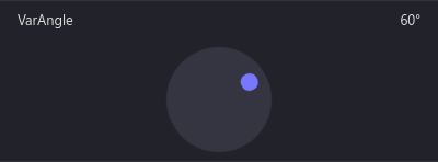
Angle picker component. Accepts and provides numbers (radians).
T = number (rad)
Base VarUI input component. Doesn't do anything besides displaying the label.
Used to construct other components from.

Button component.
Does not accept any of the base component properties.
| Property | Description | Type |
|---|---|---|
| buttonLabel | Category label. | ReactNode |
| Property | Description | Type |
|---|---|---|
| onClick | Called when the button is clicked. | () => void |
| disabled | Should the component be disabled. | boolean |

Color picker component. Returns and accepts values in form of hex color strings.
Uses react-color under the hood.
T = string (#XXXXXX)
| Property | Description | Type |
|---|---|---|
| alpha | Should allow picking alpha values? If true, the result hex code will contain extra two characters representing the alpha value, from 00 to FF. | boolean |

A simple component that displays a string or a numeric value.
Only accepts path and value. Does not change any values.
T = string | number

Integer/float number component. Accepts and provides numbers.
T = number
| Property | Description | Type |
|---|---|---|
| min | Minimum value. | number |
| max | Maximum value. | number |
| step | Step. | number |
| integer | Should the end result be rounded to an integer value. | boolean |
| showInput | If true will display an editable input, otherwise shows a read only value. | boolean |
| showButtons | If true will display buttons that increase and decrease the value by step. | boolean |

Select component. Returns and accepts either value from option object or key when value is not provided.
T = any
| Property | Description | Type |
|---|---|---|
| options | Options to be displayed. | IVarSelectOption[] |
IVarSelectOptionRequired:
| Property | Description | Type |
|---|---|---|
| key | Key for the option. Also used as value if value is not specified. | ReactText |
| label | Option label. | string |
Optional:
| Property | Description | Type |
|---|---|---|
| value | Option value. Key will be used if not specified. Note: Will be serialized to JSON and deserialized when selected. | any |

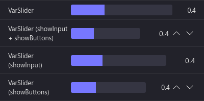
Integer/float slider component. Accepts and provides numbers.
T = number
| Property | Description | Type |
|---|---|---|
| min | Minimum value. | number |
| max | Maximum value. | number |
| step | Step. | number |
| Property | Description | Type |
|---|---|---|
| integer | Should the end result be rounded to an integer value. | boolean |
| showInput | If true will display an editable input, otherwise shows a read only value. | boolean |
| showButtons | If true will display buttons that increase and decrease the value by step. | boolean |

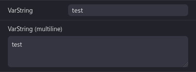
String input component. Accepts and provides a string value.
T = string
| Property | Description | Type |
|---|---|---|
| maxLength | Maximum length of the text. | number |
| multiline | Should the field be a textarea? | boolean |

Checkbox/toggle component. Accepts and returns a boolean (true/false).
T = boolean

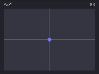
XY offset picker. Accepts and provides an array in form of [x, y].
T = [number (x), number (y)]
| Property | Description | Type |
|---|---|---|
| min | Minimum value. | [number (x), number (y)] |
| max | Maximum value. | [number (x), number (y)] |
| step | Step. | [number (x), number (y)] |
The colors can be customized as such (provided are default values):
.react-var-ui {
  /* Foreground color, used for text. */
  --react-var-ui-foreground-color: #ddd;

  /* Background color, used for category header backgrounds. */
  --react-var-ui-background-color: #11111a;

  /* Accent color, used for active parts of sliders, toggles and XY. */
  --react-var-ui-accent-color: #77f;

  /* Input background color. */
  --react-var-ui-input-background-color: #353542;

  /* Input background color (when hovered). */
  --react-var-ui-input-background-hover-color: #424253;

  /* Input background color (when pressed). Only applies to buttons. */
  --react-var-ui-input-background-pressed-color: #2b2b37;

  /* Label background color. */
  --react-var-ui-label-background-normal-color: #22222a;

  /* Label background color (when hovered). */
  --react-var-ui-label-background-hover-color: #2a2a33;

  /* Label border color. */
  --react-var-ui-label-border-color: #33333a;
}
react-var-ui provides a <VarBase /> component and a useVarUIValue hook designed to facilitate creation of custom components.
import React, { FC } from 'react';
import { useVarUIValue, IVarBaseInputProps, VarBase } from 'react-var-ui';

// Please specify the <T>.
export interface IVarCustomProps extends IVarBaseInputProps<string> {}

/**
 * Custom input component. In this example, it's a simple text input.
 */
export const VarCustom: FC<IVarCustomProps> = ({
  label,
  path,
  value,
  onChange,
  disabled,
  className
}) => {
  /**
   * currentValue will contain the current value from the value object
   * (at a given path) or value from properties if that's not available.
   *
   * setCurrentValue will set the value onto a given path in the object
   * and call onChange if available.
   *
   * All arguments are optional, path/object-based value changes take
   * precedence.
   */
  const [currentValue, setCurrentValue] = useVarUIValue(path, value, onChange);

  /**
   * We're wrapping our component in VarBase which provides the default
   * label.
   *
   * It is necessary to wrap what should appear on the right in a <span>.
   * If this behavior is undesired, a <div> with grid-column: 1 / 3; can
   * be used.
   */
  return (
    <VarBase label={label} disabled={disabled} className={className}>
      <span>
        <input
          type="text"
          maxLength={maxLength}
          value={currentValue}
          onChange={e => setCurrentValue(e.target.value)}
        />
      </span>
    </VarBase>
  );
};
FAQs
Unknown package
The npm package react-var-ui receives a total of 88 weekly downloads. As such, react-var-ui popularity was classified as not popular.
We found that react-var-ui demonstrated a healthy version release cadence and project activity because the last version was released less than a year ago. It has 1 open source maintainer collaborating on the project.
Did you know?

Socket for GitHub automatically highlights issues in each pull request and monitors the health of all your open source dependencies. Discover the contents of your packages and block harmful activity before you install or update your dependencies.

Research
Security News
Socket’s threat research team has detected six malicious npm packages typosquatting popular libraries to insert SSH backdoors.

Security News
MITRE's 2024 CWE Top 25 highlights critical software vulnerabilities like XSS, SQL Injection, and CSRF, reflecting shifts due to a refined ranking methodology.

Security News
In this segment of the Risky Business podcast, Feross Aboukhadijeh and Patrick Gray discuss the challenges of tracking malware discovered in open source softare.