Reactjs - Mapple ToolTip
A light weighted, easy and customizable tool tip for your app. Mapple is crafted in an elegant manner.
Installing
npm i reactjs-mappletooltip --save
Usage
var MappleToolTip = require('reactjs-mappletooltip');
const PageWithToolTip = () => {
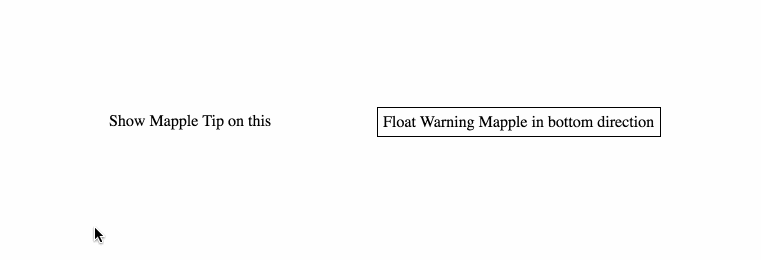
<MappleToolTip>
<div>
Show Mapple Tip on this
</div>
<div>
Hey! this is damn easy
</div>
</MappleToolTip>
<MappleToolTip float={true} direction={'bottom'} mappleType={'warning'}>
<div>
Float in bottom direction
</div>
<div>
direction = 'bottom'<br/>
float = true<br/>
mappleType = 'warning'
</div>
</MappleToolTip>
}
Isn't it super easy to start with Mapple ToolTip :sunglasses:
The Mapple-ToolTip seeks for two child elements. When the mouse pointer is hovered on the first child, div in the example, the Mapple ToolTip appears on top of the first child with the second child as the content within the tip.
Preview of defined styles

Mapple Tool Tip Props
| Prop Name | Desciption | Options | Type |
|---|
| direction | Direction of the Mapple tip to be rendered |
* top (default)
* right
* bottom
* left
| string |
| float | If set true, the Mapple floats with the cursor | * false (default)
* true | boolean |
| tipPosition | Sets the position of triangular tip, under the Mapple Tip.
Ranging from 0-100 percent. | 50 (default)
0 - 100 | number (percentage) |
| mappleType | Directly use the predefined 7 types of Mapple style | * default (default)
* light
* contra
* success
* warning
* info
* error
| string |
| backgroundColor | Sets the background of the Mapple tip.
This overwrites the defined Mapple themes | black (default)
any color
| string |
| textColor | Sets the color of text of the Mapple Tip | white (default)
any color
| string |
| shadow | Sets the shadow of the Mapple tip | * false (default)
* true
|
boolean
|
|
To do feature
- Add option to show Mapple on click
- Add different types of animations.
- Add method Callbacks
- Set zIndex


