Security News
GitHub Removes Malicious Pull Requests Targeting Open Source Repositories
GitHub removed 27 malicious pull requests attempting to inject harmful code across multiple open source repositories, in another round of low-effort attacks.
reactjs-popup
Advanced tools
reactjs-popup is a simple and flexible React component for creating various types of popups, including tooltips, modals, and dropdowns. It is designed to be easy to use and customize, making it a popular choice for adding interactive elements to React applications.
Modal Popup
This feature allows you to create a modal popup that can be triggered by a button. The modal can contain any content, and it includes a close button to dismiss the popup.
```jsx
import React from 'react';
import Popup from 'reactjs-popup';
import 'reactjs-popup/dist/index.css';
const ModalExample = () => (
<Popup trigger={<button> Open Modal </button>} modal>
{close => (
<div>
<button onClick={close}>×</button>
<div> Modal Content </div>
</div>
)}
</Popup>
);
export default ModalExample;
```Tooltip Popup
This feature allows you to create a tooltip popup that appears when you hover over a trigger element. The tooltip can be positioned relative to the trigger element.
```jsx
import React from 'react';
import Popup from 'reactjs-popup';
import 'reactjs-popup/dist/index.css';

const TooltipExample = () => (
  <Popup trigger={<button> Hover me </button>} position="right center">
    <div> Tooltip Content </div>
  </Popup>
);

export default TooltipExample;
```
Dropdown Popup
This feature allows you to create a dropdown popup that appears when you click on a trigger element. The dropdown can contain any content and can be positioned relative to the trigger element.
```jsx
import React from 'react';
import Popup from 'reactjs-popup';
import 'reactjs-popup/dist/index.css';

const DropdownExample = () => (
  <Popup trigger={<button> Open Dropdown </button>} position="bottom left">
    <div> Dropdown Content </div>
  </Popup>
);

export default DropdownExample;
```react-modal is a widely-used package for creating accessible modal dialogs in React. It provides more advanced features for managing modal states and accessibility compared to reactjs-popup, but it is primarily focused on modals rather than other types of popups.
react-tooltip is a package specifically designed for creating tooltips in React applications. It offers more customization options and advanced features for tooltips compared to reactjs-popup, but it does not support other types of popups like modals or dropdowns.
react-dropdown is a package focused on creating dropdown menus in React. It provides more specialized features for dropdowns, such as keyboard navigation and multi-select options, but it does not support other types of popups like modals or tooltips.
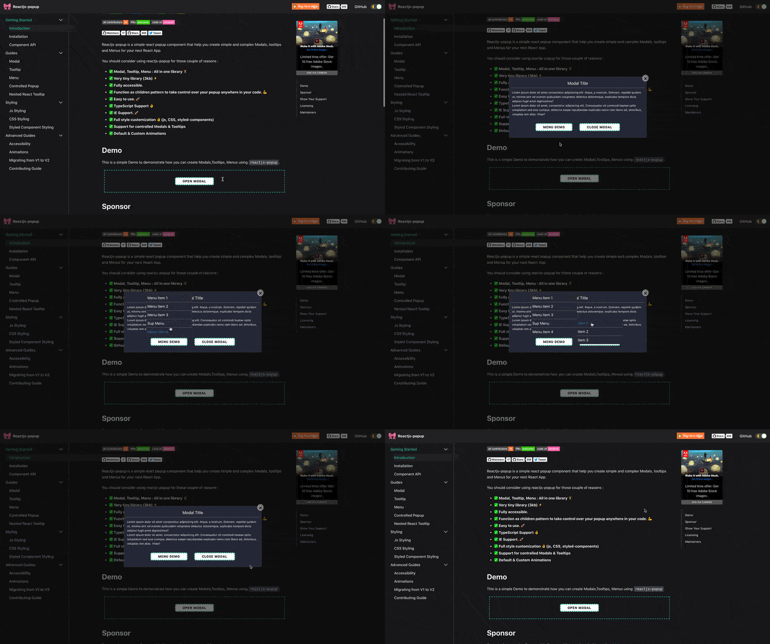
Reactjs-popup is a simple react popup component that help you create simple and complex Modals, tooltips and Menus for your next React App.
You should consider using reactjs-popup for those couple of reasons :
This is a simple Demo to demonstrate how you can create Modals,Tooltips, Menus using reactjs-popup.

This package is available in npm repository as reactjs-popup. It will work correctly with all popular bundlers.
npm install reactjs-popup --save
Using yarn
yarn add reactjs-popup -s
To start using reactjs popup you just need to import the component from the reactjs-popup package.
import React from 'react';
import Popup from 'reactjs-popup';
import 'reactjs-popup/dist/index.css';

export default () => (
  <Popup trigger={<button> Trigger</button>} position="right center">
    <div>Popup content here !!</div>
  </Popup>
);
Fork and then clone the repo
git clone git@github.com:your-username/reactjs-popup.git
Install all npm scripts:
npm install
or
yarn install
we use storybook to build popup use cases.
To start storybook:
yarn storybook
Run Test in watch mode
yarn test
To make contributing simply you need to create a new story for your use case under stories directory to demonstrate the new features or the bug fix .
Make Changes 😀.
If you want to contribute check out the help wanted issues for things that need fixing.
Before submitting a pull request run npm run test to run the unit tests .
The code in this project is licensed under MIT license.
if you are interested to Sponsor this library and list your logo in this section, Make sure to contact me.

That's all, thank you for your attention, please 

Youssouf EL Azizi |
FAQs
React Popup Component - Modals,Tooltips and Menus — All in one
We found that reactjs-popup demonstrated a not healthy version release cadence and project activity because the last version was released a year ago. It has 1 open source maintainer collaborating on the project.
Did you know?

Socket for GitHub automatically highlights issues in each pull request and monitors the health of all your open source dependencies. Discover the contents of your packages and block harmful activity before you install or update your dependencies.

Security News
GitHub removed 27 malicious pull requests attempting to inject harmful code across multiple open source repositories, in another round of low-effort attacks.

Security News
RubyGems.org has added a new "maintainer" role that allows for publishing new versions of gems. This new permission type is aimed at improving security for gem owners and the service overall.

Security News
Node.js will be enforcing stricter semver-major PR policies a month before major releases to enhance stability and ensure reliable release candidates.