Security News
The Risks of Misguided Research in Supply Chain Security
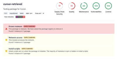
Snyk's use of malicious npm packages for research raises ethical concerns, highlighting risks in public deployment, data exfiltration, and unauthorized testing.
responsive-loader
Advanced tools
A webpack loader for responsive images. Creates multiple images from one source image, and returns a srcset. For more information on how to use srcset, read Responsive Images: If you’re just changing resolutions, use srcset.. Browser support is pretty good.
Note: starting with v1.0.0, responsive-loader is only compatible with webpack 2+. For webpack 1 support, use responsive-loader@0.7.0
npm install responsive-loader jimp --save-dev
Per default, responsive-loader uses jimp to transform images. which needs to be installed alongside responsive-loader. Because jimp is written entirely in JavaScript and doesn't have any native dependencies it will work anywhere. The main drawback is that it's pretty slow.
npm install responsive-loader sharp --save-dev
For super-charged performance, responsive-loader also works with sharp. It's recommended to use sharp if you have lots of images to transform.
If you want to use sharp, you need to configure responsive-loader to use its adapter:
module.exports = {
  // ...
  module: {
    rules: [
      {
        test: /\.(jpe?g|png)$/i,
        loader: 'responsive-loader',
        options: {
+         adapter: require('responsive-loader/sharp')
        }
      }
    ]
  },
}
Add a rule for loading responsive images to your webpack config:
module.exports = {
  // ...
  module: {
    rules: [
      {
        test: /\.(jpe?g|png)$/i,
        loader: 'responsive-loader',
        options: {
          // If you want to enable sharp support:
          // adapter: require('responsive-loader/sharp')
        }
      }
    ]
  },
}
Then import images in your JavaScript files:
// Outputs three images with 100, 200, and 300px widths
const responsiveImage = require('myImage.jpg?sizes[]=100,sizes[]=200,sizes[]=300');

// responsiveImage.srcSet => '2fefae46cb857bc750fa5e5eed4a0cde-100.jpg 100w,2fefae46cb857bc750fa5e5eed4a0cde-200.jpg 200w,2fefae46cb857bc750fa5e5eed4a0cde-300.jpg 300w'
// responsiveImage.images => [{height: 50, path: '2fefae46cb857bc750fa5e5eed4a0cde-100.jpg', width: 100}, {height: 100, path: '2fefae46cb857bc750fa5e5eed4a0cde-200.jpg', width: 200}, {height: 150, path: '2fefae46cb857bc750fa5e5eed4a0cde-300.jpg', width: 300}]
// responsiveImage.src => '2fefae46cb857bc750fa5e5eed4a0cde-100.jpg'
// responsiveImage.toString() => '2fefae46cb857bc750fa5e5eed4a0cde-100.jpg'
ReactDOM.render(<img srcSet={responsiveImage.srcSet} src={responsiveImage.src} />, el);

// Or you can just use it as props, `srcSet` and `src` will be set properly
ReactDOM.render(<img {...responsiveImage} />, el);
Or use it in CSS (only the first resized image will be used, if you use multiple sizes):
.myImage { background: url('myImage.jpg?size=1140'); }

@media (max-width: 480px) {
  .myImage { background: url('myImage.jpg?size=480'); }
}
// Outputs placeholder image as a data URI, and three images with 100, 200, and 300px widths
const responsiveImage = require('myImage.jpg?placeholder=true&sizes[]=100,sizes[]=200,sizes[]=300');

// responsiveImage.placeholder => 'data:image/jpeg;base64,/9j/4AAQSkZJRgABAQAAAQABAAD/2wCEAAIBAQE…'
ReactDOM.render(
  <div style={{
    height: responsiveImage.height,
    width: responsiveImage.width,
    backgroundSize: 'cover',
    backgroundImage: 'url("' + responsiveImage.placeholder + '")'
  }}>
    <img src={responsiveImage.src} srcSet={responsiveImage.srcSet} />
  </div>, el);
| Option | Type | Default | Description |
|---|---|---|---|
name | string | [hash]-[width].[ext] | Filename template for output files. |
outputPath | `string | Function` | undefined |
publicPath | `string | Function` | undefined |
context | string | this.options.context | Custom file context, defaults to webpack.config.js context |
sizes | array | original size | Specify all widths you want to use; if a specified size exceeds the original image's width, the latter will be used (i.e. images won't be scaled up). You may also declare a default sizes array in the loader options in your webpack.config.js. |
size | integer | original size | Specify one width you want to use; if the specified size exceeds the original image's width, the latter will be used (i.e. images won't be scaled up) |
min | integer | As an alternative to manually specifying sizes, you can specify min, max and steps, and the sizes will be generated for you. | |
max | integer | See min above | |
steps | integer | 4 | Configure the number of images generated between min and max (inclusive) |
quality | integer | 85 | JPEG compression quality |
format | string | original format | Either png or jpg; use to convert to another format |
placeholder | boolean | false | A true or false value to specify wether to output a placeholder image as a data URI |
placeholderSize | integer | 40 | A number value specifying the width of the placeholder image, if enabled with the option above |
adapter | Adapter | JIMP | Specify which adapter to use. Can only be specified in the loader options. |
disable | boolean | false | Disable processing of images by this loader (useful in development). srcSet and other attributes will still be generated but only for the original size. Note that the width and height attributes will both be set to 100 but the image will retain its original dimensions. |
background: number — Background fill when converting transparent to opaque images. Make sure this is a valid hex number, e.g. 0xFFFFFFFF)background: string — Background fill when converting transparent to opaque images. E.g. #FFFFFFSet a default sizes array, so you don't have to declare them with each require.
module.exports = {
  entry: {...},
  output: {...},
  module: {
    rules: [
      {
        test: /\.(jpe?g|png)$/i,
        loader: 'responsive-loader',
        options: {
          sizes: [300, 600, 1200, 2000],
          placeholder: true,
          placeholderSize: 50
        }
      }
    ]
  },
}
Maybe you want to use another image processing library or you want to change an existing one's behavior. You can write your own adapter with the following signature:
type Adapter = (imagePath: string) => {
  metadata: () => Promise<{width: number, height: number}>
  resize: (config: {width: number, mime: string, options: Object}) => Promise<{data: Buffer, width: number, height: number}>
}
The resize method takes a single argument which has a width, mime and options property (which receives all loader options)
In your webpack config, require your adapter
{
  test: /\.(jpe?g|png)$/i,
  loader: 'responsive-loader',
  options: {
    adapter: require('./my-adapter')
    foo: 'bar' // will get passed to adapter.resize({width, mime, options: {foo: 'bar}})
  }
}
1x, 2x sizes.FAQs
A webpack loader for responsive images
The npm package responsive-loader receives a total of 12,058 weekly downloads. As such, responsive-loader popularity was classified as popular.
We found that responsive-loader demonstrated a not healthy version release cadence and project activity because the last version was released a year ago. It has 2 open source maintainers collaborating on the project.
Did you know?

Socket for GitHub automatically highlights issues in each pull request and monitors the health of all your open source dependencies. Discover the contents of your packages and block harmful activity before you install or update your dependencies.

Security News
Snyk's use of malicious npm packages for research raises ethical concerns, highlighting risks in public deployment, data exfiltration, and unauthorized testing.

Research
Security News
Socket researchers found several malicious npm packages typosquatting Chalk and Chokidar, targeting Node.js developers with kill switches and data theft.

Security News
pnpm 10 blocks lifecycle scripts by default to improve security, addressing supply chain attack risks but sparking debate over compatibility and workflow changes.