Research
Security News
Malicious npm Packages Inject SSH Backdoors via Typosquatted Libraries
Socket’s threat research team has detected six malicious npm packages typosquatting popular libraries to insert SSH backdoors.
rn-range-slider
Advanced tools
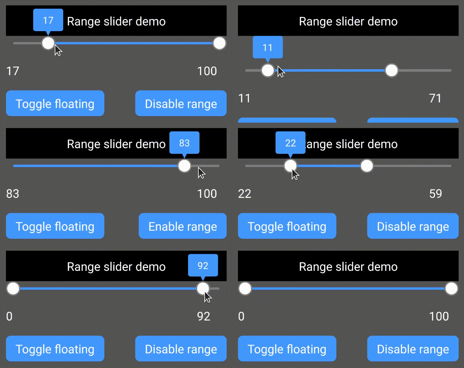
A fully customizable high quality react native Slider component backed by custom native iOS and Android views with ability to select range of values.
A fully customizable high quality react native Slider component backed by custom native iOS and Android views with ability to select range of values.

Add
npm install --save rn-range-slideryarn add rn-range-sliderLink
react-native link rn-range-sliderRangeSlider should have fixed width and height.
import RangeSlider from 'rn-range-slider';

...

<RangeSlider style={{width: 160, height: 80}} />

...
| Property | Description | Type | Default Value |
|---|---|---|---|
| onValueChanged | A callback to be called when value was changed. (lowValue, highValue, fromUser) => {} fromUser parameter is true if the value was changed because of user's interaction (not by setting lowValue or highValue properties). Just like android's OnSeekbarChangeListener. | Function | 4 |
| rangeEnabled | Slider works as an ordinary slider with 1 control if false | Boolean | true |
| lineWidth | Width of slider's line | Number | 4 |
| thumbRadius | Radius of thumb (including border) | Number | 10 |
| thumbBorderWidth | Border width of thumb | Number | 2 |
| textSize | Size of label text | Number | 16 |
| labelBorderWidth | Border width of label | Number | 2 |
| labelPadding | Padding of label (distance between border and text) | Number | 4 |
| labelBorderRadius | Border radius of label bubble | Number | 4 |
| labelTailHeight | Height of label bubble's tail | Number | 8 |
| labelGapHeight | Gap between label and slider | Number | 4 |
| textFormat | This string will be formatted with active value and shown in thumb | String "Price: %d" => "Price: 75" if the current value is 75 | %d (just the number) |
| labelStyle | Style of the label. Label is not shown if none | String Currently supported values: - none - bubble | bubble |
| gravity | Vertical gravity of drawn content | String Currently supported values: - top - bottom - center | top |
| selectionColor | Color of selected part | String (#RRGGBB or #AARRGGBB) | #4286f4 |
| blankColor | Color of unselected part | String (#RRGGBB or #AARRGGBB) | #7fffffff |
| thumbColor | Color of thumb | String (#RRGGBB or #AARRGGBB) | #ffffff |
| thumbBorderColor | Color of thumb's border | String (#RRGGBB or #AARRGGBB) | #cccccc |
| labelBackgroundColor | Color label's background | String (#RRGGBB or #AARRGGBB) | #ff60ad |
| labelBorderColor | Color label's border | String (#RRGGBB or #AARRGGBB) | #d13e85 |
| labelTextColor | Color label's text | String (#RRGGBB or #AARRGGBB) | #ffffff |
| minValue | Minimum value of slider | Number (integer) | 0 |
| maxValue | Maximum value of slider | Number (integer) | 100 |
| step | Step of slider | Number (integer) | 1 |
| lowValue | Current value of lower thumb | Number (integer) | 0 |
| highValue | Current value of higher thumb | Number (integer) | 100 |
FAQs
A highly optimized pure JS implementation of Range Slider for React Native
The npm package rn-range-slider receives a total of 10,626 weekly downloads. As such, rn-range-slider popularity was classified as popular.
We found that rn-range-slider demonstrated a not healthy version release cadence and project activity because the last version was released a year ago. It has 1 open source maintainer collaborating on the project.
Did you know?

Socket for GitHub automatically highlights issues in each pull request and monitors the health of all your open source dependencies. Discover the contents of your packages and block harmful activity before you install or update your dependencies.

Research
Security News
Socket’s threat research team has detected six malicious npm packages typosquatting popular libraries to insert SSH backdoors.

Security News
MITRE's 2024 CWE Top 25 highlights critical software vulnerabilities like XSS, SQL Injection, and CSRF, reflecting shifts due to a refined ranking methodology.

Security News
In this segment of the Risky Business podcast, Feross Aboukhadijeh and Patrick Gray discuss the challenges of tracking malware discovered in open source softare.