Security News
Fluent Assertions Faces Backlash After Abandoning Open Source Licensing
Fluent Assertions is facing backlash after dropping the Apache license for a commercial model, leaving users blindsided and questioning contributor rights.
rn-swipe-button
Advanced tools
npm install rn-swipe-button --save
import SwipeButton from 'rn-swipe-button';
<SwipeButton />


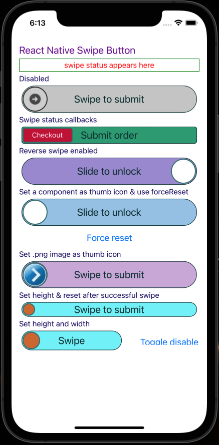
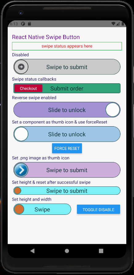
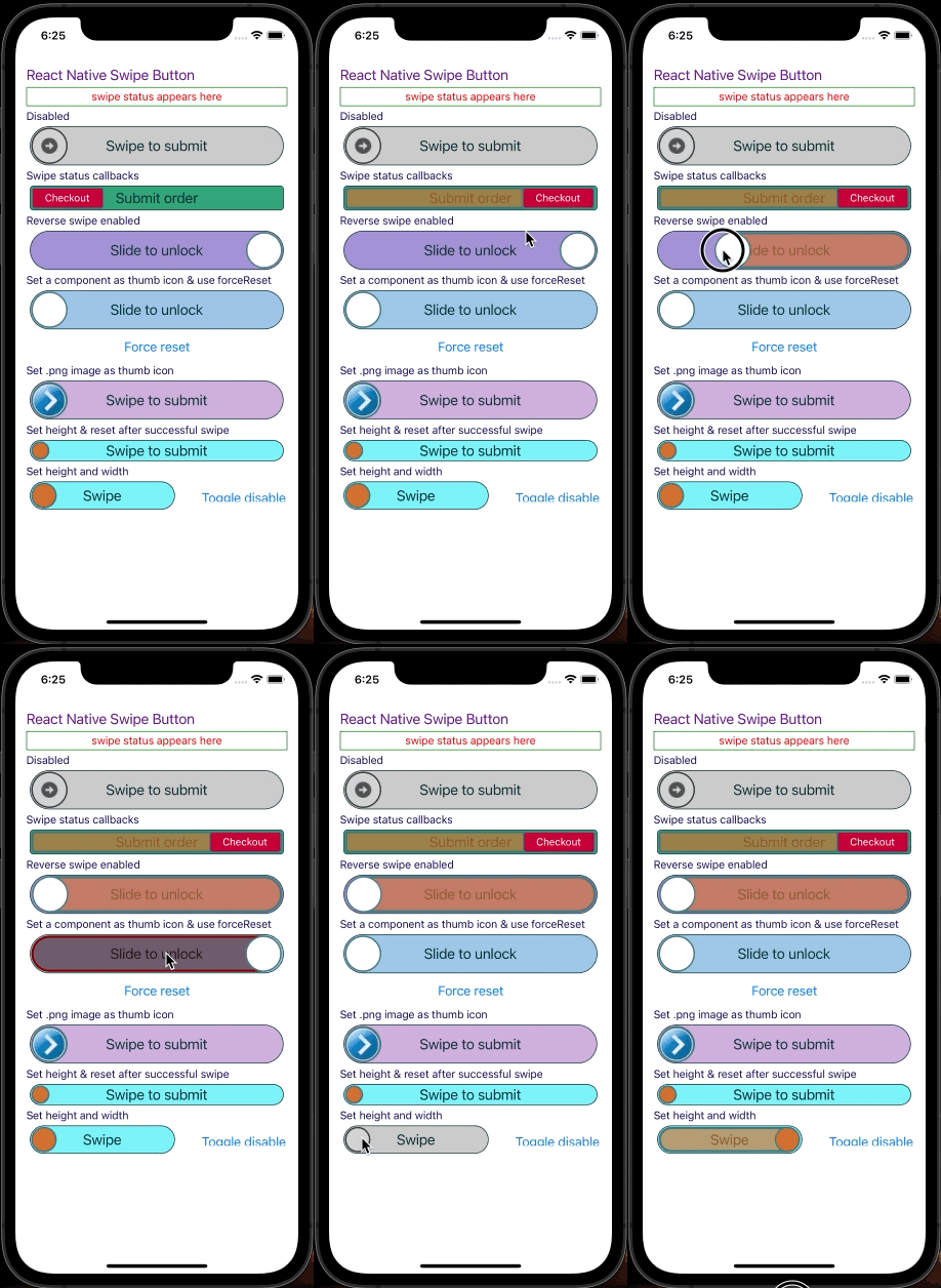
These screenshots are from demo app under examples folder in the repo
    disabled: PropTypes.bool,
    disabledRailBackgroundColor: PropTypes.string,
    disabledThumbIconBackgroundColor: PropTypes.string,
    disabledThumbIconBorderColor: PropTypes.string,
    height: PropTypes.number,
    onSwipeSuccess: PropTypes.func,
    railBackgroundColor: PropTypes.string,
    railBorderColor: PropTypes.string,
    railFillBackgroundColor: PropTypes.string,
    railFillBorderColor: PropTypes.string,
    swipeSuccessThreshold: PropTypes.number, // Ex: 70. Swipping 70% will be considered as successful swipe
    thumbIconBackgroundColor: PropTypes.string,
    thumbIconBorderColor: PropTypes.string,
    thumbIconImageSource: PropTypes.oneOfType([
      PropTypes.string,
      PropTypes.number,
    ]),
    title: PropTypes.string,
    titleColor: PropTypes.string,
    titleFontSize: PropTypes.number,
    width: PropTypes.number,
import React, {Fragment} from 'react';
import {Text, ToastAndroid} from 'react-native';
import thumbIcon from './assets/thumbIcon.png';

import SwipeButton from 'rn-swipe-button';

const App = () => {
  return (
    <View style={{padding: 15}}>
      <Text style={{color: '#700D99', fontSize: 25}}>
        React Native Swipe Button
      </Text>
      <Text style={{color: '#059478', fontSize: 30}}>**************</Text>
      <Text style={{color: '#140866', fontSize: 20}}>
        Set onSwipeSuccess callback and width
      </Text>
      <SwipeButton
        disabled={false}
        onSwipeSuccess={() => {
          ToastAndroid.showWithGravity(
            'Submitted successfully!',
            ToastAndroid.SHORT,
            ToastAndroid.CENTER,
          );
        }}
      />
      <Text style={{color: '#140866', fontSize: 20}}>
        Enabled and thumb icon
      </Text>
      <SwipeButton thumbIconImageSource={thumbIcon} />
      <Text style={{color: '#140866', fontSize: 20}}>Disabled</Text>
      <SwipeButton disabled={true} />
      <Text style={{color: '#140866', fontSize: 20}}>Set height</Text>
      <SwipeButton height={25} />
      <Text style={{color: '#140866', fontSize: 20}}>Set height and width</Text>
      <SwipeButton height={35} width={150} title="Swipe" />
    </View>
  );
};
FAQs
react native swipe/slide button component
The npm package rn-swipe-button receives a total of 5,159 weekly downloads. As such, rn-swipe-button popularity was classified as popular.
We found that rn-swipe-button demonstrated a healthy version release cadence and project activity because the last version was released less than a year ago. It has 0 open source maintainers collaborating on the project.
Did you know?

Socket for GitHub automatically highlights issues in each pull request and monitors the health of all your open source dependencies. Discover the contents of your packages and block harmful activity before you install or update your dependencies.

Security News
Fluent Assertions is facing backlash after dropping the Apache license for a commercial model, leaving users blindsided and questioning contributor rights.

Research
Security News
Socket researchers uncover the risks of a malicious Python package targeting Discord developers.

Security News
The UK is proposing a bold ban on ransomware payments by public entities to disrupt cybercrime, protect critical services, and lead global cybersecurity efforts.