Security News
Supply Chain Attack Detected in Solana's web3.js Library
A supply chain attack has been detected in versions 1.95.6 and 1.95.7 of the popular @solana/web3.js library.
rn-swipe-button
Advanced tools
npm install rn-swipe-button --save
import SwipeButton from 'rn-swipe-button';
<SwipeButton />


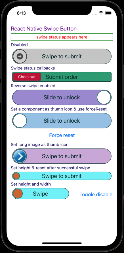
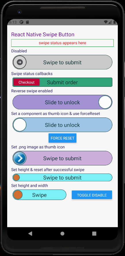
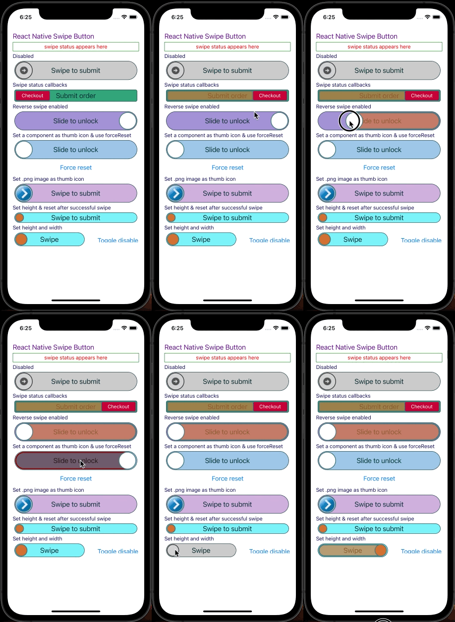
These screenshots are from demo app under examples folder in the repo
    disabled: PropTypes.bool,
    disabledRailBackgroundColor: PropTypes.string,
    disabledThumbIconBackgroundColor: PropTypes.string,
    disabledThumbIconBorderColor: PropTypes.string,
    enableRightToLeftSwipe: PropTypes.bool,
    height: PropTypes.number,
    onSwipeFail: PropTypes.func,
    onSwipeStart: PropTypes.func,
    onSwipeSuccess: PropTypes.func,
    railBackgroundColor: PropTypes.string,
    railBorderColor: PropTypes.string,
    railFillBackgroundColor: PropTypes.string,
    railFillBorderColor: PropTypes.string,
    swipeSuccessThreshold: PropTypes.number, // Ex: 70. Swipping 70% will be considered as successful swipe
    thumbIconBackgroundColor: PropTypes.string,
    thumbIconBorderColor: PropTypes.string,
    thumbIconComponent: PropTypes.node,
    thumbIconImageSource: PropTypes.oneOfType([
      PropTypes.string,
      PropTypes.number,
    ]),
    title: PropTypes.string,
    titleColor: PropTypes.string,
    titleFontSize: PropTypes.number,
    width: PropTypes.number,
import React from 'react';
import {View, Text} from 'react-native';
import Icon from 'react-native-vector-icons/FontAwesome';

import thumbIcon from './assets/thumbIcon.png';
import styles from './styles';

import SwipeButton from 'rn-swipe-button';

class App extends React.Component {
  constructor(props) {
    super(props);
    this.state = {
      message: 'swipe status appears here',
    };
  }
  showToastMessage = message => this.setState({message});
  renderSubHeading = heading => (
    <Text style={styles.subHeading}>{heading}</Text>
  );
  renderSwipeStatus = () => (
    <Text style={styles.swipeStatus}>{this.state.message}</Text>
  );
  render() {
    const TwitterIcon = () => <Icon name="twitter" color="#3b5998" size={30} />;
    const facebookIcon = () => (
      <Icon name="facebook" color="#3b5998" size={30} />
    );

    setInterval(
      () => this.setState({message: 'swipe status appears here'}),
      5000,
    );

    return (
      <View style={styles.container}>
        <Text style={styles.title}>React Native Swipe Button</Text>
        {this.renderSwipeStatus()}
        {this.renderSubHeading('Disabled')}
        <SwipeButton disabled={true} />
        {this.renderSubHeading('Swipe status callbacks')}
        <SwipeButton
          disabled={false}
          onSwipeStart={() => this.showToastMessage('Swipe started!')}
          onSwipeFail={() => this.showToastMessage('Incomplete swipe!')}
          onSwipeSuccess={() =>
            this.showToastMessage('Submitted successfully!')
          }
        />
        {this.renderSubHeading('Right to left swipe enabled')}
        <SwipeButton
          enableRightToLeftSwipe
          thumbIconBackgroundColor="#FFFFFF"
          thumbIconComponent={facebookIcon}
          title="Slide to unlock"
          onSwipeSuccess={() => this.showToastMessage('Slide success!')}
        />
        {this.renderSubHeading('Set a component as thumb icon')}
        <SwipeButton
          thumbIconBackgroundColor="#FFFFFF"
          thumbIconComponent={TwitterIcon}
          title="Slide to unlock"
        />
        {this.renderSubHeading('Set .png image as thumb icon')}
        <SwipeButton thumbIconImageSource={thumbIcon} />
        {this.renderSubHeading('Set height')}
        <SwipeButton height={25} />
        {this.renderSubHeading('Set height and width')}
        <SwipeButton height={35} width={150} title="Swipe" />
      </View>
    );
  }
}
FAQs
react native swipe/slide button component
The npm package rn-swipe-button receives a total of 6,493 weekly downloads. As such, rn-swipe-button popularity was classified as popular.
We found that rn-swipe-button demonstrated a healthy version release cadence and project activity because the last version was released less than a year ago. It has 0 open source maintainers collaborating on the project.
Did you know?

Socket for GitHub automatically highlights issues in each pull request and monitors the health of all your open source dependencies. Discover the contents of your packages and block harmful activity before you install or update your dependencies.

Security News
A supply chain attack has been detected in versions 1.95.6 and 1.95.7 of the popular @solana/web3.js library.

Research
Security News
A malicious npm package targets Solana developers, rerouting funds in 2% of transactions to a hardcoded address.

Security News
Research
Socket researchers have discovered malicious npm packages targeting crypto developers, stealing credentials and wallet data using spyware delivered through typosquats of popular cryptographic libraries.