Security News
pnpm 10.0.0 Blocks Lifecycle Scripts by Default
pnpm 10 blocks lifecycle scripts by default to improve security, addressing supply chain attack risks but sparking debate over compatibility and workflow changes.
rsuite-table
Advanced tools
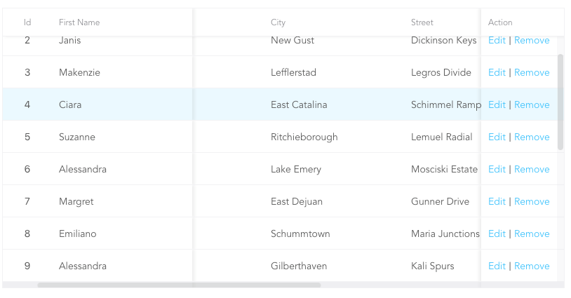
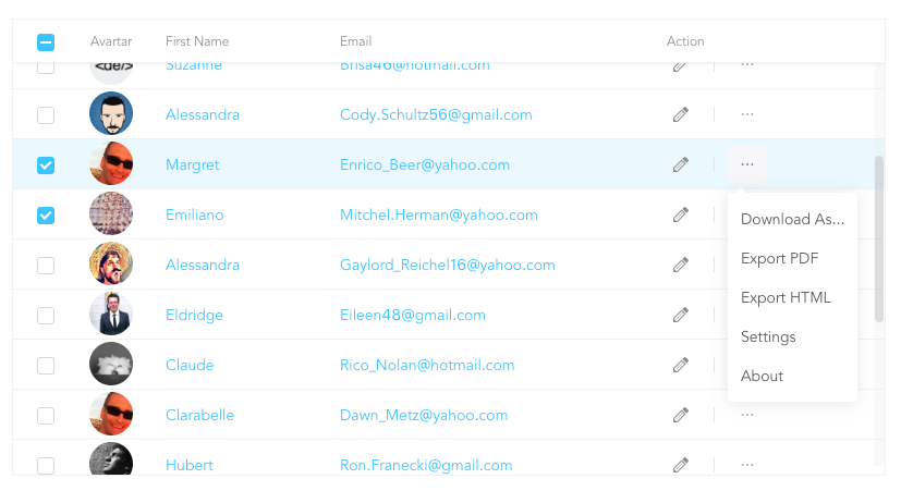
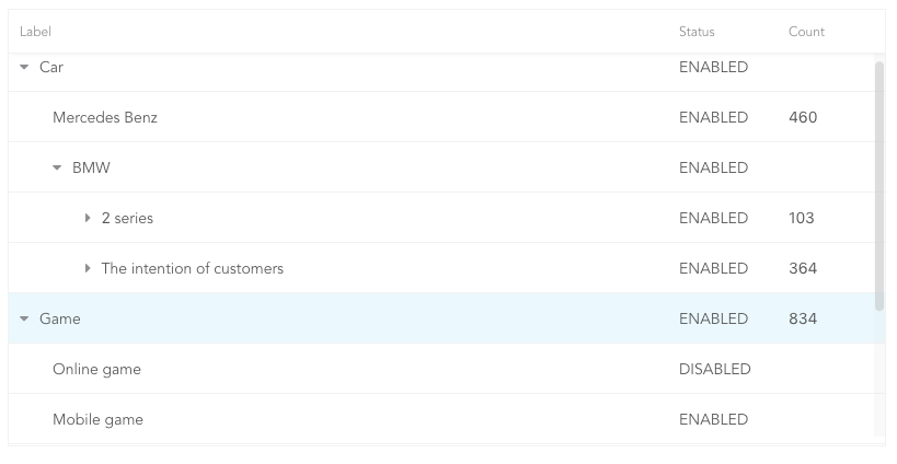
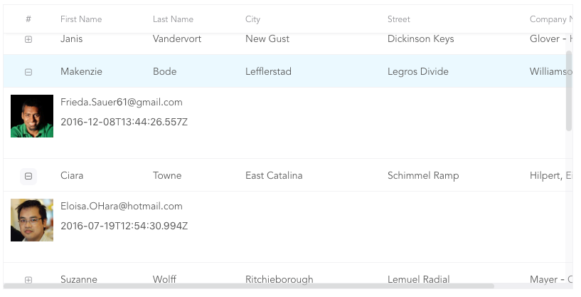
A React table component.


npm i rsuite-table --save
import { Table, Column, HeaderCell, Cell } from 'rsuite-table';
import 'rsuite-table/lib/less/index.less'; // or 'rsuite-table/dist/css/rsuite-table.css'

const dataList = [
  { id: 1, name: 'a', email: 'a@email.com', avartar: '...' },
  { id: 2, name: 'b', email: 'b@email.com', avartar: '...' },
  { id: 3, name: 'c', email: 'c@email.com', avartar: '...' }
];

const ImageCell = ({ rowData, dataKey, ...rest }) => (
  <Cell {...rest}>
    <img src={rowData[dataKey]} width="50" />
  </Cell>
);

const App = () => (
  <Table data={dataList}>
    <Column width={100} sort fixed resizable>
      <HeaderCell>ID</HeaderCell>
      <Cell dataKey="id" />
    </Column>

    <Column width={100} sort resizable>
      <HeaderCell>Name</HeaderCell>
      <Cell dataKey="name" />
    </Column>

    <Column width={100} sort resizable>
      <HeaderCell>Email</HeaderCell>
      <Cell>
        {(rowData, rowIndex) => {
          return <a href={`mailto:${rowData.email}`}>{rowData.email}</a>;
        }}
      </Cell>
    </Column>

    <Column width={100} resizable>
      <HeaderCell>Avartar</HeaderCell>
      <ImageCell dataKey="avartar" />
    </Column>
  </Table>
);
<Table>| Property | Type (Default) | Description |
|---|---|---|
| affixHeader | boolean,number | Affix the table header to the specified location on the page |
| autoHeight | boolean | Automatic height |
| bodyRef | (ref: HTMLElement) => void | A ref attached to the table body element |
| bordered | boolean | Show border |
| cellBordered | boolean | Show cell border |
| data * | object[] | Table data |
| defaultExpandAllRows | boolean | Expand all nodes By default |
| defaultExpandedRowKeys | string[] | Specify the default expanded row by rowkey |
| defaultSortType | enum: 'desc', 'asc' | Sort type |
| expandedRowKeys | string[] | Specify the default expanded row by rowkey (Controlled) |
| headerHeight | number(40) | Table Header Height |
| height | number(200) | Table height |
| hover | boolean (true) | The row of the table has a mouseover effect |
| isTree | boolean | Show as Tree table |
| loading | boolean | Show loading |
| locale | object: { emptyMessage: ('No data'), loading: ('Loading...') } | Messages for empty data and loading states |
| minHeight | number (0) | Minimum height |
| onExpandChange | (expanded:boolean,rowData:object)=>void | Tree table, the callback function in the expanded node |
| onRowClick | (rowData:object, event: SyntheticEvent)=>void | Click the callback function after the row and return to rowDate |
| onScroll | (scrollX:object, scrollY:object)=>void | Callback function for scroll bar scrolling |
| onSortColumn | (dataKey:string, sortType:string)=>void | Click the callback function of the sort sequence to return the value sortColumn, sortType |
| renderEmpty | (info: React.ReactNode) => React.ReactNode | Customized data is empty display content |
| renderLoading | (loading: React.ReactNode) => React.ReactNode | Customize the display content in the data load |
| renderRowExpanded | (rowDate?: Object) => React.ReactNode | Customize what you can do to expand a zone |
| renderTreeToggle | (icon:node,rowData:object,expanded:boolean)=> node | Tree table, the callback function in the expanded node |
| rowClassName | string , (rowData:object)=>string | Add an optional extra class name to row |
| rowExpandedHeight | number (100) | Set the height of an expandable area |
| rowHeight | number(46), (rowData: object) => number | Row height |
| rowKey | string ('key') | Each row corresponds to the unique key in data |
| rtl | boolean | Right to left |
| showHeader | boolean (true) | Display header |
| sortColumn | string | Sort column name ˝ |
| sortType | enum: 'desc', 'asc' | Sort type (Controlled) |
| virtualized | boolean | Effectively render large tabular data |
| width | number | Table width |
<Column>| Property | Type (Default) | Description |
|---|---|---|
| align | enum: 'left','center','right' | Alignment |
| colSpan | number | Merges column cells to merge when the dataKey value for the merged column is null or undefined. |
| fixed | boolean, 'left', 'right' | Fixed column |
| flexGrow | number | Set the column width automatically adjusts, when set flexGrow cannot set resizable and width property |
| minWidth | number(200) | When you use flexGrow, you can set a minimum width by minwidth |
| onResize | (columnWidth?: number, dataKey?: string) => void | Callback after column width change |
| resizable | boolean | Customizable Resize Column width |
| sortable | boolean | Sortable |
| verticalAlign | enum: 'top', 'middle', 'bottom' | Vertical alignment |
| width | number | Column width |
| treeCol | boolean | A column of a tree. |
sortableis used to define whether the column is sortable, but depending on whatkeysort needs to set adataKeyinCell. The sort here is the service-side sort, so you need to handle the logic in the ' Onsortcolumn ' callback function of<Table>, and the callback function returnssortColumn,sortTypevalues.
<Cell>| Property | Type (Default) | Description |
|---|---|---|
| dataKey | string | Data binding key, but also a sort of key |
| rowData | object | Row data |
| rowIndex | number | Row number |
<Cell>, as follows:dataKey.<Column width="{100}" align="center">
<HeaderCell>Name</HeaderCell>
<Cell dataKey="name" />
</Column>
<Cell>.const NameCell = ({ rowData, ...props }) => (
<Cell {...props}>
<a href={`mailto:${rowData.email}`}>{rowData.name}<a>
</Cell>
);
<Column width={100} align="center">
<HeaderCell>Name</HeaderCell>
<NameCell />
</Column>
<Cell>.<Column width={100} align="center">
<HeaderCell>Name</HeaderCell>
<Cell>
{(rowData, rowIndex) => {
return <a href={`mailto:${rowData.email}`}>{rowData.name}</a>;
}}
</Cell>
</Column>
3.9.3
resizable property of the columns of the table would not work.FAQs
A React table component
The npm package rsuite-table receives a total of 66,639 weekly downloads. As such, rsuite-table popularity was classified as popular.
We found that rsuite-table demonstrated a healthy version release cadence and project activity because the last version was released less than a year ago. It has 0 open source maintainers collaborating on the project.
Did you know?

Socket for GitHub automatically highlights issues in each pull request and monitors the health of all your open source dependencies. Discover the contents of your packages and block harmful activity before you install or update your dependencies.

Security News
pnpm 10 blocks lifecycle scripts by default to improve security, addressing supply chain attack risks but sparking debate over compatibility and workflow changes.

Product
Socket now supports uv.lock files to ensure consistent, secure dependency resolution for Python projects and enhance supply chain security.

Research
Security News
Socket researchers have discovered multiple malicious npm packages targeting Solana private keys, abusing Gmail to exfiltrate the data and drain Solana wallets.