Security News
Research
Data Theft Repackaged: A Case Study in Malicious Wrapper Packages on npm
The Socket Research Team breaks down a malicious wrapper package that uses obfuscation to harvest credentials and exfiltrate sensitive data.
Sass function and mixin to use rem units with optional pixel fallback.
4.0: changed default function name when imported globally (@use "rem" as *; or @import "sass-rem";) to rem-convert, as CSS now use rem() for calculating the remainder. It shouldn't change anything if you used Sass Modules introduced in 3.0 (rem.convert).
3.0: now using Sass Modules, using @use and rem is renamed to rem.convert. You could still use @import with no changes (see usage below), but if you need LibSass/node-sass and Ruby Sass support (both deprecated), you should stay on 2.0 (which works fine) or use the PostCSS version.
2.0: $rem-fallback is now set to false (see support) and $rem-baseline to 16px by default.
yarn add sass-remnpm install sass-remImport in your project depending of your setup:
@use "rem";
// or @use "~sass-rem" as rem;
// or @use "../node_modules/sass-rem" as rem;

.demo {
  font-size: rem.convert(24px); // Simple
  padding: rem.convert(5px 10px); // Multiple values
  border-bottom: rem.convert(1px solid black); // Multiple mixed values
  box-shadow: rem.convert(0 0 2px #ccc, inset 0 0 5px #eee); // Comma-separated values
  // Multiple properties
  @include rem.convert((
    margin: 10px 5px,
    text-shadow: (1px 1px #eee, -1px -1px #eee) // Parentheses needed because of comma
  ));
}
Will output:
.demo {
  font-size: 1.5rem;
  padding: 0.3125rem 0.625rem;
  border-bottom: 0.0625rem solid black;
  box-shadow: 0 0 0.125rem #ccc, inset 0 0 0.3125rem #eee;
  margin: 0.625rem 0.3125rem;
  text-shadow: 0.0625rem 0.0625rem #eee, -0.0625rem -0.0625rem #eee;
}
You can change the namespace when importing and use rem function and mixin instead of convert:
@use "rem" as to; // Because why not?

.demo {
  font-size: to.rem(24px);
}
Or you can even load the library globally (but beware of conflicts, avoided by the idea of modules):
@use "rem" as *;

.demo {
  font-size: rem-convert(24px);
}
You can enable pixel fallback by setting $fallback to true, but you will have to use the mixin instead of the function. The mixin accepts a map to convert multiple properties at once too:
@use "rem" with (
  $fallback: true
);

.demo {
  @include rem.convert(font-size, 24px); // Simple
  @include rem.convert(padding, 5px 10px); // Multiple values
  @include rem.convert(border-bottom, 1px solid black); // Multiple mixed values
  @include rem.convert(box-shadow, 0 0 2px #ccc, inset 0 0 5px #eee); // Comma-separated values
  // Multiple properties
  @include rem.convert((
    margin: 10px 5px,
    text-shadow: (1px 1px #eee, -1px -1px #eee) // Parentheses needed because of comma
  ));
}
Will output:
.demo {
  font-size: 24px;
  font-size: 1.5rem;
  padding: 5px 10px;
  padding: 0.3125rem 0.625rem;
  border-bottom: 1px solid black;
  border-bottom: 0.0625rem solid black;
  box-shadow: 0 0 2px #ccc, inset 0 0 5px #eee;
  box-shadow: 0 0 0.125rem #ccc, inset 0 0 0.3125rem #eee;
  margin: 10px 5px;
  margin: 0.625rem 0.3125rem;
  text-shadow: 1px 1px #eee, -1px -1px #eee;
  text-shadow: 0.0625rem 0.0625rem #eee, -0.0625rem -0.0625rem #eee;
}
You can totally disable rem units by setting $px-only to true (for a lt-ie9 only stylesheet for example):
.demo {
  font-size: 24px;
  padding: 5px 10px;
  border-bottom: 1px solid black;
  box-shadow: 0 0 2px #ccc, inset 0 0 5px #eee;
  margin: 10px;
  text-shadow: 1px 1px #eee, -1px -1px #eee;
}
By default, sass-rem now uses a 16px baseline, but you can change this value with $baseline and by using the baseline mixin on the html element to adjust the root font size. The rem function and mixin will calculate rem values accordingly.
For example, you can set $baseline to 10px to have a root font size of 62.5% and improve readability (10px = 1rem), which was the pre-2.0 behavior:
@use "rem" with (
  $baseline: 10px
);

html {
  @include rem.baseline;
}

.demo {
  font-size: rem.convert(24px);
}
Will output:
html {
  font-size: 62.5%;
}

.demo {
  font-size: 2.4rem;
}
You can also change the baseline zoom by passing the desired zoom to the baseline mixin which will calculate it depending of $baseline. Useful for creating responsive typography depending on viewport, especially with a different baseline than 16px:
@use "rem" with (
  $baseline: 10px
);

html {
  @include rem.baseline; // Default zoom to 100%

  @media (max-width: 400px) {
    @include rem.baseline(75%);
  }

  @media (min-width: 800px) {
    @include rem.baseline(125%);
  }
}
Will output:
html {
  font-size: 62.5%;
}

@media (max-width: 400px) {
  html {
    font-size: 46.875%;
  }
}

@media (min-width: 800px) {
  html {
    font-size: 78.125%;
  }
}
If you don't want to use Sass Modules, you can still use @import with rem-convert function, mixin and namespaced $rem-* variables:
@import "sass-rem";
// or @import "~sass-rem";
// or @import "../node_modules/sass-rem";

$rem-baseline: 10px;

.demo {
  font-size: rem-convert(24px);
}
sass-em https://github.com/pierreburel/sass-emFAQs
Sass function and mixin to use rem units with optional pixel fallback.
The npm package sass-rem receives a total of 11,960 weekly downloads. As such, sass-rem popularity was classified as popular.
We found that sass-rem demonstrated a not healthy version release cadence and project activity because the last version was released a year ago. It has 1 open source maintainer collaborating on the project.
Did you know?

Socket for GitHub automatically highlights issues in each pull request and monitors the health of all your open source dependencies. Discover the contents of your packages and block harmful activity before you install or update your dependencies.

Security News
Research
The Socket Research Team breaks down a malicious wrapper package that uses obfuscation to harvest credentials and exfiltrate sensitive data.

Research
Security News
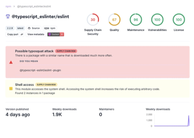
Attackers used a malicious npm package typosquatting a popular ESLint plugin to steal sensitive data, execute commands, and exploit developer systems.

Security News
The Ultralytics' PyPI Package was compromised four times in one weekend through GitHub Actions cache poisoning and failure to rotate previously compromised API tokens.