schema2form
效果
快速上手
依赖于 react 和 antd 以及 @ali/uniform-react-components。
安装
npm install schema2form --save
使用
'use strict';
import React from 'react';
import ReactDOM from 'react-dom';
import { Form, Button } from 'antd';
import BizTypeSelect from 'components/BizTypeExtraSelect/BizTypeExtraSelect';
import Schema2Form from './index';
const FormItem = Form.Item;
import schema from './mock/schema.js';
import data from './mock/data.js';
import './mock/mock.js';
Schema2Form.extend('BizTypeSelect', BizTypeSelect, {type: '', extra: '{}'}, true);
class IndexTestForm extends React.Component {
constructor(props) {
super(props);
}
save = () => {
this.props.form.validateFields((err, values) => {
if (!err) {
console.log('form value:', values);
}
});
}
render() {
const formItemLayout = {
labelCol: { span: 7 },
wrapperCol: { span: 10 }
};
return (
<Form style={{marginTop: 5}}>
<Schema2Form
data={data}
schema={schema}
form={this.props.form}
formItemLayout={formItemLayout}
state={this.state}
/>
<FormItem
wrapperCol={{
xs: { span: 24, offset: 0 },
sm: { span: 16, offset: 8 }
}}
>
<Button type="primary" onClick={this.save} size="large">Submit</Button>
</FormItem>
</Form>
);
}
}
IndexTestForm.displayName = 'IndexTestForm';
const WrappedIndexTestForm = Form.create()(IndexTestForm);
ReactDOM.render(<WrappedIndexTestForm />, document.getElementById('app'));
组件
<Schema2Form
  data={data}
  schema={schema}
  form={this.props.form}
  formItemLayout={formItemLayout}
  father={this}
/>
组件属性
| 属性 | 类型 | 描述 | 是否必须 |
|---|
| data | object | 表单初始值 | 否 |
| schema | object | 描述表单的 schema 对象 | 是 |
| form | object | antd form 的 this.props.form 属性 | 是 |
| formItemLayout | object | FormItem 布局对象 | 否 |
| state | object | 父组件传入的 state | 否 |
Schema
自己定义的一套 schema 标准,用于描述 from 表单,非 json-schema 标准。
一个简单的例子如下:
{
    "fields": [
        {
            "type": "Input",
            "label": "姓名",
            "model": "name",
            "initialValue": "",
            "props": {
                "type": "text"
            }
        },
        {
            "type": "InputNumber",
            "label": "年龄",
            "model": "age",
            "initialValue": 18,
            "props": {}
        }
    ]
}
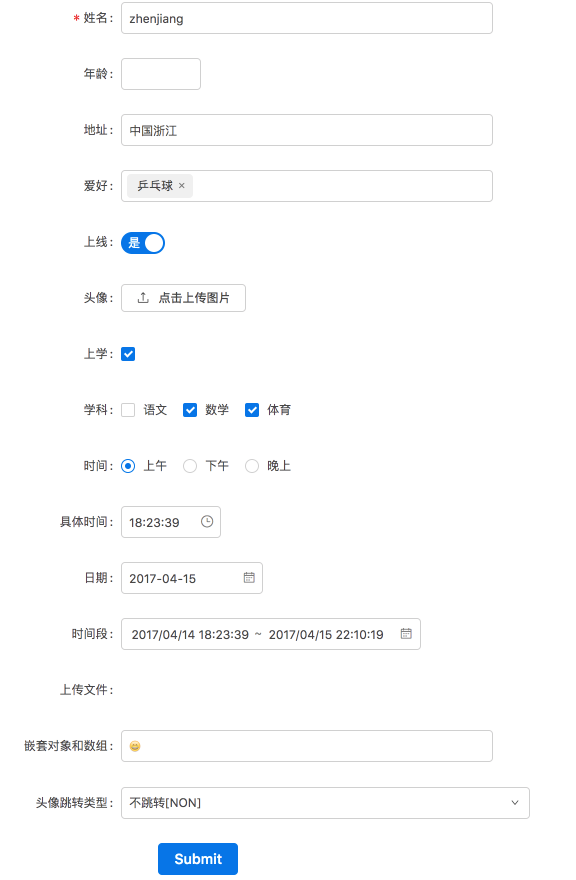
复杂例子,包含了大部分 fields:
{
fields: [
{
type: "FormArr",
model: "arr",
fields: [
{
type: "Input",
label: "账号",
model: "account"
},
{
type: "RadioGroup",
label: "性别",
model: "sex",
props: {
options: [
{ label: '男', value: 'man' },
{ label: '女', value: 'feman' }
]
}
}
]
},
{
type: "Input",
label: "姓名",
model: "name",
initialValue: "zhenjiang",
required: true,
props: {
type: "text"
}
},
{
type: "InputNumber",
label: "年龄",
model: "age",
props: {
}
},
{
type: "Input",
label: "地址",
model: 'user.address',
props: {
disabled: "state.disable",
type: "text"
}
},
{
type: "Select",
label: "爱好",
model: "favor",
options: [
{value: '0', desc: "乒乓球"},
{value: '1', desc: "羽毛球"},
{value: '2', desc: "足球", disabled: {favor: '0'}},
{value: '3', desc: "篮球"}
],
props: {
}
},
{
type: "Switch",
label: "上线",
model: "status",
props: {
checkedChildren: "是",
unCheckedChildren: "否"
}
},
{
type: "UploadImg",
label: "头像",
model: "avatar",
props: {
}
},
{
type: "Checkbox",
label: "上学",
model: "study",
props: {
}
},
{
type: "CheckboxGroup",
label: "学科",
model: "subjects",
props: {
options: [
{ label: '语文', value: 'Chinese'},
{ label: '数学', value: 'Math', disabled: {subjects: ['Chinese']} },
{ label: '体育', value: 'Sport', disabled: {subjects: ['Chinese']} }
],
onChange: function(checkedList) {
if (checkedList.indexOf('Chinese') > -1) {
setTimeout(() => {
this.props.form.setFieldsValue({
subjects: ['Chinese']
});
}, 0);
}
}
}
},
{
type: "RadioGroup",
label: "时间",
model: "time",
props: {
options: [
{ label: '上午', value: 'morning' },
{
label: '下午',
value: 'afternoon',
disabled: {
time: 'morning'
}
},
{
label: '晚上',
value: 'night'
}
]
}
},
{
type: "TimePicker",
label: "具体时间",
model: "curTime",
dependsOn: {
time: "afternoon"
},
props: {
}
},
{
type: "DatePicker",
label: "日期",
model: "date",
dependsOn: [
{
study: false
},
{
time: 'night'
}
],
props: {
}
},
{
type: "RangePicker",
label: "时间段",
model: "timeRange",
props: {
showTime: true,
format: "YYYY/MM/DD HH:mm:ss"
}
},
{
type: "Upload",
label: "上传文件",
model: "file",
props: {
name: 'file',
action: '//jsonplaceholder.typicode.com/posts/',
headers: {
authorization: 'authorization-text'
},
onChange(info) {
if (info.file.status !== 'uploading') {
console.log(info.file, info.fileList);
}
}
}
},
{
type: "Input",
label: "嵌套对象和数组",
model: "nested[0].other.a[0].b"
},
{
type: "BizTypeSelect",
label: "跳转",
model: "action",
props: {
layout: {
labelCol: { span: 7 },
wrapperCol: { span: 11 }
},
label: "头像"
}
}
]
}
Fields
schema 中的一个 field 定义了一个对应于 modal 值的表单元素。
支持的 fields:
核心 fields:
- Input
- InputNumber
- Select
- Switch
- Checkbox
- CheckboxGroup
- RadioGroup
- TimePicker
- DatePicker
- RangePicker
- Upload
自定义 fields:
- UploadImg
- BizTypeSelect
field 属性
field 的属性分为 field 通用属性和各种 field 特有属性。
field 通用属性
| 属性 | 类型 | 描述 | 是否必须 | 默认值 |
|---|
| type | string | field 的 type,唯一标识 | 是 | 无 |
| label | string | field 的 label | 是 | 无 |
| model | string | 属性对应 data 中的名字,支持嵌套路径 | 是 | 无 |
| initialValue | any | 初始值 | 否 | undefined |
| required | boolean | 是否必填项 | 否 | false |
| dependsOn | object | field 要可见需满足条件 | 否 | 无 |
| extra | string | 额外的提示信息 | 否 | 无 |
| rules | object[] | 校验规则(antd) | 否 | [{required: required, message: 请输入${label}}] |
| props | object | 控件的 react 属性(props) | 否 | undefined |
不同 type 的 field 的特有属性
见下文中各个 field 的文档。
对嵌套对象的支持
{
    fields: [
        {
          type: "Input",
          label: "嵌套对象和数组",
          model: "nested[0].other.a[0].b"
        },
    ]
}
对动态表单的支持
动态的显示和隐藏表单
dependsOn 字段是一个对象,只有当前表单的值包含了 dependsOn 所定义的对象,即 dependsOn 所描述的条件都被满足时,该表单项显示,否则隐藏。
一个例子如下:
{
  type: "RadioGroup",
  label: "时间",
  model: "time",
  props: {
    options: [
      { label: '上午', value: 'morning' },
      { label: '下午', value: 'afternoon' },
      { label: '晚上', value: 'night' }
    ]
  }
},
{
  type: "TimePicker",
  label: "具体时间",
  model: "curTime",
  dependsOn: {
    time: "afternoon"
  },
  props: {

  }
}
只用当 time 的值为 "afternoon" 时,curTime 表单项才会显示。
支持多个条件取‘或’,dependsOn 为数组时,数组中任意一个对象满足即为 true:
{
  type: "DatePicker",
  label: "日期",
  model: "date",
  dependsOn: [
    {
      study: false
    },
    {
      time: 'night'
    }
  ],
  props: {

  }
}
当 study 为 false 或者 time 为 'night' 时,date 表单项显示。
动态地 disable
1、通过传入的 state 控制组件 disabled
例子:
<Schema2Form
  data={data}
  schema={schema}
  form={this.props.form}
  formItemLayout={formItemLayout}
  state={disable: true}
/>

{
  type: "Input",
  label: "地址",
  model: 'user.address',
  props: {
    disabled: "state.disable",
    type: "text"
  }
}
2、通过 form 表单自身当前的值控制 disabled
例子:
{
  type: "Select",
  label: "爱好",
  model: "favor",
  options: [
    {value: '0', desc: "乒乓球"},
    {value: '1', desc: "羽毛球"},
    {value: '2', desc: "足球", disabled: {favor: '0'}},
    {value: '3', desc: "篮球"}
  ],
  props: {
  }
}
当表单 favor 的值为 '0' 时, "足球" 选项 disabled。
3、复杂情况,仅适用于 schema 写在 js 代码中,而非在外部配置:
{
  type: "CheckboxGroup",
  label: "学科",
  model: "subjects",
  props: {
    options: [
      { label: '语文', value: 'Chinese'},
      { label: '数学', value: 'Math', disabled: {subjects: ['Chinese']} },
      { label: '体育', value: 'Sport', disabled: {subjects: ['Chinese']} }
    ],
    onChange: function(checkedList) {
      if (checkedList.indexOf('Chinese') > -1) {
        setTimeout(() => {
          this.props.form.setFieldsValue({
            subjects: ['Chinese']
          });
        }, 0);
      }
    }
  }
}
选中 '语文' 时,其他选项都不选择,并 disabled。
对 onChange 的支持
仅在 schema 写在 js 代码中时支持。
动态地增加和删除表单 (数组的情况)
数组的动态增减,schema 中 type 为 FormArr:
schema 配置如下:
{
  type: "FormArr",
  model: "arr",
  fields: [
    {
      type: "Input",
      label: "账号",
      model: "account"
    },
    {
      type: "RadioGroup",
      label: "性别",
      model: "sex",
      props: {
        options: [
          { label: '男', value: 'man' },
          { label: '女', value: 'feman' }
        ]
      }
    }
  ]
}
效果如下:

对数组表单,动态地显示隐藏或者动态 disable
如果表单项依赖于数组内同一组内的其他表单项,那么 dependsOn 需要这么写,加上 __ARRAY__.
dependsOn: {
    __ARRAY__: {
      sex: 'man'
    }
}
{
  type: "FormArr",
  model: "arr",
  label: "数组数据",
  addText: '添加用户组',
  fields: [
    {
      type: "Input",
      label: "账号",
      model: "account",
      dependsOn: {
        __ARRAY__: {
          sex: 'man'
        }
      }
    },
    {
      type: "RadioGroup",
      label: "性别",
      model: "sex",
      props: {
        options: [
          { label: '男', value: 'man' },
          { label: '女', value: 'feman' }
        ]
      }
    }
  ]
}
对表单初始值的支持(编辑表单的情况)
通过 Schema2Form 组件的 data 属性传入即可。一个 data 的例子:
{
    "name": "zhenjiang",
    "age": 18,
    "user": {
        "address": "中国浙江"
    },
    "favor": "0",
    "status": 1,
    "avatar": "",
    "study": true,
    "subjects": [
        "Math",
        "Sport"
    ],
    "time": "morning",
    "curTime": 1492165419000,
    "date": 1492265419000,
    "timeRange": [1492165419000, 1492265419000],
    "startTime": 1492165419000,
    "endTime": 1492265419000,
    "nested": [
        {
            "other": {
                a: [
                    {
                        b: '😄'
                    }
                ]
            }
        }
    ],
    "arr": [
        {
            "account": "1",
            "sex": "feman"
        },
        {
            "account": "2",
            "sex": "man"
        }
    ]
}
核心 fields
Input
介绍
特有属性
schema 示例
InputNumber
Select
Switch
Checkbox
CheckboxGroup
RadioGroup
TimePicker
DatePicker
RangePicker
UploadImg
Upload
自定义 fields
如何编写自定义 field。
-
编写满足 antd form 组件需求的自定义表单控件,该组件需遵循以下约定:
提供受控属性 value 或其它与 valuePropName 的值同名的属性。
提供 onChange 事件或 trigger 的值同名的事件。
不能是函数式组件。
-
按如下方式扩展 Schema2Form 组件 (以编写的BizTypeSelect组件为例):
import BizTypeSelect from 'components/BizTypeExtraSelect/BizTypeExtraSelect';

Schema2Form.extend('BizTypeSelect', BizTypeSelect, {type: '', extra: '{}'}, true);
Schema2Form.extend 方法传入的 4 个参数如下:
| 参数 | 类型 | 描述 | 是否必须 | 默认值 |
|---|
| type | string | 对应于 schema 中的 type | 是 | 无 |
| cpnt | React Component | 对应的自定义表单控件 | 是 | 无 |
| defaultInitialValue | any | 控件对应的初始值 | 是 | 无 |
| dropFormItem | boolean | 是否不要 FormItem | 否 | false |
-
使用时编写 schema
{
  fields: [
    {
      type: "BizTypeSelect",
      label: "跳转",
      model: "action",
      props: {
        layout: {
          labelCol: { span: 7 },
          wrapperCol: { span: 11 }
        },
        label: "头像"
      }
    }
  ]
}
已有自定义 field:
BizTypeSelect
表单校验
支持生成代码


