
Security News
Oracle Drags Its Feet in the JavaScript Trademark Dispute
Oracle seeks to dismiss fraud claims in the JavaScript trademark dispute, delaying the case and avoiding questions about its right to the name.
By Sarah Gooding - Feb 07, 2025
schema2form
Advanced tools
依赖于 react 和 antd 以及 @ali/uniform-react-components。
npm install schema2form --save
/* eslint no-console: 0*/
'use strict';

import React from 'react';
import ReactDOM from 'react-dom';
import { Form, Button } from 'antd';
import BizTypeSelect from 'components/BizTypeExtraSelect/BizTypeExtraSelect';
import Schema2Form from './index';
const FormItem = Form.Item;

import schema from './mock/schema.js';
import data from './mock/data.js';
import './mock/mock.js';

Schema2Form.extend('BizTypeSelect', BizTypeSelect, {type: '', extra: '{}'}, true);

class IndexTestForm extends React.Component {
  constructor(props) {
    super(props);
  }

  save = () => {
    this.props.form.validateFields((err, values) => {
      if (!err) {
        console.log('form value:', values);
      }
    });
  }

  render() {
    const {getFieldDecorator} = this.props.form;
    const formItemLayout = {
      labelCol: { span: 7 },
      wrapperCol: { span: 10 }
    };

    return (
      <Form className="indexTestformComponent">
        <Schema2Form
          data={data}
          schema={schema}
          getFieldDecorator={getFieldDecorator}
          formItemLayout={formItemLayout}
        />

        <FormItem
          wrapperCol={{
            xs: { span: 24, offset: 0 },
            sm: { span: 16, offset: 8 }
          }}
        >
          <Button type="primary" onClick={this.save} size="large">Submit</Button>
        </FormItem>
      </Form>
    );
  }
}

IndexTestForm.displayName = 'IndexTestForm';
const WrappedIndexTestForm = Form.create()(IndexTestForm);

ReactDOM.render(<WrappedIndexTestForm />, document.getElementById('app'));
<Schema2Form
  data={data}
  schema={schema}
  getFieldDecorator={getFieldDecorator}
  formItemLayout={formItemLayout}
/>
组件属性
| 属性 | 类型 | 描述 | 是否必须 |
|---|---|---|---|
| data | object | 表单初始值 | 否 |
| schema | object | 描述表单的 schema 对象 | 是 |
| getFieldDecorator | function | antd form 组件提供的双向绑定函数 | 是 |
| formItemLayout | object | FormItem 布局对象 | 否 |
自己定义的一套 schema 标准,用于描述 from 表单,非 json-schema 标准。 一个简单的例子如下:
{
    fields: [
        {
            type: "Input",
            label: "姓名",
            model: "name",
            initialValue: "",
            props: {
                type: "text"
            }
        },
        {
            type: "InputNumber",
            label: "年龄",
            model: "age",
            initialValue: 18,
            props: {

            }
        }
    ]
}
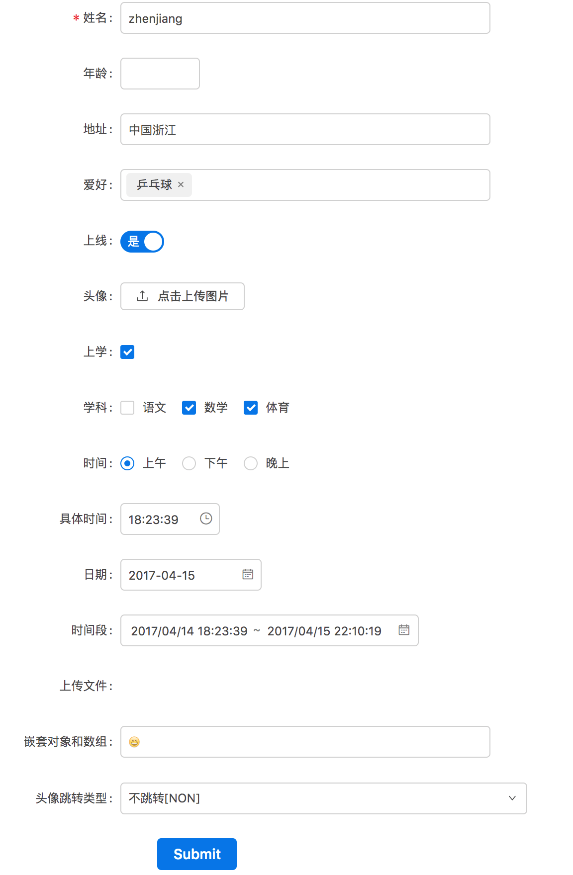
复杂例子,包含了大部分 fields:
{
  fields: [
    {
      type: "Input",
      label: "姓名",
      model: "name",
      initialValue: "zhenjiang",
      required: true,
      props: {
        type: "text"
      }
    },
    {
      type: "InputNumber",
      label: "年龄",
      model: "age",
      //initialValue: 18,
      props: {

      }
    },
    {
      type: "Input",
      label: "地址",
      model: 'user.address',
      //initialValue: "",
      props: {
        type: "text"
      }
    },
    {
      type: "Select",
      label: "爱好",
      model: "favor",
      options: [
        {value: '0', desc: "乒乓球"},
        {value: '1', desc: "羽毛球"},
        {value: '2', desc: "足球"},
        {value: '3', desc: "篮球"}
      ],
      //initialValue: '0',
      props: {
        mode: "tags"
      }
    },
    {
      type: "Switch",
      label: "上线",
      model: "status",
      //initialValue: 1,
      props: {
        checkedChildren: "是",
        unCheckedChildren: "否"
      }
    },
    {
      type: "UploadImg",
      label: "头像",
      model: "avatar",
      //initialValue: "",
      props: {

      }
    },
    {
      type: "Checkbox",
      label: "上学",
      model: "study",
      //initialValue: true,
      props: {

      }
    },
    {
      type: "CheckboxGroup",
      label: "学科",
      model: "subjects",
      props: {
        options: [
          { label: '语文', value: 'Chinese' },
          { label: '数学', value: 'Math' },
          { label: '体育', value: 'Sport' }
        ]
      }
    },
    {
      type: "RadioGroup",
      label: "时间",
      model: "time",
      props: {
        options: [
          { label: '上午', value: 'morning' },
          { label: '下午', value: 'afternoon' },
          { label: '晚上', value: 'night' }
        ]
      }
    },
    {
      type: "TimePicker",
      label: "具体时间",
      model: "curTime",
      props: {

      }
    },
    {
      type: "DatePicker",
      label: "日期",
      model: "date",
      props: {

      }
    },
    {
      type: "RangePicker",
      label: "时间段",
      model: "timeRange",
      props: {
        showTime: true,
        format: "YYYY/MM/DD HH:mm:ss"
      }
    },
    {
      type: "Upload",
      label: "上传文件",
      model: "file",
      props: {
        name: 'file',
        action: '//jsonplaceholder.typicode.com/posts/',
        headers: {
          authorization: 'authorization-text'
        },
        onChange(info) {
          if (info.file.status !== 'uploading') {
            console.log(info.file, info.fileList);
          }
        }
      }
    },
    {
      type: "Input",
      label: "嵌套对象和数组",
      model: "nested[0].other.a[0].b"
    },
    {
      type: "BizTypeSelect",
      label: "跳转",
      model: "action",
      props: {
        layout: {
          labelCol: { span: 7 },
          wrapperCol: { span: 11 }
        },
        label: "头像"
      }
    }
  ]
}
schema 中的一个 field 定义了一个对应于 modal 值的表单元素。 支持的 fields: 核心 fields:
field 的属性分为 field 通用属性和各种 field 特有属性。
| 属性 | 类型 | 描述 | 是否必须 | 默认值 |
|---|---|---|---|---|
| type | string | field 的 type,唯一标识 | 是 | 无 |
| label | string | field 的 label | 是 | 无 |
| model | string | 属性对应 data 中的名字,支持嵌套路径 | 是 | 无 |
| initialValue | any | 初始值 | 否 | undefined |
| required | boolean | 是否必填项 | 否 | false |
| props | object | 控件的 react 属性(props) | 否 | undefined |
见下文中各个 field 的文档。
{
    fields: [
        {
          type: "Input",
          label: "嵌套对象和数组",
          model: "nested[0].other.a[0].b"
        },
    ]
}
dependsOn
数组的动态增减
介绍
特有属性
schema 示例
如何编写自定义 field。
编写满足 antd form 组件需求的自定义表单控件,该组件需遵循以下约定:
提供受控属性 value 或其它与 valuePropName 的值同名的属性。
提供 onChange 事件或 trigger 的值同名的事件。
不能是函数式组件。
按如下方式扩展 Schema2Form 组件 (以编写的BizTypeSelect组件为例):
import BizTypeSelect from 'components/BizTypeExtraSelect/BizTypeExtraSelect';

Schema2Form.extend('BizTypeSelect', BizTypeSelect, {type: '', extra: '{}'}, true);
Schema2Form.extend 方法传入的 4 个参数如下:
| 参数 | 类型 | 描述 | 是否必须 | 默认值 |
|---|---|---|---|---|
| type | string | 对应于 schema 中的 type | 是 | 无 |
| cpnt | React Component | 对应的自定义表单控件 | 是 | 无 |
| defaultInitialValue | any | 控件对应的初始值 | 是 | 无 |
| dropFormItem | boolean | 是否不要 FormItem | 否 | false |
使用时编写 schema
{
  fields: [
    {
      type: "BizTypeSelect",
      label: "跳转",
      model: "action",
      props: {
        layout: {
          labelCol: { span: 7 },
          wrapperCol: { span: 11 }
        },
        label: "头像"
      }
    }
  ]
}
已有自定义 field:
FAQs
schema2form transform schema to form
The npm package schema2form receives a total of 1 weekly downloads. As such, schema2form popularity was classified as not popular.
We found that schema2form demonstrated a not healthy version release cadence and project activity because the last version was released a year ago. It has 3 open source maintainers collaborating on the project.
Did you know?

Socket for GitHub automatically highlights issues in each pull request and monitors the health of all your open source dependencies. Discover the contents of your packages and block harmful activity before you install or update your dependencies.
Security News
Oracle seeks to dismiss fraud claims in the JavaScript trademark dispute, delaying the case and avoiding questions about its right to the name.

Security News
The Linux Foundation is warning open source developers that compliance with global sanctions is mandatory, highlighting legal risks and restrictions on contributions.

Security News
Maven Central now validates Sigstore signatures, making it easier for developers to verify the provenance of Java packages.