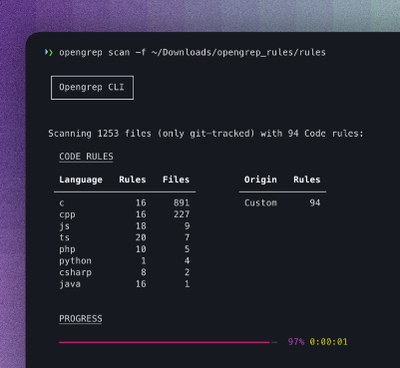
Security News
Opengrep Emerges as Open Source Alternative Amid Semgrep Licensing Controversy
Opengrep forks Semgrep to preserve open source SAST in response to controversial licensing changes.
By Sarah Gooding - Jan 28, 2025
simple-react-calendar
Advanced tools


A simple calendar component for React based applications.
A component that is easy to start using, yet flexible when you need customization.
You can find the component's online demo here.

npm install simple-react-calendar
yarn add simple-react-calendar
import React, { Component } from 'react'

import SimpleReactCalendar from 'simple-react-calendar'

class MyApp extends Component {
  render() {
    return <SimpleReactCalendar activeMonth={new Date()} />
  }
}
All of the properties are optional, just rendering <Calendar /> will already give you a working calendar component.
datePropType - number, string or instanceOf(Date)
You can easily override any rendered part of the calendar by providing the proper render function as a Prop.
| Render Prop name | Default usage | Default Render Prop Component |
|---|---|---|
renderDay | (props) => <Day {...props} /> | RenderPropsComponents/Day/Day.tsx |
renderDayOfWeek | (props) => <DayOfWeek {...props} /> | RenderPropsComponents/DayOfWeek/DayOfWeek.tsx |
renderNotice | (props) => <Notice {...props} /> | RenderPropsComponents/Notice/Notice.tsx |
You can easily override any helper methods, all of them exposed as pure functions.
| Helper function | Default function |
|---|---|
getDayFormatted | getDayFormatted |
getISODate | getISODate |
getNoticeContent | getNoticeContent |
simple-react-calendar follows BEM-like class naming approach and uses
single block name as a prefix. Default block class name is calendar, so
elements will have names like calendar-day, calendar-month etc.
Block class name can be overrided with blockClassName prop (see above).
| Description | Default Class Name | Modifier Class Names |
|---|---|---|
| Calendar (root element) | .calendar | |
| Calendar month header | .calendar-month_header | |
| Calendar month header title (month name) | .calendar-month_header_title | |
| Calendar header button (month switcher) | .calendar-header_button |
|
| Calendar week header (week days) | .calendar-days_of_week | |
| Calendar week header day (week day) | .calendar-days_of_week_day |
|
| Calendar month (weeks wrapper element) | .calendar-month | |
| Calendar week (days wrapper element) | .calendar-week | |
| Calendar day | .calendar-day |
|
| Calendar notice (notice element) | .calendar-notice |
Fork this repository and clone your version of the repository
Install dependencies
yarn
Start example server locally
yarn start
You now have examples running on http://localhost:9000
Fork this repository and clone your version of the repository
Install dependencies
yarn
Start example server locally
yarn storybook
You now have examples running on http://localhost:6006
FAQs
A simple calendar component for React based applications.
The npm package simple-react-calendar receives a total of 1,853 weekly downloads. As such, simple-react-calendar popularity was classified as popular.
We found that simple-react-calendar demonstrated a not healthy version release cadence and project activity because the last version was released a year ago. It has 4 open source maintainers collaborating on the project.
Did you know?

Socket for GitHub automatically highlights issues in each pull request and monitors the health of all your open source dependencies. Discover the contents of your packages and block harmful activity before you install or update your dependencies.
Security News
Opengrep forks Semgrep to preserve open source SAST in response to controversial licensing changes.

Security News
Critics call the Node.js EOL CVE a misuse of the system, sparking debate over CVE standards and the growing noise in vulnerability databases.

Security News
cURL and Go security teams are publicly rejecting CVSS as flawed for assessing vulnerabilities and are calling for more accurate, context-aware approaches.