Research
Security News
Threat Actor Exposes Playbook for Exploiting npm to Build Blockchain-Powered Botnets
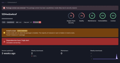
A threat actor's playbook for exploiting the npm ecosystem was exposed on the dark web, detailing how to build a blockchain-powered botnet.
solenya-autocomplete
Advanced tools
Assuming you have `solenya` installed, you will need the following npm packages:
Assuming you have solenya installed, you will need the following npm packages:
solenya-autocomplete
bootstrap
popper.js
jquery
Currently solenya-autocomplete superficially depends on bootstrap & jquery for styling & menus. Those dependencies will be removed in the future.
The usage of AutoComplete is as follows:
export class AutoCompleteSample extends Component
{
    usStates: string[] = []

    @transient usStateAutocomplete =
        new AutoComplete ({
            target: this,
            prop: () => this.usStates,
            isMultiSelect: true,
            modelToLabel: mapPropertyFromTo (usStates, c => c.code, c => c.label),
            labelToModel: mapPropertyFromTo (usStates, c => c.label, c => c.code),
            suggestor: async searchText => {
                const reg = new RegExp (searchText, "i")
                return usStates.filter (l => reg.test (l.label)).map(l => l.label)
            }
        })

    view() {
        return this.usStateAutocomplete.view ()
    }
}

const usStates = [
    { code: "AL", label: "Alabama" },
    { code: "AK", label: "Alaska" },
    { code: "AZ", label: "Arizona" },
    ...
}
Like all the built-in inputs, AutoComplete databinds to a property. The property type is of type T|T[], where you use an array when isMultiSelect is true.
modelToLabel and labelToModel allow you to translate between logical values and the values the user sees. In the above example, the logical values are the state codes, while the label values are the full names of the states.
The suggestor is a promise that returns a list of suggestions given a searchText.
You can customize the styling to the various composite elements of the autocomplete as follows:
 this.usStateAutocomplete.view ({
    selectionAttrs: {
        style: {
            backgroundColor: "#eee"
        }
    }
})
interface IAutoCompleteProps<T>
{
    /** Can be used to prefix the input id used by the autocomplete, which is based on the property name the autocomplete is bound to. */
    prefix: string

    /** Whether the user can select multiple items. Defaults to false. */
    isMultiSelect : boolean

    /** The maximum number of suggestions to display. Defaults to 10. */
    suggestionLimit: number

    /** Whether the databound property is updated in response to text changes. True by default. If set to false, you will need to call the autocomplete's autocomplete() method to manually trigger the autocomplete. */
    isRealtime: boolean

    /** Whether to automatically filter the results based on suggestions returned. Defaults to true, meaning that by default the suggestor doesn't need to filter the list it returns. */
    autoFilter: boolean

    /** Whether to display the autocomplete's `noResultsFoundText` courtesy message when no results are found. */
    showNoResultsFound: boolean

    /** Whether to automatically select a suggestion when there's only a single possible suggestion that matches the current input text.  */
    autoSelectSingleResult: boolean

    /** Whether the user is allowed to enter values that are not suggestions. */
    allowNonSuggestions: boolean

    /** Whether to call the suggestor with an empty value to trigger the suggestor loading and caching its values. */
    preload: boolean

    /** A promise that returns an array of suggestions given `searchText`. If `autoFilter` is `true` then filtering will be automatically applied, albeit potentially less efficiently or correctly than if you filter yourself.` */
    suggestor?: (searchText: string) => Promise<string[]>

    /** An optional function tha converts a label to your databound value. */
    labelToModel?: (label: string) => T

    /** An optional function that conversts your databound value to a label. */
    modelToLabel?: (model: T) => string

    /** A function that receives an event when the user's selection changes. */
    onSelectEvent?: (selection: string | string[]) => void
}
FAQs
A databound autocomplete input for solenya.
The npm package solenya-autocomplete receives a total of 0 weekly downloads. As such, solenya-autocomplete popularity was classified as not popular.
We found that solenya-autocomplete demonstrated a not healthy version release cadence and project activity because the last version was released a year ago. It has 1 open source maintainer collaborating on the project.
Did you know?

Socket for GitHub automatically highlights issues in each pull request and monitors the health of all your open source dependencies. Discover the contents of your packages and block harmful activity before you install or update your dependencies.

Research
Security News
A threat actor's playbook for exploiting the npm ecosystem was exposed on the dark web, detailing how to build a blockchain-powered botnet.

Security News
NVD’s backlog surpasses 20,000 CVEs as analysis slows and NIST announces new system updates to address ongoing delays.

Security News
Research
A malicious npm package disguised as a WhatsApp client is exploiting authentication flows with a remote kill switch to exfiltrate data and destroy files.