Research
Security News
Malicious npm Packages Inject SSH Backdoors via Typosquatted Libraries
Socket’s threat research team has detected six malicious npm packages typosquatting popular libraries to insert SSH backdoors.
stimulus-toggle-util
Advanced tools
An on/off toggle utility for Stimulus.
$ yarn add stimulus-toggle-util
// ./packs/application.js
import { Application } from 'stimulus';
// import Toggle
import Toggle from 'stimulus-toggle-util';

import { definitionsFromContext } from 'stimulus/webpack-helpers';
const application = Application.start();
const context = require.context('../controllers', true, /\.js$/);
application.load(definitionsFromContext(context));

// Manually register `stimulus-toggle-util` as a stimulus controller
application.register('toggle', Toggle);
<body> or <main> so it can be used anywhere.
<main data-controller="toggle">...</main>
action and a toggle target to an element that should perform the toggling.
<button data-action="toggle#toggle" data-toggle-target="sidebar-1">Toggle</button>
data-action="toggle#toggle": toggle is the ToggleController, #toggle is the action that is performed when this element is clicked.toggle name to an element that should be toggled.
<aside data-toggle-name="sidebar-1">...</aside>
<main data-controller="toggle">
  <button data-action="toggle#toggle" data-toggle-target="sidebar-1">
    Toggle Sidebar 1
  </button>

  <aside class="is-hidden" data-toggle-name="sidebar-1">
    <p>Here's "Sidebar 1".</p>
  </aside>
</main>

<main data-controller="toggle">
  <button data-action="toggle#toggle" data-toggle-target="sidebar-1">
    Toggle Sidebar 1
  </button>
  <button
    data-action="toggle#toggle"
    data-toggle-target="sidebar-1,sidebar-2"
  >
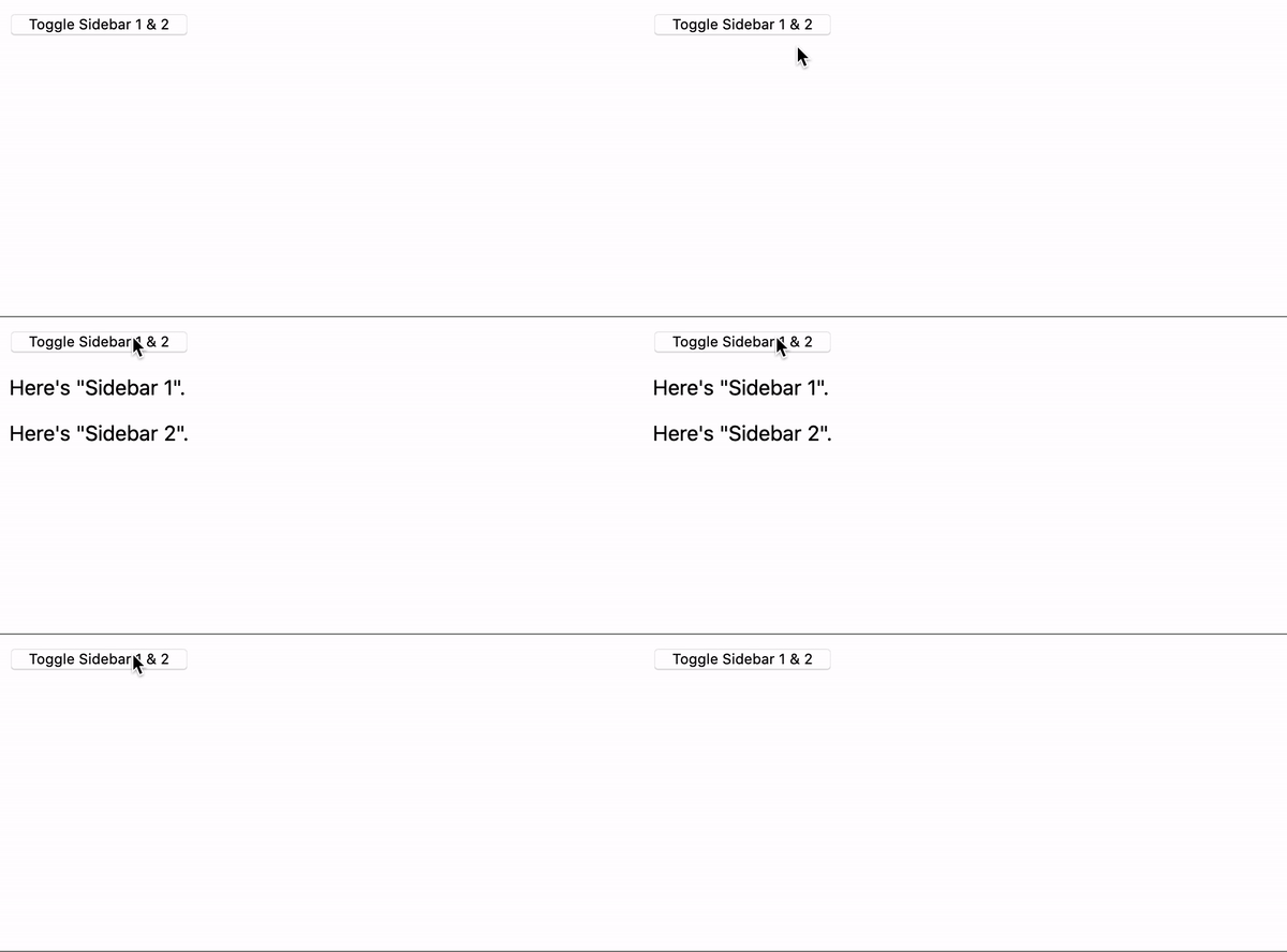
    Toggle Sidebar 1 & 2
  </button>

  <aside class="is-hidden" data-toggle-name="sidebar-1">
    <p>Here's "Sidebar 1".</p>
  </aside>
  <aside class="is-hidden" data-toggle-name="sidebar-2">
    <p>Here's "Sidebar 2".</p>
  </aside>
</main>

<main data-controller="toggle" data-hidden-class="custom-hidden-class">
  <button data-action="toggle#toggle" data-toggle-target="sidebar-1">
    Toggle Sidebar 1
  </button>

  <aside data-toggle-name="sidebar-1">
    <p>Here's "Sidebar 1".</p>
  </aside>
</main>
| Option | Type | Required | Default | Description |
|---|---|---|---|---|
data-hidden-class | String | 🚫 | is-hidden | The CSS class to toggle on/off. It's up to you to apply styles to the to this class to hide/show the element. |
This project is licensed under the MIT License.
FAQs
An on/off toggle utility for Stimulus
We found that stimulus-toggle-util demonstrated a not healthy version release cadence and project activity because the last version was released a year ago. It has 1 open source maintainer collaborating on the project.
Did you know?

Socket for GitHub automatically highlights issues in each pull request and monitors the health of all your open source dependencies. Discover the contents of your packages and block harmful activity before you install or update your dependencies.

Research
Security News
Socket’s threat research team has detected six malicious npm packages typosquatting popular libraries to insert SSH backdoors.

Security News
MITRE's 2024 CWE Top 25 highlights critical software vulnerabilities like XSS, SQL Injection, and CSRF, reflecting shifts due to a refined ranking methodology.

Security News
In this segment of the Risky Business podcast, Feross Aboukhadijeh and Patrick Gray discuss the challenges of tracking malware discovered in open source softare.