Security News
PyPI’s New Archival Feature Closes a Major Security Gap
PyPI now allows maintainers to archive projects, improving security and helping users make informed decisions about their dependencies.


The svgs module is compatibility layer between react-native-svg and regular
react (browser) based SVG elements. This allows you to write SVG in the react
and react-native using exactly the same API. Bringing your applications a step
closer to writing fully isomorphic application.
The library itself is written in ES6 and comes with the correct babel transforms as dependencies so it's easy to integrate in your existing tool chains and webpack builds.
There are 2 ways in using this package, you could use svgs instead of
react-native-svg which is recommended. But you could also instruct your
WebPack builder to use svgs as an alias for react-native-svg.
For regular react usage:
npm install --save svgs
For React-Native usage:
npm install --save svgs
npm install --save react-native-svg
react-native link react-native-svg
Word of caution, make sure that you install a react-native-svg version that
works with your react-native version. See the react-native-svg
project for a list of supported React versions.
To use this package as alias for react-native-svg you need to update your
WebPack configuration to include the following snippet:
resolve: {
  alias: {
    ...
    'react-native-svg': 'svgs',
  }
}
The API that we expose is exactly the same as the react-native-svg project so
please visit: https://github.com/react-native-community/react-native-svg for the
full API documentation. But here is a quick little overview of the available
elements:
import Svg, {
  Circle,
  ClipPath,
  Defs,
  Ellipse,
  G,
  Image,
  Line,
  LinearGradient,
  Mask,
  Path,
  Pattern,
  Polygon,
  Polyline,
  RadialGradient,
  Rect,
  Stop,
  Svg,
  Symbol,
  TSpan,
  Text,
  TextPath,
  Use
} from 'svgs';
Any incompatibilities should be seen as a bug and be reported in the svgs/issue page on Github.
Import all the SVG elements and make a Twitter logo.
import React, { Component } from 'react';
import Svg, { Path } from 'svgs';

class Twitter extends Component {
  render() {
    return (
      <Svg height='1208' width='1000' viewbox='0 0 1000 1208.3' preserveAspectRatio='meet'>
        <Path fill='#000' d='M0 1007.9q139.6 92.1 305.8 92.1 76.7 0 146.9-18.1 70.2-18.1 126.5-50 56.2-31.9 103.9-75.6 47.7-43.8 82.5-95.7 34.8-51.8 59.2-108.9 24.4-57.1 36.5-116.3 12-59.1 12-117.5 0-17.9-0.4-26.6 13.4-10 42.1-25.5 28.8-15.4 51-30.8 22.3-15.4 34-33.3-15.8 7.1-41.5 10-25.6 2.9-56.4 3.7-30.8 0.9-44.2 2.5 34.6-21.6 69.2-58.1 34.6-36.5 45-69.8-31.3 19.2-76.3 38.3-45 19.2-77 25.9-28-30.4-65.7-47.5-37.7-17.1-79.8-17.1-54.1 0-100.2 27.5-46 27.5-72.7 74.6-26.6 47.1-26.6 102.5 0 24.1 5 46.6-122.5-6.6-229.4-63.1-106.9-56.4-181.9-150.6-26.7 46.7-26.7 102.9 0 52.1 23.8 97.1 23.7 45 64.6 72.9-48.4-1.2-90-25.4l0 2.5q0 73.7 45.4 130.2 45.4 56.5 114.6 70.2-25 7.5-52.5 7.5-19.2 0-37.9-3.7 19.1 61.6 70.4 101.2 51.2 39.6 116.2 40.8-108.7 87.5-247.9 87.5-25.8 0-47.5-2.9z' />
      </Svg>
    );
  }
}
If you want Section 508 Accessibility add the title prop to the <Svg /> component like this:
<Svg title="Image Description" width="1000" height="1000" ... />
When this renders on native, you'll get your SVG wrapped in a View with an accessibilityLabel.
On web, the SVG element will get two aria labels and a <title> element that are
required for accessibility.
<svg role="img" aria-label="[title]" width="1000" height="1000">
  <title>Image Description</title>
  ...
</svg>
4.2.0
FAQs
svgs is a compatiblity layer between svg and react-native-svg
The npm package svgs receives a total of 6,553 weekly downloads. As such, svgs popularity was classified as popular.
We found that svgs demonstrated a not healthy version release cadence and project activity because the last version was released a year ago. It has 2 open source maintainers collaborating on the project.
Did you know?

Socket for GitHub automatically highlights issues in each pull request and monitors the health of all your open source dependencies. Discover the contents of your packages and block harmful activity before you install or update your dependencies.

Security News
PyPI now allows maintainers to archive projects, improving security and helping users make informed decisions about their dependencies.

Research
Security News
Malicious npm package postcss-optimizer delivers BeaverTail malware, targeting developer systems; similarities to past campaigns suggest a North Korean connection.

Security News
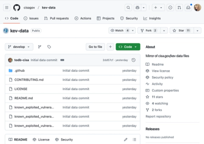
CISA's KEV data is now on GitHub, offering easier access, API integration, commit history tracking, and automated updates for security teams and researchers.