
Research
Security News
Malicious npm Package Targets Solana Developers and Hijacks Funds
A malicious npm package targets Solana developers, rerouting funds in 2% of transactions to a hardcoded address.
By Socket Research Team - Dec 02, 2024
swipe-scroller
Advanced tools
Horizontal card slider for the modern web. Requires minimum JavaScript. Demo
<noscript>.Tested on the latest evergreen browsers.
| Chrome | Safari | Firefox | Safari (iOS) | Samsung Internet | |
|---|---|---|---|---|---|
| CSS Scroll Snap | 69 | 11 | 68 | 11 | 10.1 |
| CSS Scroll-behavior | 61 | 15.4 | 36 | 15.4 | 8.2 |
npm create svelte@latest
npm i swipe-scroller -D
Following code is based on SvelteKit v1.
<!-- src/routes/+layout.svelte -->

<script>
  import 'swipe-scroller/style';
</script>

<div class="container-outer" style="position: fixed; inset: 0;" />

<div style="position: relative; overflow-x: hidden;">
  <slot />
</div>
<!-- src/routes/+page.svelte -->

<script>
  import Scroller from 'swipe-scroller/Scroller.svelte';
</script>

<div class="container-inner">
  <h1>Swipe Scroller</h1>
</div>

<Scroller>
  {#each { length: 5 } as _, index}
    <a href="#{index}" class="card">
      <img src="https://scroller.hyunbin.page/{index}.jpg" alt="" />
      <div>Card No. {index + 1}</div>
    </a>
  {/each}
</Scroller>

<style>
  .card {
    text-decoration: none;
    color: white;
    background-color: gray;
    width: 80%;
    min-width: 224px;
    max-width: 296px;
    overflow: hidden;
  }

  .card > img {
    display: block;
    aspect-ratio: 1;
    width: 100%;
  }

  .card > div {
    padding: 1rem;
    text-align: center;
  }
</style>
Reference how it works for an in-depth explanation.
The following DOM events are forwarded to the component.
<!-- Provide custom callbacks if needed. -->
<Scroller on:scroll on:scrollend />
// Optional Component Props

/** Width and height of the clickable control buttons. */
export let buttonWidth = '2.5rem';
/** Horizontal gap between the provided card components. */
export let cardGap = '1.25rem';

/** Hang control buttons on the outer container border. */
export let hangButtons = true;
/** Invert the scroll direction of the control buttons. */
export let invertButtons = false;
<!-- Optional Named Slots -->

<slot name="noscript" />
<slot name="button-prev" />
<slot name="button-next" />
The buttons are shown only when hovered with @media (pointer: fine) such as a mouse cursor. ↩
For accessibility, wrap the card component with tabbable elements such as <a> or <button>. ↩
FAQs
Horizontal card slider for the modern web
We found that swipe-scroller demonstrated a not healthy version release cadence and project activity because the last version was released a year ago. It has 1 open source maintainer collaborating on the project.
Did you know?

Socket for GitHub automatically highlights issues in each pull request and monitors the health of all your open source dependencies. Discover the contents of your packages and block harmful activity before you install or update your dependencies.
Research
Security News
A malicious npm package targets Solana developers, rerouting funds in 2% of transactions to a hardcoded address.

Security News
Research
Socket researchers have discovered malicious npm packages targeting crypto developers, stealing credentials and wallet data using spyware delivered through typosquats of popular cryptographic libraries.
Security News
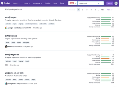
Socket's package search now displays weekly downloads for npm packages, helping developers quickly assess popularity and make more informed decisions.