Security News
Oracle Drags Its Feet in the JavaScript Trademark Dispute
Oracle seeks to dismiss fraud claims in the JavaScript trademark dispute, delaying the case and avoiding questions about its right to the name.
timeline-calendar
Advanced tools
Simple timeline calendar for React that is easy to customize and work with.
Simple timeline calendar for React that is easy to customize and work with.
import React, { useState } from "react";
import TimelineCalendar from "timeline-calendar";
// Import this CSS file if you do not want to implement all the details yourself.
import "../node_modules/timeline-calendar/dist/lib.esm.css";
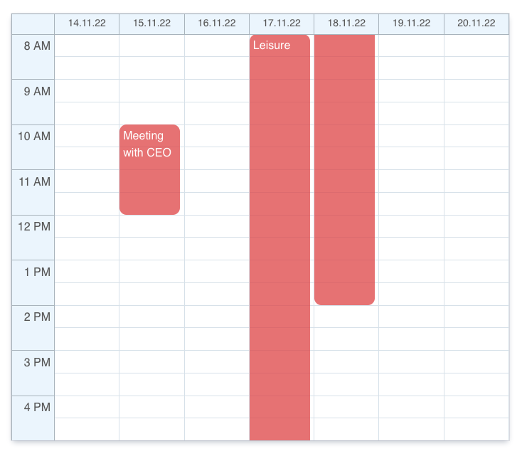
let events = [
{
id: 1,
title: "Meeting with CEO",
start: new Date("2022-11-15 10:00"),
end: new Date("2022-11-15 12:00"),
},
{
id: 2,
title: "Leisure",
start: new Date("2022-11-17 08:00"),
end: new Date("2022-11-18 14:00"),
}
];
let options = {
events: events,
// events: Event[];
// numberOfColumns?: number; Defaults to 7 (weekly).
// onCellClick?: (date: Date) => void;
// onEventClick?: (event: Event) => void;
// disableCellPredicate?: (date: Date) => boolean; Defaults to false.
// hourWindowDateFormat?: string; Format of the string is based on Unicode Technical Standard #35
// dateWindowDateFormat?: string; Format of the string is based on Unicode Technical Standard #35
// businessHourStart?: number; Defaults to 8.
}
export default function App() {
let [date, setDate] = useState(new Date());
return <TimelineCalendar {...options} currentDate={date} />;
}

It is easy to customize the theme by defining CSS variables in :root.
:root {
    --cell-divider-color: #dce5ec;
    --cell-bg-color: white;
    --xy-bg-color: #eef6fd;
    --xy-color: #606060;
    --xy-divider-color: #b1bbc4;
    --border-color: transparent;
    --event-color: rgba(225, 81, 83, 0.75);
    --cell-hover-color: #a8a8a8;
    --cell-disabled-color: rgb(245, 245, 245);
}
Change height by assigning height to this CSS class:
.timeline-calendar {
    height: 800px !important;
}

.calendar-grid {
    height: 600px !important;
}
This package exports ESM only at this point in time.
FAQs
Simple timeline calendar for React that is easy to customize and work with.
The npm package timeline-calendar receives a total of 5 weekly downloads. As such, timeline-calendar popularity was classified as not popular.
We found that timeline-calendar demonstrated a not healthy version release cadence and project activity because the last version was released a year ago. It has 1 open source maintainer collaborating on the project.
Did you know?

Socket for GitHub automatically highlights issues in each pull request and monitors the health of all your open source dependencies. Discover the contents of your packages and block harmful activity before you install or update your dependencies.

Security News
Oracle seeks to dismiss fraud claims in the JavaScript trademark dispute, delaying the case and avoiding questions about its right to the name.

Security News
The Linux Foundation is warning open source developers that compliance with global sanctions is mandatory, highlighting legal risks and restrictions on contributions.

Security News
Maven Central now validates Sigstore signatures, making it easier for developers to verify the provenance of Java packages.