v-dialogs
A simple and powerful dialog, dialog type including Modal, Alert, Mask and Toast, based on Vue2.x
The Dialog Icon
the icons in alert dialog used are made by Elegant Themes
and control icon, toast icon used are come from IconFont
Install
npm i v-dialogs --save
Include plugin in your main.js file.
import Vue from 'vue'
import vDialog from 'v-dialogs';
...

Vue.use(vDialog);
Use case
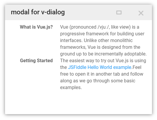
Modal
import myComponent from './myComponent';
new Vue({
el: '#app',
methods: {
click(){
this.$vDialog.modal(myComponent, {
params: {
a: 1,
b: 2
}
});
}
}
});
receive params in component
export default {
name: 'myComponent',
props: ['params']
data(){
console.log(this.params);
return {};
}
}
close dialog and return data in component
export default {
name: 'myComponent',
props: ['params']
data(){
console.log(this.params);
return {};
},
methods: {
closeDialog(){
let data = {
a: 2,
b: 4
};
this.$vDialog.close(data);
}
}
}
Alert
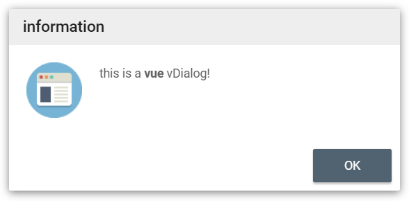
this.$vDialog.alert('This is a <b>Vue</b> dialog plugin: vDialog!');
this.$vDialog.alert('This is a <b>Vue</b> dialog plugin: vDialog!',function(){
});
this.$vDialog.alert('This is a <b>Vue</b> dialog plugin: vDialog!',function(){
},{
messageType: 'error',
closeTime: 2,
language: 'en'
});
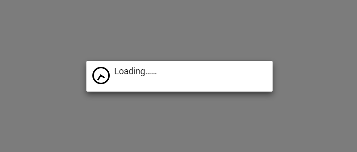
Mask
this.$vDialog.mask();
this.$vDialog.mask('my data loading...');
this.$vDialog.mask('my data loading...', function(){
});
some time, you can use mask like this:
let that = this;
let dialogKey = this.$vDialog.mask();
axios.post(...).then(resp){
that.$vDialog.close(null, dialogKey);
};
Toast
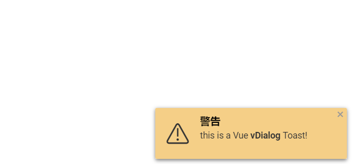
open a Toast dialog in a corner
this.$vDialog.toast('This is a Vue <b>vDialog</b> Toast!');
this.$vDialog.toast('This is a Vue <b>vDialog</b> Toast!', function(){
});
this.$vDialog.toast('This is a Vue <b>vDialog</b> Toast!',null, {
messageType: 'warning',
position: 'topLeft',
dialogCloseButton: false,
closeTime: 3
});
messageType:
- 'info'(default)
- 'warning'
- 'error'
- 'success'
position:
- 'topLeft'
- 'topCenter'
- 'topRight'
- 'bottomLeft'
- 'bottomCenter'
- 'bottomRight'


