Security News
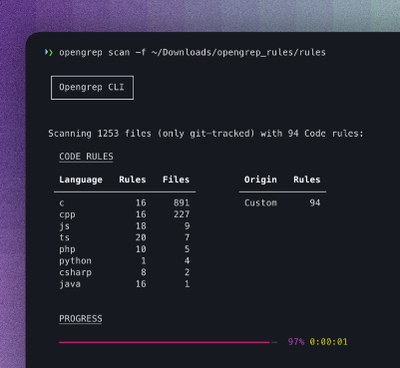
Opengrep Emerges as Open Source Alternative Amid Semgrep Licensing Controversy
Opengrep forks Semgrep to preserve open source SAST in response to controversial licensing changes.
vanilla-lazyload
Advanced tools
A fast, lightweight script to load images as they enter the viewport. Supporting responsive images (both srcset + sizes and picture).
LazyLoad is a fast, lightweight and flexible script for loading images only when they're about to enter the viewport of a scrollable area, which supports the srcset attribute and with and takes best advantage from the progressive JPEG image format (which is good for performance).
This script was inspired by Mika Tuupola's jQuery_lazyLoad. The following are the main differences between the scripts.
lazyLoad shows your images while they load, letting progressive JPEG do its magic. jQuery_lazyload will only show your images once fully loaded.scroll event is throttled by default, meaning that the main function of the script will not continuously be executed on devices with a smooth scroll such as mobile devices or Macs. jQuery_lazyload doesn't have this option, so its scroll handler function is executed more frequently then necessary, slowing down the user device.srcset attribute (x notation, i.g. 1x, 2x .. nx and w notation, i.g. 100w, 200w + sizes attribute), and via the picture tag.img tagsMarkup your images putting the image source inside the data-original attribute.
Specify both width and height attributes if known upfront, so the browser can allocate the space on your page.
<img data-original="/your/image1.jpg" width="100" height="172">
<img data-original="/your/image2.jpg" width="100" height="172">
<img data-original="/your/image3.jpg" width="100" height="172">
Or if you want to use srcset:
<img data-original="/your/image1.jpg"
    data-original-set="/your/image1.jpg 1x, /your/image1@2x.jpg 2x"
    width="100" height="172">
<img data-original="/your/image2.jpg"
    data-original-set="/your/image2.jpg 1x, /your/image2@2x.jpg 2x"
    width="100" height="172">
<img data-original="/your/image3.jpg"
    data-original-set="/your/image3.jpg 1x, /your/image3@2x.jpg 2x"
    width="100" height="172">
Or if you want to use srcset and sizes:
<img data-original="/your/image1.jpg"
    data-original-set="/your/image1.jpg 200w, /your/image1@2x.jpg 400w"
    sizes="(min-width: 20em) 35vw, 100vw">
<img data-original="/your/image2.jpg"
    data-original-set="/your/image2.jpg 200w, /your/image2@2x.jpg 400w"
    sizes="(min-width: 20em) 35vw, 100vw">
<img data-original="/your/image3.jpg"
    data-original-set="/your/image3.jpg 200w, /your/image3@2x.jpg 400w"
    sizes="(min-width: 20em) 35vw, 100vw">
Or if you want to use the picture tag:
<picture>
    <source media="(min-width: 1024px)" data-original-set="/your/image1a.jpg" />
    <source media="(min-width: 500px)" data-original-set="/your/image1b.jpg" />
    <img alt="Stivaletti" data-original="/your/image1.jpg">
</picture>
<picture>
    <source media="(min-width: 1024px)" data-original-set="/your/image2a.jpg" />
    <source media="(min-width: 500px)" data-original-set="/your/image2b.jpg" />
    <img alt="Stivaletti" data-original="/your/image2.jpg">
</picture>
<picture>
    <source media="(min-width: 1024px)" data-original-set="/your/image3a.jpg" />
    <source media="(min-width: 500px)" data-original-set="/your/image3b.jpg" />
    <img alt="Stivaletti" data-original="/your/image3.jpg">
</picture>
Note that not all the images in the page needs to be lazy loaded. You can leave the first images (the amount that you're quite sure that fits in the majority of viewports) loaded normally, then start lazy loading the rest.
script tagInclude the script in the bottom of your HTML page, just before the closing </body> tag.
<body>
    <!-- Your content ... -->
    <script src="lazyload.min.js"></script>
</body>
In your javascript code, create an instance of LazyLoad, doing so:
var myLazyLoad = new LazyLoad();
Or, if you want to customize the behaviour of LazyLoad passing some options in, you can do so:
var myLazyLoad = new LazyLoad({
    // example of options object -> see options section
    threshold: 500,
    container: document.getElementById('scrollPane'),
    elements_selector: ".showCase img",
    throttle: 30,
    data_src: "src",
    data_srcset: "srcset",
    callback_set: function() { /* ... */ }
});
See the demos and options sections for further defails.
Be sure that the images that are going to be lazy loaded occupy some vertical space (*), ideally the same space of the loaded images.
To do that you can size all your img elements using CSS, for example doing this:
/* Sets a min-height to all images
so that they occupy some space
before they are loaded */
img {
    display: block;
    width: 100%;
    height: auto;
    min-height: 300px;
}
In addition, something needs to be done to avoid the "broken image" icon to appear when the img element without the src attribute enters the viewport.
/* Prevents img without src to appear */
img:not([src]) {
    visibility: hidden;
}
Furthermore, we need to deal with a Firefox anomaly that still shows the "broken image" icon while the image is loading. The CSS code that does this trick is the following:
/* Fixes Firefox anomaly */
@-moz-document url-prefix() {
    img:-moz-loading {
        visibility: hidden;
    }
}
(*) if you won't do so, a lot of images would enter the viewport as the user scrolls down, so you would lose the advantages that LazyLoad would bring to your website.
For every instance of LazyLoad you can pass in some options, to alter its default behaviour. Here's the list of the options.
| Name | Meaning | Default value |
|---|---|---|
container | The container in which to start searching for elements, and from which to listen to the scroll event | window |
elements_selector | The selector of the image elements inside the container | "img" |
threshold | The distance out of the viewport, expressed in pixel, before which to start loading the images | 300 |
throttle | The time that has to pass between one element parsing and the following, when fast scroll events occur | 40 |
data_src | The name of the data attribute containing the original image source. The "data-" is automatically added. | "original" |
data_srcset | The name of the data attribute containing the original image source set. The "data-" is automatically added. If you also need to add the sizes attribute, you can do it directly to you img tag, as sizes gets ignored when the srcset attribute is missing . | "original-set" |
class_loading | The class applied to the img or iframe elements while the loading is in progress | "loading" |
class_loaded | The class applied to the img or iframe elements when the loading is complete | "loaded" |
skip_invisible | Specifies whether the script has to consider invisible images or not | true |
callback_load | A function to be called when an image was loaded. | null |
callback_set | A function to be called when the src of an image is set in the DOM. | null |
callback_processed | A function to be called when an image was processed. | null |
| Method name | Effect |
|---|---|
update() | Tells LazyLoad that new lazy images have arrived in the container, so it must start to manage them |
destroy() | Destroys the instance, unsetting instance variables and removing listeners. |
handleScroll() | A throttled scroll handler. This is called automatically from LazyLoad if the container element fires a scroll event, but it's exposed as a public method to allow you to use LazyLoad otherwise (i.g. when using iScroll) |
Learn how to use LazyLoad in different contexts by looking at the code.
The images are in the page body, so LazyLoad is created with the default options.
See it in action | View source
srcset attribute (1x 2x notation) demoThe images also rely on the srcset attribute to be loaded lazily. Just pass in the data_srcset option and the job will be done.
See it in action | View source
srcset + sizes attributes demoThe images also rely on the srcset attribute to be loaded lazily, and on the sizes attribute to be sized. Just pass in the data_srcset option, set the sizes attribute normally and the job will be done.
See it in action | View source
picture tag demoThe images can also be marked up using the picture tag and still be loaded lazily. Just pass in the data_srcset option and the job will be done.
See it in action | View source
iframe demoTo lazy load iframes, set the elements_selector to iframes and optionally change the data_src option (default data-original) to define which data attribute will contain the source of the iframe.
See it in action | View source
To make lazy load use background images, set the elements_selector to whatever tag you want except img and iframe. The image will be loaded from the URL specified in the data attribute defined by the data_src option (default data-original).
See it in action | View source
The images are in scrolling container, a scrolling div inside the page body.
See it in action | View source
The images are in multiple scrolling containers, two scrolling divs inside the page body.
See it in action | View source
The images are added in different times, simulating content that gets added by AJAX requests or other actions.
See it in action | View source
This demo shows how to destroy LazyLoad when you're finished using it, to free up some memory.
See it in action | View source
Browser support is starting from Internet Explorer 8 up.
Please mind that you can't use CSS 3 selectors in IE8, so beware of them if you change the elements_selector default option.
It's time to give it a try and boost your website performance!
Download the package from GitHub and add dist/lazyload.min.js to your project files.
Run the following command on your terminal or command prompt.
bower install vanilla-lazyload
Run the following command on your terminal or command prompt.
npm install vanilla-lazyload
14.0.0
🎉 Major refactoring and performance improvement! 🔍 File size stays tiny: only 2.07 KB gZipped
Settings
callback_loading is called when an element started loadingcallback_reveal is now ⚠ DEPRECATED, use callback_loading instead (it's the same thing, it was just renamed). callback_reveal will be removed and will stop working in version 15.Instance methods
update() method now also unobserves deleted elements, instead of just looking for and observing new elementsdestroy() destroys better than it did before, delete-ing properties instead of setting their values to nullload() method (as an instance method) is now ⚠ DEPRECATED, use the static method instead. If you were using aLazyLoadInstance.load(element) you should change it to LazyLoad.load(element, settings).Static methods
load() was added as a static method. Note that if you need to use custom settings, you need to pass them in the settings parameter.Instance properties
toLoadCount. It's the counter of the elements that haven't been lazyloaded yet.DOM
data-was-processed attribute, that was added to mark lazy DOM elements as "already managed". If you were manually handling that attribute to obtain some goal, this is a potentially breaking change. You should now refer to the data-ll-status instead.data-ll-status attribute, which is now used to mark the status of a lazy DOM element. The values it can take are: observing (not loaded yet), loading (loading started), loaded (load completed), error (an error has occured), native (similar to observing, but managed by native lazy loading).Love this project? 😍 Buy me a coffee!
FAQs
LazyLoad is a lightweight (2.4 kB) and flexible script that speeds up your web application by deferring the loading of your below-the-fold images, videos and iframes to when they will enter the viewport. It's written in plain "vanilla" JavaScript, it leve
The npm package vanilla-lazyload receives a total of 42,711 weekly downloads. As such, vanilla-lazyload popularity was classified as popular.
We found that vanilla-lazyload demonstrated a healthy version release cadence and project activity because the last version was released less than a year ago. It has 1 open source maintainer collaborating on the project.
Did you know?

Socket for GitHub automatically highlights issues in each pull request and monitors the health of all your open source dependencies. Discover the contents of your packages and block harmful activity before you install or update your dependencies.

Security News
Opengrep forks Semgrep to preserve open source SAST in response to controversial licensing changes.

Security News
Critics call the Node.js EOL CVE a misuse of the system, sparking debate over CVE standards and the growing noise in vulnerability databases.

Security News
cURL and Go security teams are publicly rejecting CVSS as flawed for assessing vulnerabilities and are calling for more accurate, context-aware approaches.