Security News
Opengrep Emerges as Open Source Alternative Amid Semgrep Licensing Controversy
Opengrep forks Semgrep to preserve open source SAST in response to controversial licensing changes.
SFC Vue component implementing a Pomodoro timer

Vuemodoro is a Vue Single File Component implementing a countdown timer, intended to provide a Pomodoro countdown in your Vue applications. It comes with a set of properties making the component customizable for your needs. For example, you can customize either the duration of the countdown or the labels of the buttons for interacting with the component.
Moreover, you can choose between different styles for your Vuemodoro look and feel. 🍅
If you need to customize the Pomodoro timer behavior, you can use one of the following optional properties.
| Properties | Default | Description | Type |
|---|---|---|---|
| minutes | 25 | sets the minutes of the countdown | Number |
| seconds | 0 | sets the seconds of the countdowm | Number |
| pomodoroLabel | Pomodoro Timer | adds a descriptive label to the timer container | String |
| startLabel | Start | adds a descriptive label to the start button of the timer | String |
| pauseLabel | Pause | adds a descriptive label to the pause button of the timer | String |
| resetLabel | Reset | adds a descriptive label to the reset button of the timer | String |
| muted | false | defines if the timer must play a sound when the countdown ends. | Boolean |
| theme | dark | defines the styles of the timer. It comes with three different styles. bare, light and dark are the available options. | String |
You can install Vuemodoro using npm:
npm install --save vuemodoro
Alternatively, you can import vuemodoro via <script> tag in the browser directly, avoiding the NPM installation:
<script src="https://unpkg.com/vue"></script>
<script src="https://unpkg.com/vuemodoro"></script>
Once installed, it is easy to use it.
First, you need to import vuemodoro in your files. You can do that in different ways. For example, it can be imported into a build process for use in full-fledged Vue applications:
import Pomodoro from 'vuemodoro';

export default {
  components: {
    Pomodoro,
  },
  // rest of the component
}
Once imported, you can use your component as follows:
<Pomodoro/>
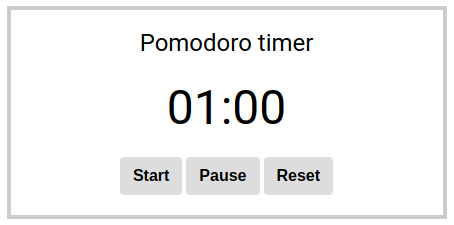
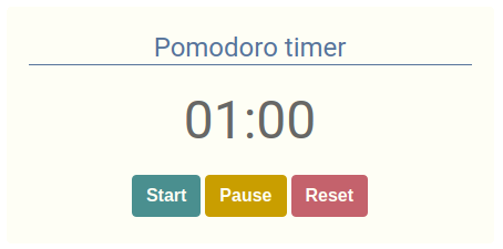
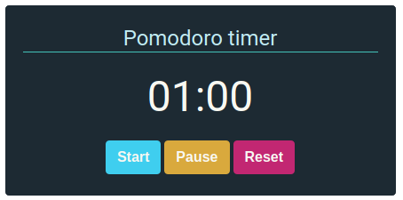
Vuemodoro comes with a theme prop. It allows to modify the look and feel of the component. The available options are:
bare, it is a minimal look and feel, intended for customization:

light, it is the light theme of Vuemodoro:

dark, it is the dark theme of Vuemodoro:

This component can be improved both in features and performances. Please, help me in doing it better 🍅
FAQs
Vue component implementing a Pomodoro Timer
The npm package vuemodoro receives a total of 2 weekly downloads. As such, vuemodoro popularity was classified as not popular.
We found that vuemodoro demonstrated a not healthy version release cadence and project activity because the last version was released a year ago. It has 1 open source maintainer collaborating on the project.
Did you know?

Socket for GitHub automatically highlights issues in each pull request and monitors the health of all your open source dependencies. Discover the contents of your packages and block harmful activity before you install or update your dependencies.

Security News
Opengrep forks Semgrep to preserve open source SAST in response to controversial licensing changes.

Security News
Critics call the Node.js EOL CVE a misuse of the system, sparking debate over CVE standards and the growing noise in vulnerability databases.

Security News
cURL and Go security teams are publicly rejecting CVSS as flawed for assessing vulnerabilities and are calling for more accurate, context-aware approaches.