
Research
Security News
Malicious npm Package Targets Solana Developers and Hijacks Funds
A malicious npm package targets Solana developers, rerouting funds in 2% of transactions to a hardcoded address.
A highly accessible, customizable and lightweight dialog.
Try the dialog yourself at Codepen. Go here to see a demo https://appnest-demo.firebaseapp.com/web-dialog/.
Building a good dialog is hard - there are many things you might not think about if you try to build one. This dialog has been build using the WAI-ARIA Authoring Practices and follows all of the best practices. This makes the dialog:
openDialog(...)It is recommended that you install the library through NPM.
$ npm i web-dialog
To use this library you first need to get import the library through code somewhere (import "web-dialog";). After you have done this you'll be able to use the web-dialog web component. In-between the opening and closing tags you can add whatever content you'd want to show in the dialog.
<web-dialog>
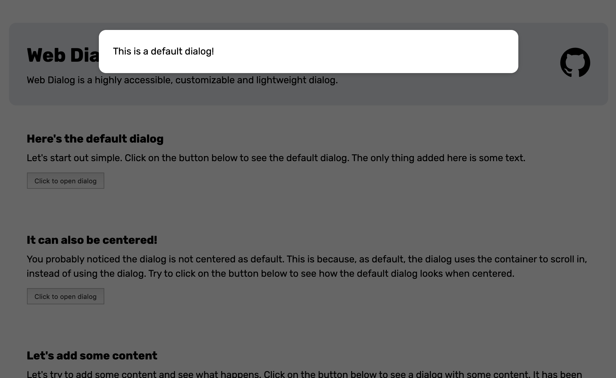
  <span>This is a default dialog!</span>
</web-dialog>
To open the dialog you will have to add the open attribute to the element.
<web-dialog open>
  <span>This is a default dialog!</span>
</web-dialog>
Alternatively you can set the .open property of the dialog to true through Javascript.
const $dialog = document.querySelector("web-dialog");
$dialog.open = true;
When the dialog opens it will look like this.

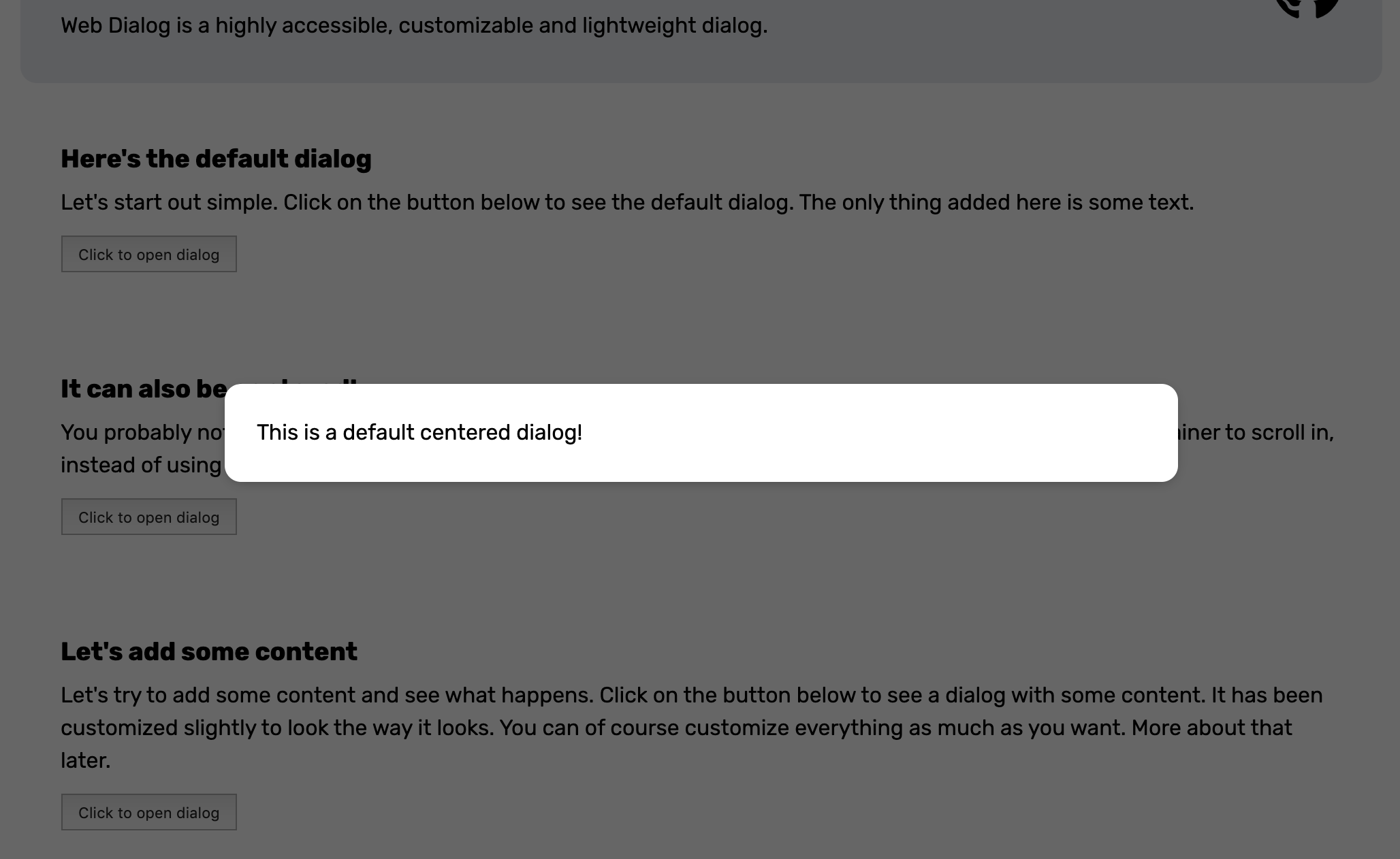
You probably noticed the dialog is not centered as default. This is because, as default, the dialog uses the container around the element to scroll in instead of using the inside of the dialog. To center the dialog you can add the center attribute or set the .center property to true.
<web-dialog center>
  <span>This is a default centered dialog!</span>
</web-dialog>
When opened the dialog will look like this.
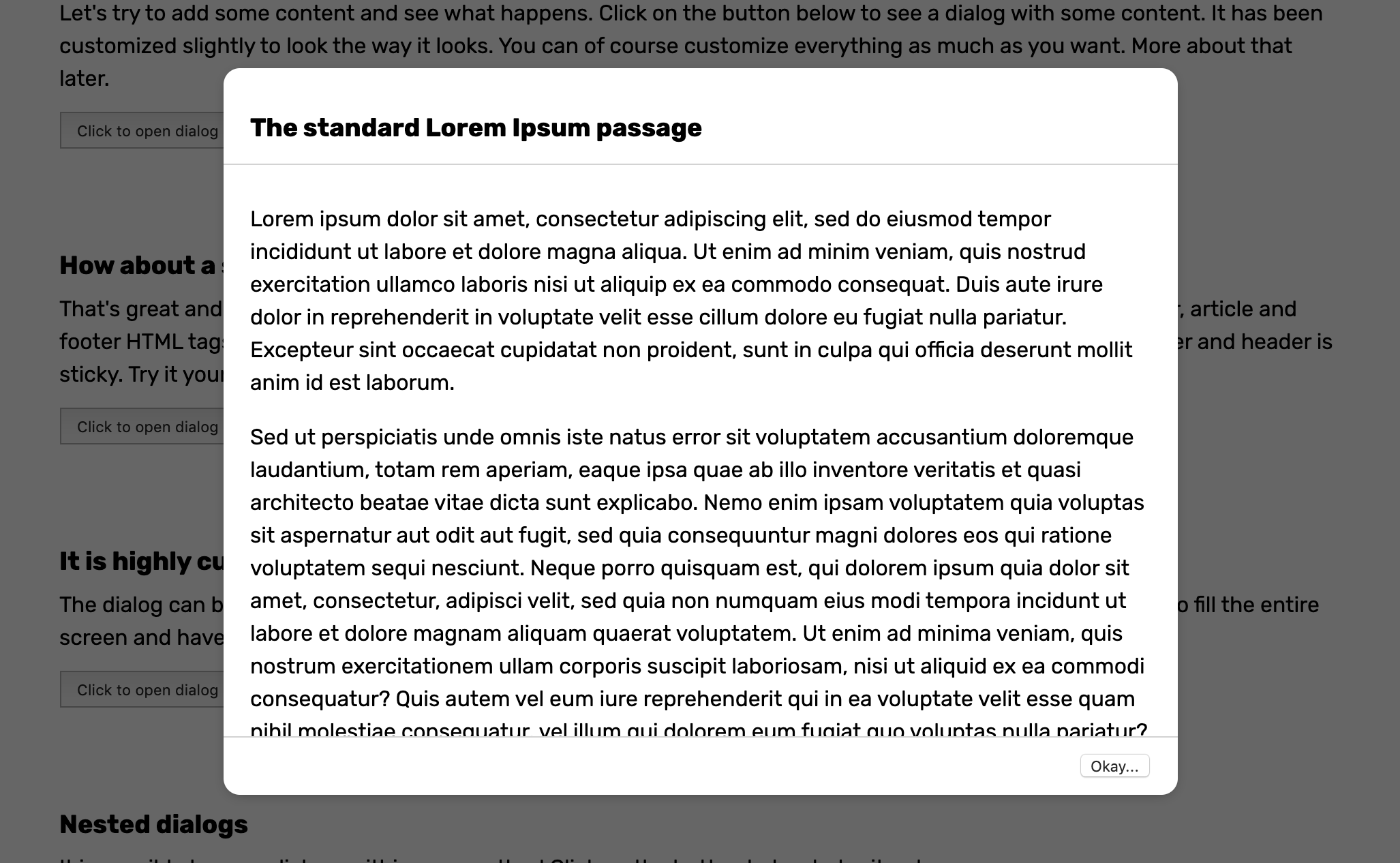
What about a sticky header and footer? No problem at all. Just make sure to use header, article and footer HTML tags for your content and center the dialog. This will style the content in such as way that the footer and header is sticky.
<web-dialog center>
  <header>
    <h3>The standard Lorem Ipsum passage</h3>
  </header>
  <article>
    <p>Lorem ipsum dolor sit amet, consectetur adipiscing...</p>
  </article>
  <footer>
    <button>Okay...</button>
  </footer>
</web-dialog>
To make thing look nice you can add some CSS and apply a bottom border to the header, a top border to the footer and add some padding to the elements. When opened the dialog will look like this.
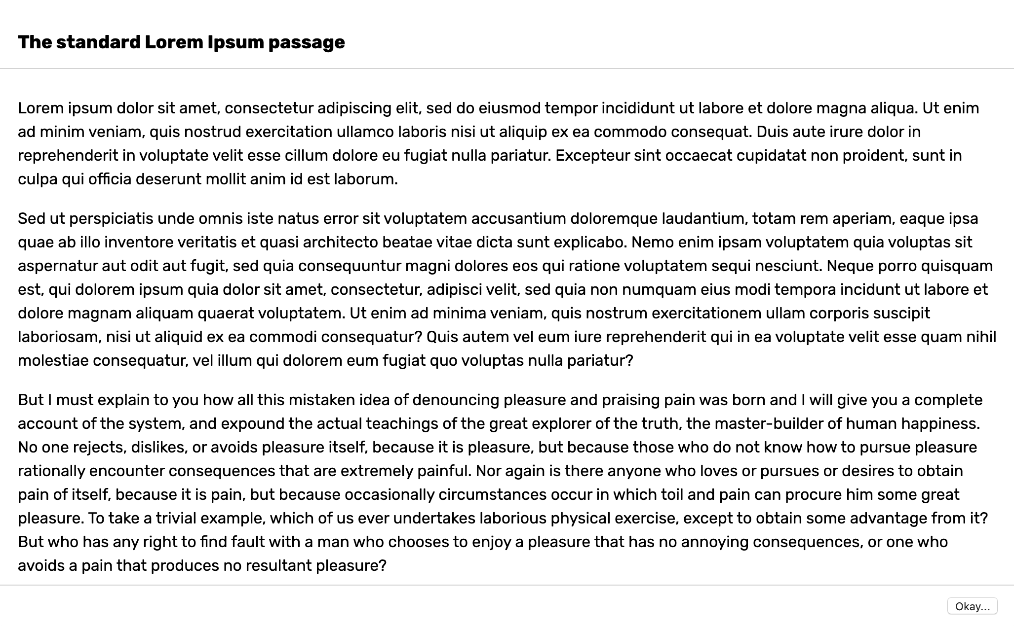
The dialog can be customized by setting some CSS variables or modifying the shadow parts. You can read about all of the CSS variables you can set and shadow parts you can change here. Let's say you want to create a fullscreen dialog. Then you could change the following CSS variable to achieve it.
web-dialog {
  --dialog-container-padding: 0;
  --dialog-border-radius: 0;
  --dialog-max-width: 100vw;
  --dialog-height: 100%;
  --dialog-animation-duration: 0;
}
<web-dialog>
  <header>
    <h3>The standard Lorem Ipsum passage</h3>
  </header>
  <article>
    <p>Lorem ipsum dolor sit amet, consectetur adipiscing...</p>
  </article>
  <footer>
    <button>Okay...</button>
  </footer>
</web-dialog>
When opened the dialog will look like this.
The dialog can dispatch 3 different events.
open event which is dispatched when the dialog opens.closing event which is dispatched when the dialog is about to close due to the user clicking on the backdrop or pressing escape. If .preventDefault() is called on this event the dialog won't close.close event which is dispatched when the dialog closes. If .result is set on the dialog, the .detail property of the close event will have the value of the result.Here's an example on how you'd use the events.
const $dialog = document.querySelector("web-dialog");

$dialog.addEventListener("open", () => {
  console.log("The dialog opened!");
});

$dialog.addEventListener("closing", () => {
  console.log("The dialog is about to close because the backdrop was clicked or because escape was pressed!");

  // Don't allow the dialog to close
  e.preventDefault();
});

$dialog.addEventListener("close", e => {
  console.log("The dialog closed!", e.detail);
});
openDialog(...)If you want to use the dialog programmatically you can use the openDialog(...) function. This function makes sure to append content inside the dialog, adds it to the DOM and removes it when it closes. You can give an object with the following fields to the function.
body element.WebDialog. This is smart to overwrite if you for example have extended the WebDialog class and want to open that custom dialog instead.In it's most simple form you can open a dialog like this:
import {openDialog} from "web-dialog";

const $template = document.createElement("template");
$template.innerHTML = `
  <span>This is some content for the dialog!</span>
`;

openDialog({
  $content: $template.content.cloneNode(true)
});
When the openDialog(...) function above is called it will look like this.
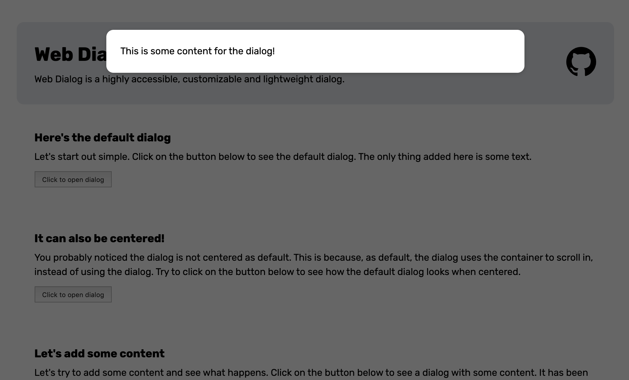
The openDialog(...) function returns an object with the following two properties.
Based on the information above, here's a little more advanced example.
import {openDialog} from "web-dialog";

// Create a template
const $template = document.createElement("template");
$template.innerHTML = `
  <button data-value="no">No</button>
  <button data-value="yes">Yes</button>
`;

// Open the dialog
const {$dialog, resolver} = openDialog({
  $content: $template.content.cloneNode(true)
});

// Attach an event listener that sets the closes the dialog with the result when a button is clicked
$dialog.querySelectorAll("button").forEach($button => $button.addEventListener("click", e => {
  const result = e.target.dataset.value;
  $dialog.close(result);
}));

// Wait for the result
const result = await resolver;

// Print the result
console.log(`The result was ${result}`);
Here's a little trick for you if you use lit-element or lit-html. If you want to quickly open a dialog with some content you can use the render function of lit-html like this.
import {openDialog} from "web-dialog";
import {render} from "lit-html";

openDialog({
  $content: $dialog => render(html`
    <h3>Do you like this dialog?</h3>
    <button @click="${() => $dialog.close()}">Umm, yeah!</button>
  `, $dialog)
});
It is totally possible to extend the dialog. The only thing you have to do is define a new class and extend the WebDialog class. Then you can add your custom logic and define a new custom element with your new class. Here's an example of what you could if you for example want a custom dialog that shows an image.
import { WebDialog } from "web-dialog";

// Create a template for the content of the dialog
const $template = document.createElement("template");
$template.innerHTML = `
  <style>
    #img {
      width: 100%;
      height: 400px;
      object-fit: cover;
    }
  </style>
  <img id="img" />
`;

// Create a class extending the WebDialog class.
class ImageDialog extends WebDialog {

  // Observe the src attribute so we can react each time it changes
  static get observedAttributes () { return ["src"]; }

  // Make sure the src property is getting reflected as an attribute
  get src () { return this.hasAttribute("src"); }
  set src (value) { this.setAttribute("src", value); }

  constructor () {
    super();

    // Append the dialog content
    this.$dialog.appendChild($template.content.cloneNode(true));

    // Get a reference to the img element
    this.$img = this.shadowRoot.querySelector("#img");
  }

  // Each time the src attribute changes we set the src of the image element
  attributeChangedCallback (name, newValue) {
    switch (name) {
      case "src":
        this.$img.src = newValue;
        break;
    }
  }
}

// Remember to define your new custom element
customElements.define("image-dialog", ImageDialog);
After you have defined your new dialog you are be able to use it like this.
<image-dialog open center src="https://i.ytimg.com/vi/NCZ0eg1zEvw/maxresdefault.jpg"></image-dialog>
Or this
import {openDialog} from "web-dialog";

openDialog({
  initialize: () => {
    const $dialog = new ImageDialog();
    $dialog.src = `https://i.ytimg.com/vi/NCZ0eg1zEvw/maxresdefault.jpg`;
    $dialog.center = true;
    return $dialog;
  }
});
When our custom dialog opens it will look like this.
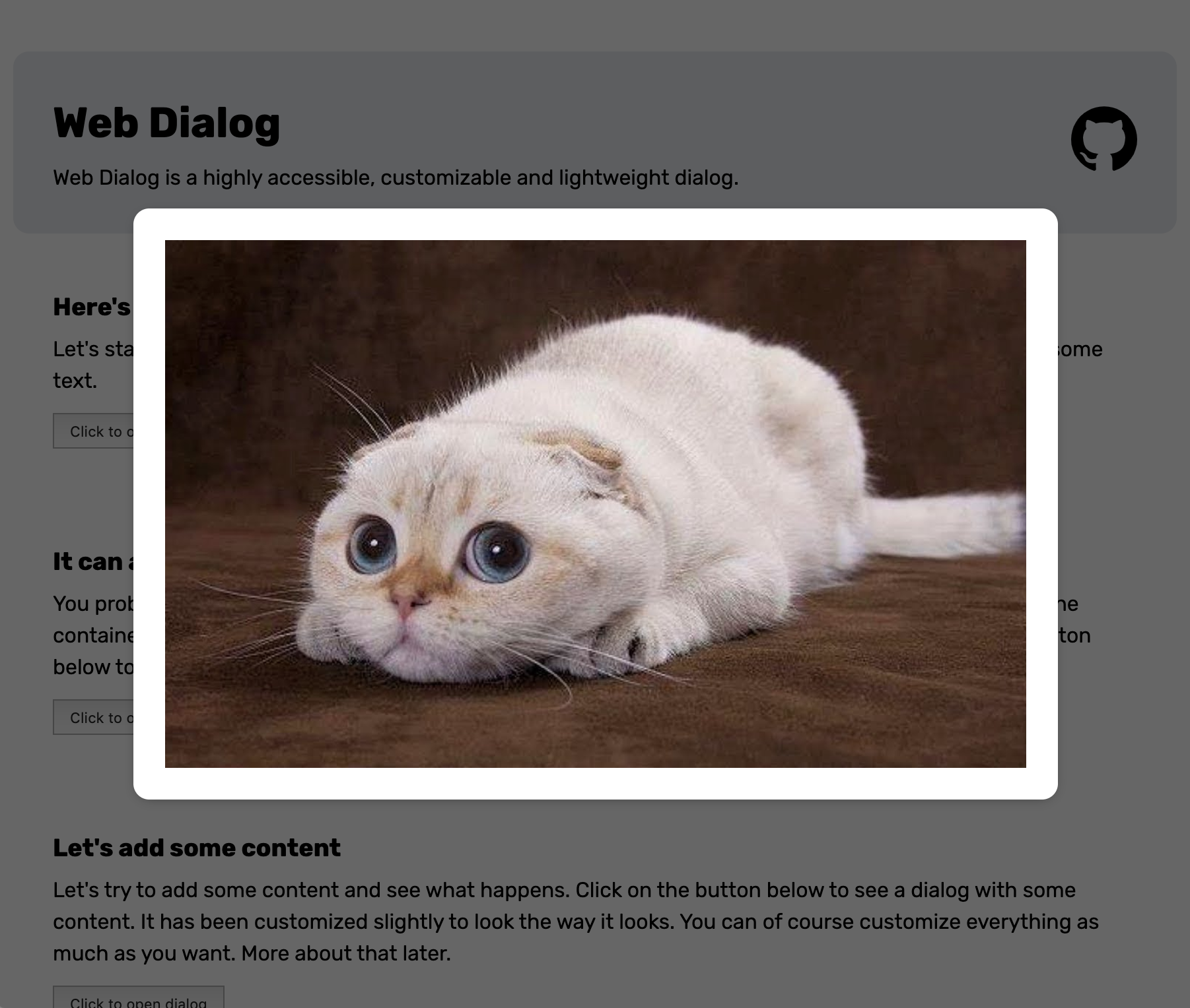
This section documents the attributes, css variables and slots of the web components this library exposes.
A dialog web component that can be used to display highly interruptive messages.
| Property | Attribute | Type | Description |
|---|---|---|---|
center | center | Whether the dialog is centered on the page. | |
onBackdropClick | |||
onKeyDown | |||
open | open | Whether the dialog is opened. | |
result | R | undefined |
| Method | Type | Description |
|---|---|---|
assertClosing | (): any | Dispatches an event that, if asserts whether the dialog can be closed. If "preventDefault()" is called on the event, assertClosing will return true if the event was not cancelled. It will return false if the event was cancelled. |
close | (result?: R | undefined): void | Closes the dialog with a result. |
didClose | (): void | Clean up the dialog after it has closed. |
didOpen | (): void | Setup the dialog after it has opened. |
onBackdropClick | (): void | Closes the dialog when the backdrop is clicked. |
onKeyDown | (e: any): void | Closes the dialog when escape is pressed. |
show | (): void | Shows the dialog. |
| Event | Description |
|---|---|
close | This event is fired when the dialog closes. |
closing | This event is fired before the dialog is closed by clicking escape or on the backdrop. The event is cancellable which means event.preventDefault() can cancel the closing of the dialog. |
open | This event is fired when the dialog opens. |
| Part | Description |
|---|---|
backdrop | Backdrop part. |
dialog | Dialog part. |
| Property | Description |
|---|---|
--dialog-animation-duration | Duration of the dialog animation. |
--dialog-animation-easing | Easing of the dialog animation. |
--dialog-backdrop-bg | Background of the backdrop. |
--dialog-bg | Background of the dialog. |
--dialog-border-radius | Border radius of the dialog. |
--dialog-box-shadow | Box shadow of the dialog. |
--dialog-color | Color of the dialog. |
--dialog-container-padding | Padding of the host container of the dialog. |
--dialog-height | Height of the dialog. |
--dialog-max-height | Max height of the dialog. |
--dialog-max-width | Max width of the dialog. |
--dialog-overflow-x | Overflow of the x-axis. |
--dialog-overflow-y | Overflow of the y-axis. |
--dialog-padding | Padding of the dialog. |
--dialog-width | Width of the dialog. |
--dialog-z-index | Z-index of the dialog. |
| Andreas Mehlsen | You? |
Licensed under MIT.
FAQs
A highly accessible, customizable and lightweight dialog.
The npm package web-dialog receives a total of 378 weekly downloads. As such, web-dialog popularity was classified as not popular.
We found that web-dialog demonstrated a not healthy version release cadence and project activity because the last version was released a year ago. It has 1 open source maintainer collaborating on the project.
Did you know?

Socket for GitHub automatically highlights issues in each pull request and monitors the health of all your open source dependencies. Discover the contents of your packages and block harmful activity before you install or update your dependencies.

Research
Security News
A malicious npm package targets Solana developers, rerouting funds in 2% of transactions to a hardcoded address.

Security News
Research
Socket researchers have discovered malicious npm packages targeting crypto developers, stealing credentials and wallet data using spyware delivered through typosquats of popular cryptographic libraries.

Security News
Socket's package search now displays weekly downloads for npm packages, helping developers quickly assess popularity and make more informed decisions.