Security News
Research
Data Theft Repackaged: A Case Study in Malicious Wrapper Packages on npm
The Socket Research Team breaks down a malicious wrapper package that uses obfuscation to harvest credentials and exfiltrate sensitive data.
middleman-srcset_images
Advanced tools
Install libvips 8.6 or higher. Unfortunately on Debian that means compiling it from source.
Add the gem to your site's Gemfile.
gem 'middleman-srcset_images', github: 'jkraemer/middleman-srcset_images'
Create a configuration file as outlined below.
In your Markdown files, use this syntax for images:

where half is one of the configured image sizes (see below). The result will be an image tag with srcset and sizes attributes. To create a linked image, add another exclamation mark followed by the destination URL:

Relative image paths are assumed to be local to the article, and the file
extension is assumed to be jpg if not present. So when using the 'one
directory per page' approach where you have a file layout like this:
source/
  some-article.html.md
  some-article/
    image.jpg
    another_image.jpg
you can significantly shorten your markup like this:

Configuration takes place in data/srcset_images.yml.
The keys in this hash are the sizes that can be used in Markdown / with the
image_tag helper. The value is put into the sizes attribute of the
resulting img tag. The purpose of this attribute is to give the browser a hint
about how big this image will actually be rendered (relative to the screen
size) due to your CSS rules.
The sample below is for a site which can display content images in 3 different sizes, and that has a separate config for teaser images. On small devices, all images are rendered at full width, while on larger devices, they only take a fraction of the actual screen width. The separate teaser config is only there to allow for different cropping rules in the image versions config.
Configure scaling options for landscape and portrait images. These rules
determine which sizes of images will be created when building your site, and
also what goes into the srcset attribute of the img tag.
Besides the landscape and portrait keys, which act as fallbacks for images of landscape or portrait dimensions, you can add any other keys here for different use cases (i.e. cropping to a fixed xy ratio for teaser images as is done in the sample below).
When rendering an img tag, the image version config to be used is picked as
follows:
---

sizes:
  full: "(min-width: 768px) 90vw, 100vw"
  half: "(min-width: 768px) 45vw, 100vw"
  third: "(min-width: 768px) 30vw, 100vw"
  teaser: "(min-width: 768px) 30vw, 100vw"

images: posts/**/*.jpg
# in case you have symlinked directories to your actual photos, use something
# like this:
# images: posts/**{,/*/**}/*.jpg

image_versions:
  # configuration for landscape and square images
  landscape:
    quality: 80
    srcset:
      -
        width: 2000
      -
        width: 1400
        is_default: true
      -
        width: 800
      -
        width: 400

  # portrait content images, cropped to 3:4
  portrait:
    quality: 80
    crop: true
    srcset:
      -
        height: 1800
        width: 1350
      -
        height: 1200
        width: 900
        is_default: true
      -
        height: 800
        width: 600

  # teaser image, cropped to landscape 3:2
  teaser:
    crop: true
    quality: 80
    srcset:
      -
        width: 1800
        height: 1200
      -
        width: 1200
        height: 800
        is_default: true
      -
        width: 600
        height: 400
MIT, see LICENSE
FAQs
Unknown package
We found that middleman-srcset_images demonstrated a not healthy version release cadence and project activity because the last version was released a year ago. It has 1 open source maintainer collaborating on the project.
Did you know?

Socket for GitHub automatically highlights issues in each pull request and monitors the health of all your open source dependencies. Discover the contents of your packages and block harmful activity before you install or update your dependencies.

Security News
Research
The Socket Research Team breaks down a malicious wrapper package that uses obfuscation to harvest credentials and exfiltrate sensitive data.

Research
Security News
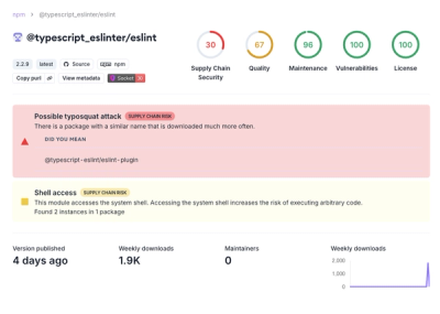
Attackers used a malicious npm package typosquatting a popular ESLint plugin to steal sensitive data, execute commands, and exploit developer systems.

Security News
The Ultralytics' PyPI Package was compromised four times in one weekend through GitHub Actions cache poisoning and failure to rotate previously compromised API tokens.