
Security News
Oracle Drags Its Feet in the JavaScript Trademark Dispute
Oracle seeks to dismiss fraud claims in the JavaScript trademark dispute, delaying the case and avoiding questions about its right to the name.
By Sarah Gooding - Feb 07, 2025
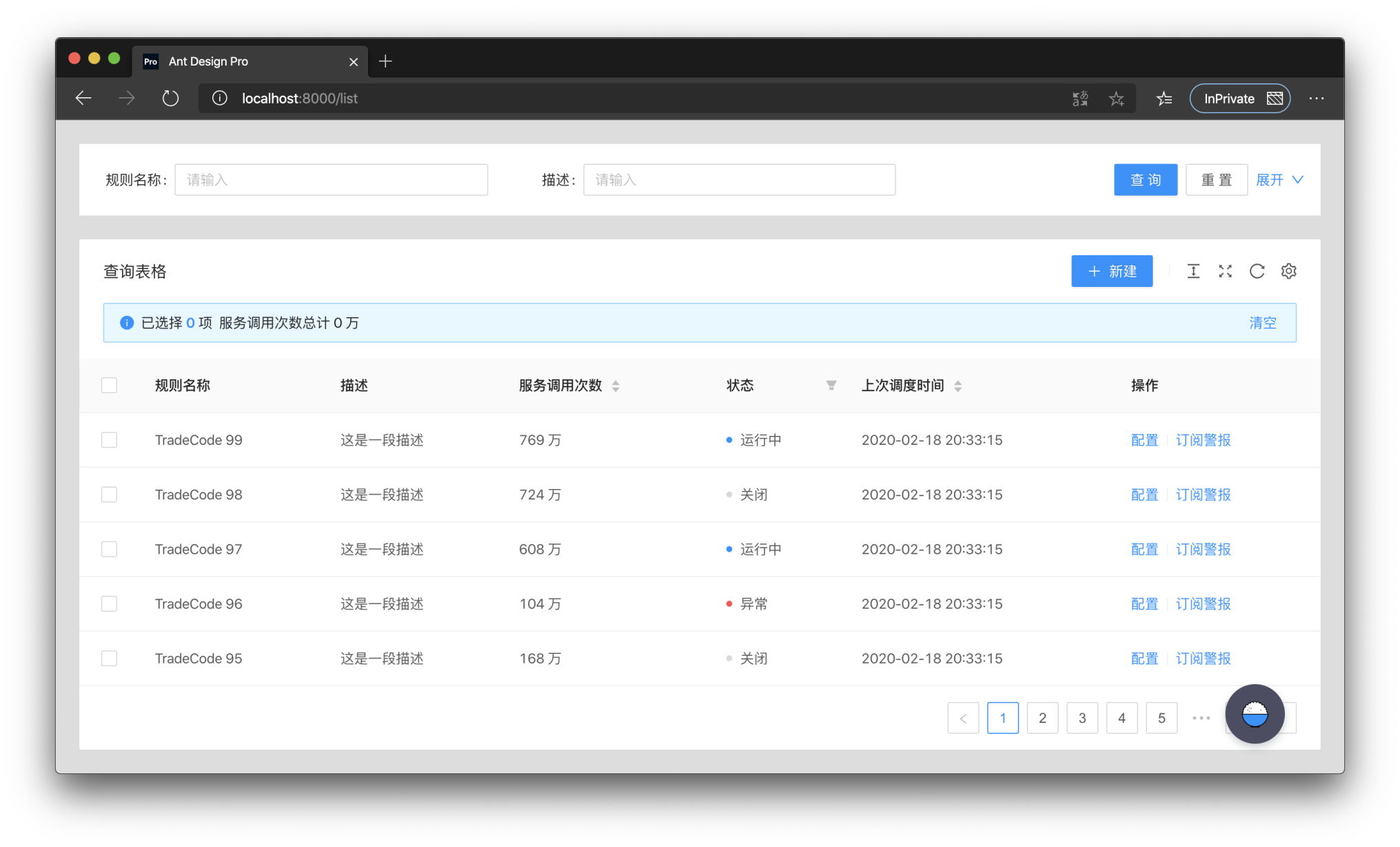
@ant-design/pro-table
Advanced tools
@ant-design/pro-table is a powerful table component built on top of Ant Design's table. It provides advanced features for handling complex data tables, including search, filtering, sorting, and more, making it suitable for professional data management applications.
Advanced Search and Filtering
This feature allows users to apply filters to table columns, enabling them to search and filter data efficiently. The code sample demonstrates how to set up filters for a column named 'Name'.
{
"columns": [
{
"title": "Name",
"dataIndex": "name",
"filters": [
{
"text": "Joe",
"value": "Joe"
},
{
"text": "Jim",
"value": "Jim"
}
],
"onFilter": "(value, record) => record.name.includes(value)"
}
]
}Editable Table
The editable table feature allows users to modify table data directly within the table interface. The code sample shows how to make the 'Age' column editable.
{
  "editable": true,
  "columns": [
    {
      "title": "Age",
      "dataIndex": "age",
      "editable": true
    }
  ]
}
Pagination and Sorting
This feature provides built-in pagination and sorting capabilities, allowing users to navigate through data and sort it by different criteria. The code sample demonstrates setting up pagination and a sorter for the 'Address' column.
{
  "pagination": {
    "pageSize": 10
  },
  "columns": [
    {
      "title": "Address",
      "dataIndex": "address",
      "sorter": "(a, b) => a.address.length - b.address.length"
    }
  ]
}React Table is a lightweight, fast, and extendable data grid built for React. It provides a headless UI, meaning it doesn't come with built-in styles, allowing for more customization. Compared to @ant-design/pro-table, it requires more setup for styling and advanced features but offers greater flexibility.
Material Table is a data table component built on Material-UI. It offers features like sorting, filtering, and pagination out of the box, similar to @ant-design/pro-table. However, it is more tightly integrated with Material-UI's design system, which may be preferable for projects already using Material-UI.
AG Grid is a feature-rich data grid supporting major JavaScript frameworks, including React. It offers a wide range of features such as grouping, pivoting, and live updates. AG Grid is more comprehensive and may be more suitable for enterprise applications compared to @ant-design/pro-table.
ProTable was created to solve the problem of having to write a lot of sample code for tables in a project, so a lot of common logic was encapsulated in it. These wrappers can be simply categorized as pre-defined behaviors and pre-defined logic.
ProTable puts a layer of wrapping on top of antd's Table, supports some presets, and encapsulates some behaviors. Only api's that differ from antd Table are listed here.
request is the most important API of ProTable, request takes an object. The object must have data and success in it, and total is also required if manual paging is needed. request takes over the loading settings and re-executes them when the query form is queried and the params parameters are modified. Also the query form values and params parameters are brought in. The following is an example.
<ProTable<DataType, Params>
  // params is a parameter that needs to be self-contained
  // This parameter has higher priority and will override the parameters of the query form
  params={params}
  request={async (
    // The first parameter params is the combination of the query form and params parameters
    // The first parameter will always have pageSize and current, which are antd specifications
    params: T & {
      pageSize: number;
      current: number;
    },
    sort,
    filter,
  ) => {
    // Here you need to return a Promise, and you can transform the data before returning it
    // If you need to transform the parameters you can change them here
    const msg = await myQuery({
      page: params.current,
      pageSize: params.pageSize,
    });
    return {
      data: msg.result,
      // Please return true for success.
      // otherwise the table will stop parsing the data, even if there is data
      success: boolean,
      // not passed will use the length of the data, if it is paged you must pass
      total: number,
    };
  }}
/>
| Property | Description | Type | Default Value |
|---|---|---|---|
| request | How to get dataSource | (params?: {pageSize,current},sort,filter) => {data,success,total} | - |
| params | Additional parameters used for request query, once changed will trigger reloading | object | - |
| postData | Process the data obtained through request | (data: T[]) => T[] | - |
| defaultData | Default data | T[] | - |
| dataSource | Table data, protable recommends using request to load | T[] | - |
| onDataSourceChange | Triggered when Table data changes | (dataSource: T[]) => void | - |
| actionRef | Reference to Table action for custom triggering | MutableRefObject<ActionType> | - |
| formRef | The form instance of the query form can be obtained for some flexible configuration | MutableRefObject<FormInstance> | - |
| toolBarRender | Render toolbar, support returning a dom array, will automatically increase margin-right | (action) => ReactNode[] | - |
| onLoad | Triggered after the data is loaded, it will be triggered multiple times | (dataSource: T[]) => void | - |
| onLoadingChange | Triggered when loading is modified, usually caused by network requests | (loading:boolean)=>void | - |
| onRequestError | Triggered when data loading fails | (error) => void | - |
| tableClassName | className of the encapsulated table | string | - |
| tableStyle | style of the encapsulated table | CSSProperties | - |
| options | table toolbar, not displayed when set to false | {{ density?: boolean, fullScreen?: boolean | function, reload?: boolean | function, reloadIcon?: React.ReactNode, densityIcon?: React.ReactNode, setting?: boolean | SettingOptionType }} | { fullScreen: false, reload :true, density: true, setting: true} |
| search | Whether to display the search form, when the object is passed in, it is the configuration of the search form | false | SearchConfig | - |
| dateFormatter | Convert moment format data to a specific type, false will not be converted | "string" | "number" | ((value: Moment, valueType: string) => string | number) |false | "string" |
| defaultSize | Default size | SizeType | - |
| beforeSearchSubmit | Make some changes before searching | (params:T)=>T | - |
| onSizeChange | The table size has changed | (size:'default' |'middle' |'small') => void | - |
| type | pro-table type | "form" | - |
| form | antd form configuration | FormProps | - |
| onSubmit | Triggered when the form is submitted | (params: U) => void | - |
| onReset | Triggered when the form is reset | () => void | - |
| columnEmptyText | Display when it is empty, display - when it is not set, false can turn off this function | string | false | false |
| tableRender | Custom rendering table function | (props,dom,domList:{ toolbar,alert,table}) => ReactNode | - |
| toolbar | Transparent transmission of ListToolBar configuration items | ListToolBarProps | - |
| tableExtraRender | The main function of the custom table | (props: ProTableProps<T, U>, dataSource: T[]) => ReactNode; | - |
| manualRequest | Do you need to manually trigger the first request? When configured as true, the search form cannot be hidden | boolean | false |
| editable | Related configuration of editable table | TableRowEditable | - |
| cardBordered | Border of Card components around Table and Search | boolean | {search?: boolean, table?: boolean} | false |
| ghost | Ghost mode, that is, whether to cancel the padding of the table content area. | boolean | false |
| debounceTime | Debounce time | number | 10 |
| revalidateOnFocus | Automatically re-request when the window is focused | boolean | false |
| columnsState | Column Status Control, you can operate the display hide | ColumnStateType | - |
| Property | Description | Type | Default Value |
|---|---|---|---|
| record | The row data to be added, generally contains a unique key | T | {} |
| position | Where does the line increase, start or end | top | bottom | bottom |
| (...buttonProps) | ButtonProps of antd | ButtonProps | — |
| Property | Description | Type | Default |
|---|---|---|---|
| defaultValue | The default value of the column status, only for the first time. Used for resetting value | Record <string, ColumnsState>; | |
| value | Column status, support controlled mode | Record <string, ColumnsState>; | |
| onChange | Column status After changing | (value: Record <string, ColumnsState>) => void | |
| PersistenceKey | The key of the persistence column is used to determine if it is the same table | string | Number | |
| PersistenceType | The type of persistence column, localStorage is also existing after closing the browser, sessionStorage closes the browser will be lost | localStorage | sessionStorage |
| Property | Description | Type | Default Value |
|---|---|---|---|
| filterType | Filter form type | 'query' | 'light' | 'query' |
| searchText | Search button text | string | Search |
| resetText | reset button text | string | reset |
| submitText | The text of the submit button | string | Submit |
| labelWidth | Label width | 'number' | 'auto' | 80 |
| span | Configure the number of columns in the query form | 'number' | 'ColConfig' | defaultColConfig |
| className | Encapsulated search Form className | string | - |
| collapseRender | Collapse button render | ((collapsed: boolean,showCollapseButton?: boolean) => ReactNode)|false | - |
| defaultCollapsed | Whether to collapse by default | boolean | true |
| collapsed | collapsed | boolean | - |
| onCollapse | Collapse button event | (collapsed: boolean) => void; | - |
| optionRender | Custom action bar | ((searchConfig,formProps,dom) => ReactNode[])|false | - |
| showHiddenNum | Whether to show the number of hidden items after storing | boolean | false |
| Property | Description | Type | Default Value |
|---|---|---|---|
| type | Type of editable table, single or multiple | single | multiple | - |
| form | Form instance of editable form, use Form.useForm to generate and use | FormInstance | - |
| formProps | form properties can be configured, but onFinish is not supported | `FormProps' | - |
| editableKeys | Row being edited, controlled attributes. The defaultkey will use the configuration of rowKey,if there is no configuration, it will use theindex, it is recommended to use rowKey | Key[] | - |
| onChange | Triggered when row data is modified | (editableKeys: Key[], editableRows: T[]) => void | - |
| onSave | Triggered when a row is saved | (key: Key, row: T,originRow:T,newLine?:newLineConfig) => Promise<any> | - |
| saveText | Text for saving a row | React.ReactNode | Save |
| onDelete | Triggered when a row is deleted | (key: Key, row: T) => Promise<any> | - |
| deleteText | Text for deleting a row | React.ReactNode | Delete |
| onCancel | Triggered when cancel editing a line | (key: Key, row: T,originRow:T,newLine?:newLineConfig) => Promise<any> | - |
| cancelText | Text for canceling the editing of a row | React.ReactNode | Cancel |
| actionRender | Custom edit mode action bar | (row: T, config: ActionRenderConfig<T>) => ReactNode[] | - |
| deletePopconfirmMessage | The pop-up confirmation box prompt message when deleting | ReactNode | Delete this line? |
| onlyOneLineEditorAlertMessage | Only one line can be edited | ReactNode | Only one line can be edited at the same time |
| onlyAddOneLineAlertMessage | Only one line can be added at the same time | ReactNode | Only add one line |
const defaultColConfig = {
  xs: 24,
  sm: 24,
  md: 12,
  lg: 12,
  xl: 8,
  xxl: 6,
};
Using npm:
$ npm install --save @ant-design/pro-table
or using yarn:
$ yarn add @ant-design/pro-table
FAQs
🏆 Use Ant Design Table like a Pro!
The npm package @ant-design/pro-table receives a total of 25,913 weekly downloads. As such, @ant-design/pro-table popularity was classified as popular.
We found that @ant-design/pro-table demonstrated a healthy version release cadence and project activity because the last version was released less than a year ago. It has 0 open source maintainers collaborating on the project.
Did you know?

Socket for GitHub automatically highlights issues in each pull request and monitors the health of all your open source dependencies. Discover the contents of your packages and block harmful activity before you install or update your dependencies.
Security News
Oracle seeks to dismiss fraud claims in the JavaScript trademark dispute, delaying the case and avoiding questions about its right to the name.

Security News
The Linux Foundation is warning open source developers that compliance with global sanctions is mandatory, highlighting legal risks and restrictions on contributions.

Security News
Maven Central now validates Sigstore signatures, making it easier for developers to verify the provenance of Java packages.