Clinic.js Common
Common functionality shared throughout Clinic.js.
Table of contents
Utils
getLoggingPaths(toolName, toolSpecificFiles=[])
Create a function that builds paths for tool log information. The returned function returns an object mapping virtual path names to actual path names, such as:
{
  '/systeminfo': '{pid}.clinic-{toolName}/{pid}.clinic-{toolName}-systeminfo'
}
Arguments:
toolName - name of the Clinic.js tool.toolSpecificFiles - array of file names to generate, on top of the defaults (/, /systeminfo).
If toolName is 'doctor', this defaults to ['/traceevent', '/processstat'].
If toolName is 'bubbleprof', this defaults to ['/traceevent', '/stacktrace'].
checkForTranspiledCode(fileName)
A function that will check file contents for transpiled code. Check also includes a search for a source map comment.
Arguments:
fileName - Path to the file being passed in.
Scripts
buildJs(opts = {})
Returns a Browserify bundle (Readable Stream)
Usage
const buildJs = require('@clinic/clinic-common/scripts/build-js')

const scriptFile = buildJs({
  basedir: __dirname, (String)
  debug: this.debug, (Boolean)
  fakeDataPath, (String)
  scriptPath, (String)
  beforeBundle: b => b.doSomethingWithBundle() (Function)
})
💡 The debug option will ensure the bundle contains a sourcemap
💡 If fakeDataPath is not provided, make sure to provide a separate dataFile to the main template.
buildCss(opts = {})
Returns a PostCSS bundle (Promise)
Usage
const buildCss = require('@clinic/clinic-common/scripts/build-css')

const styleFile = buildCss({
  stylePath, (String)
  debug: this.debug (Boolean)
})
💡 The debug option will ensure the bundle contains a sourcemap
Templates
Templates use stream-template to interpolate streams, promises and strings into a common template without the need to buffer them first.
mainTemplate(opts = {})
Returns a streamTemplate (Readable Stream)
Use this template for building tool output with a common chrome including a header and a popout tray.
This will need to be used in conjunction with the common UI styles and the tray behaviours.
Usage
const mainTemplate = require('@clinic/clinic-common/templates/main')

const outputFile = mainTemplate({
  htmlClass: '', (String)
  favicon: 'URI', (String)
  title: 'Title', (String)
  styles: styleFile, (Readable Stream)
  data: dataFile, (Readable Stream)
  script: scriptFile, (Promise)
  headerLogoUrl: 'https://github.com/somewhere', (String)
  headerLogoTitle: 'Logo title', (String)
  headerLogo: logoFile, (String)
  headerText: 'Text', (String)
  toolVersion: '1.2.3', (String)
  uploadId: 'ID', (String)
  head: 'extra <head> content', (String)
  body: 'extra <body> contents' (String)
})
💡 opts.data can be provided to place the JSON output of the analysis into its own script tag. When not provided, analysis data should be bundled in the scriptFile by the user.
Styles
Importable CSS to include when using the mainTemplate to be used in conjunction with the buildCss script to ensure it is bundled with tool-specific styling. This adds some global styles for the header and tray. The CSS is written using BEM to avoid specificity and has the following overrideable CSS variables:
html {
  --nc-colour-text: white;
  --nc-colour-code: #E9F100;
  --nc-colour-notification-dot: #2165E5;
  --nc-colour-tray-backdrop: rgba(0, 0, 0, 0.6);
  --nc-colour-tray: #292d39;
  --nc-colour-header-background: #292d39;
}
Usage
@import '@clinic/clinic-common/styles/styles.css';

.your {
  tool: styles;
}
Standards
CSS should be written using classes using BEM as a naming convention for better encapsulation and lower specificity.
Inside this repo, all classes are vendor-prfixed with .nc- to avoid class name collision with third party or tool specific styles. For tool-based styling, all styles should follow the same conventions with prefixes for the tools as follows:
.ncd- Clinic.js Doctor
.ncb- Clinic.js Bubbleprof
.ncf- Clinic.js Flame
Breakdown
.nc-tray { ...
.nc-tray__inner { ...
Icons
Returns a dictionary object whose keys are the icon names and the values are the svg files content.
Useful to inline svg files.
Find here the icons list
Use examples:
const icons = require('@clinic/clinic-common/icons')

console.log(icons.activity)

output:
`<svg class="icon-img activity-svg" width="24" height="24" viewBox="0 0 24 24" fill="none" xmlns="http://www.w3.org/2000/svg">
<path fill-rule="evenodd" clip-rule="evenodd" d="M10.7069 3.00248C11.1545 3.03412 11.5262 3.36 11.6161 3.79959L14.2191 16.5255L15.7076 12.796C15.8593 12.4159 16.2272 12.1667 16.6364 12.1667H21C21.5523 12.1667 22 12.6144 22 13.1667C22 13.7189 21.5523 14.1667 21 14.1667H17.314L14.8379 20.3707C14.6741 20.7811 14.2603 21.0353 13.8202 20.996C13.3801 20.9568 13.0179 20.6333 12.9294 20.2004L10.3742 7.70839L8.30541 13.5029C8.1633 13.9009 7.78629 14.1667 7.36364 14.1667H3C2.44772 14.1667 2 13.7189 2 13.1667C2 12.6144 2.44772 12.1667 3 12.1667H6.65884L9.69459 3.66375C9.84545 3.24118 10.2593 2.97084 10.7069 3.00248Z" fill="#7A7F8F"></path>
</svg>`
Alternatively you can import the needed icons individually:
const cog = require('@clinic/clinic-common/icons/cog')
...
`<span class="my_icon_wrapper">${cog}</span>`
Basic style can be imported into the page by adding the following line to your main css file (if you use postcss-import):
@import "@clinic/clinic-common/icons/style.css";
That will add the following rules:
svg.icon-img {
width: 1em;
height: 1em;
display: block;
}
Using the icons as BG images
It is possible to use an icon as a background image too.
In your style.css import the icons you need, i.e.:
@import "@clinic/clinic-common/icons/cog.css";
This will generate the following css variable :
html {
    --cog-icon: url(data:image/svg+xml;utf8,<svg width="24" height="24" viewBox="0 0 24 24" fil…2 19.0006 14.7857 18.9737 14.8485L18.0545 14.4545Z" fill="#7A7F8F"></svg>);
}
Now you can use it like this:
.settings-button{
  background-image: var(--cog-icon);
  width: 24px;
  height: 24px;
...
}
Images
It is possible to embed Base64-Encoded images.
scripts/build-images.js exposes two methods:
path(sourceDir, exportDir)
file(filePath, exportDir)
The supported file extensions are:
png jpeg jpg and gif
Use example:
const buildImg = require('@clinic/clinic-common/scripts/build-images')
buildImg.file('my/amazing/image.jpg', 'visualizer/assets/images')
const myImage = require('visualizer/assets/images/image.js')
`<img src=${myImage} ... />
Components
A set of base components and helpers. All the components styles are @imported in style.css and can be imported as follows:
@import "@clinic/clinic-common/base/style.css";
Each component can be imported singularly:
const button = require('@clinic/clinic-common/base/button.js')
or you can import multiple components at once:
const { button, checkbox, contextOverlay } = require('@clinic/clinic-common/base')
Each component is a function that returns an HTML element
button
myForm.appendChild(button({
label: 'Submit',
title: 'Click me!',
classNames: ['submitBtn', 'primaryButton'],
leftIcon: submitIcon,
onClick: () => validateAndSubmit()
}))
style can be customised by defining these CSS vars in your CSS
  --nc-button-bgColor
  --nc-button-color
  --nc-button-fontSize
  --nc-button-bgHover
  --nc-button-hoverOutline
link
div.appendChild(link({
label: 'Documentation',
title: 'Click me!',
href: '/docs',
classNames: ['openDocs'],
rightIcon: externalLink
}))
style can be customised by defining these CSS vars in your CSS
  --nc-link-bgColor
  --nc-link-color
  --nc-link-fontSize
  --nc-link-bgHover
  --nc-link-hoverOutline
dropdown
div.appendChild(dropdown({
classNames: ['key-v8'],
label: checkbox({
leftLabel: 'V8',
onChange: e => {
this.setCodeAreaVisibility('all-v8', e.target.checked)
}
}),
content: `<span>This is some content. ${greetings}</span>`,
expandAbove: true
}))
style can be customised by defining these CSS vars in your CSS
  --nc-checkbox-bgColor
  --nc-checkbox-hoverColor
  --nc-checkbox-hoverOutline
  --nc-checkbox-borderColor
  --nc-checkbox-checkedIconColor
  --nc-checkbox-indeterminateIconColor
checkbox
checkbox({
classNames: ['key-core'],
leftLabel: `<span class='after-bp-1'>Node JS</span>
<span class='before-bp-1'>Node</span>`,
onChange: e => this.setCodeAreaVisibility('core', e.target.checked)
})
style can be customised by defining these CSS vars in your CSS
  --nc-dropdown-borderColor
  --nc-dropdown-color
  --nc-dropdown-bgColor
  --nc-dropdown-contentBg
  --nc-dropdown-contentBorderColor
contexOverlay
Displays an overlay containig the given msg right next to the targetElement or the targetRect
If targetElement and targetRect are null||undefined then the overlay content will be centerd on the page.
overlay.show({
msg: this.wrapper,
classNames: ['wt-container'],
offset: { y: 10, height: 20 },
targetElement: document.querySelector('.my-cool-element'),
showArrow: true
})
Walkthrough
A class to display step-by-step guide to the UI features.
const wt = new Walkthrough({ steps = [], showBackdrop = false, showControls = true, onProgress })
WT exposes the following methods:
  `start`
  `next`
  `end`
  `skipTo`
steps is an array of objects, each step has the following properties:
attachTo: a css selector to identify the element describedmsg: an HTMLElement or string template of the message to be displayed
onProgress(index) gets triggered whenever the Walkthrough component state changes.
const steps = [
{
attachTo: '#selection-controls',
msg: `
<div>
<div class="step-1">
${flame}
Hello, and welcome to Flame!
</div>
</div>
`
},
{
attachTo: '.frame-dropdown',
msg: `
<div>
<p>Do you like Flame?</p>
<img style="width:400px; height: 225px; display:block;" src="https://images.pexels.com/photos/750225/pexels-photo-750225.jpeg?auto=compress&cs=tinysrgb&dpr=1&w=500" />
${docs}
</div>`
}
]
walkthroughButton
The standardised button to tools which activates the Walkthroughs
const hdtw = walkthroughButton(wtSteps, index => {
this.pushHistory()
})
helpers
A set of useful functions. Currently contains:
toHtml(data) Data can be a string, a function or an HTMLElement. The output is an HTMLElement
const myHtml = helpers.toHtml(`<span>${greetings}</span>`)
const myHtml = helpers.toHtml(getGreetings)
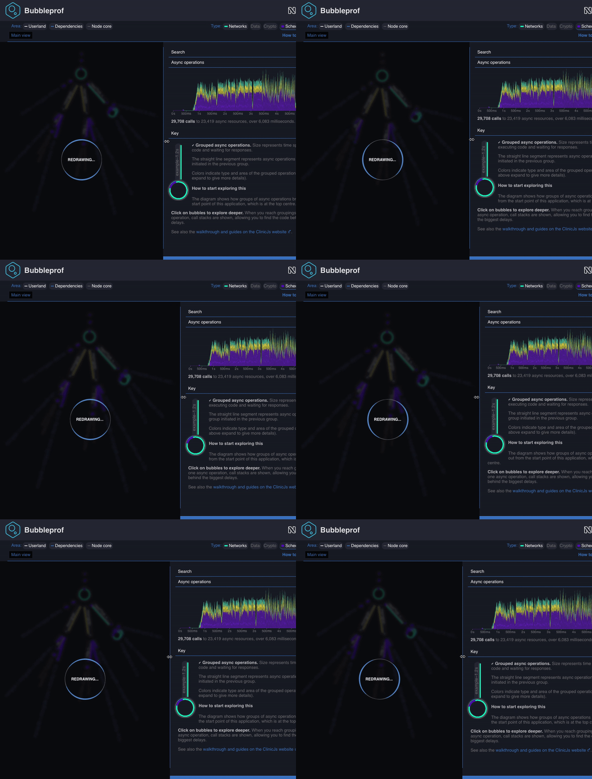
Spinner
To add the loading spinner to your app please import @clinic/clinic-common/spinner in your main.js and the style.css file to your style.css
Example:
in main.js
require('@clinic/clinic-common/spinner')
in style.css
@import "@clinic/clinic-common/spinner/style.css";
This will display the loading spinner while the page gets loaded.
If you need to show the spinner later on, maybe while the app is busy doing some calculation, you can programmatically switch the spinner on and off as shown in the following example:
const spinner = require('@clinic/clinic-common/spinner')
...
const redrawSpinner = spinner.attachTo(document.querySelector('#myHtmlContainerNode'))
redrawSpinner.show('Melting the North pole down...')
redrawSpinner.hide()
The spinner rotating border is white by default, you can customise it by setting the css var --spinner-border-color in your css:
html {
--spinner-border-color: --my-fancy-primary-color;
}
#myHtmlContainerNode {
--spinner-border-color: --my-fancy-secondary-color;
}
Attaching the spinner to an element creates a new instance of spinner that can be used later on the switch the spinner on/off. When the spinner is displayed, the element to which the spinner is attached gets blurred and overlaid by a dark box.

License
MIT


